Van Gogh's paint supplies weren't as mysterious as people make them out to be. He mostly reached for oil paints you’d find right off the shelf in late 1800s Europe. Today, we know he favored brands like Lefranc & Cie and Tasset et L’Hôte—mainstays in French art shops at the time. Imagine grabbing tubes in a Paris store, just like he did, not some secret alchemist’s formula.
His choices were practical, not exotic. Van Gogh aimed for bright colors that stayed intense, even after years on canvas. He knew what pigments gave him that punch—chromes for yellow and orange, cobalt and ultramarine for blues, and the newly available emerald green. He picked these because they popped, and they let him capture sunlight the way he saw it outdoors.
- Van Gogh and His Paint Brands
- The Colors and Pigments He Chose
- How Van Gogh Applied His Paint
- Common Questions About His Materials
- Tips for Modern Artists Inspired by Van Gogh
Van Gogh and His Paint Brands
If you think Van Gogh mixed up his own paint recipes in secret, that's just not how he rolled. The guy used commercial oil paint brands—real products you could actually buy from Paris art shops during the late 19th century. His letters spill the beans on this; he name-dropped paint makers when talking to his brother Theo.
The main brands Van Gogh went for were Lefranc & Cie and Tasset et L’Hôte. These weren’t obscure or exclusive—they were the heavy hitters in French art supply. You’d spot their tubes in any artist’s bag back then. Every tube was ready-made, which was honestly a lifesaver since he hated wasting time grinding pigments. Ready-made tubes let him get straight to painting outdoors.
What made these brands crucial for Van Gogh was their color range. Paint companies at the time were expanding their selection, even including synthetic pigments like chrome yellow and emerald green. For someone obsessed with color like Van Gogh, this was a game changer.
Here’s a quick rundown of what set these paint brands apart for Van Gogh:
- Van Gogh needed bold, long-lasting colors, and these brands delivered.
- The tubes made it cheap and easy to paint anywhere (especially outside).
- They had a wide selection, including new synthetic pigments that had just hit the market.
- Packaging was practical—tubes that didn’t dry out, so nothing got wasted.
Check out this comparison of brands Van Gogh used versus other 1880s options:
| Brand Name | Country | Notable Features |
|---|---|---|
| Lefranc & Cie | France | Wide color range, good pigment stability, easy-to-squeeze tubes |
| Tasset et L’Hôte | France | Affordable, reliable, lots of modern pigments |
| Winsor & Newton | England | Higher cost, found more in English studios, less popular in Paris |
Van Gogh wasn’t loyal to just one manufacturer, but he did lean heavily on what was available locally and priced right. If you want to channel his approach, look for brands offering pure pigments, simple ingredients, and won’t break the bank.
The Colors and Pigments He Chose
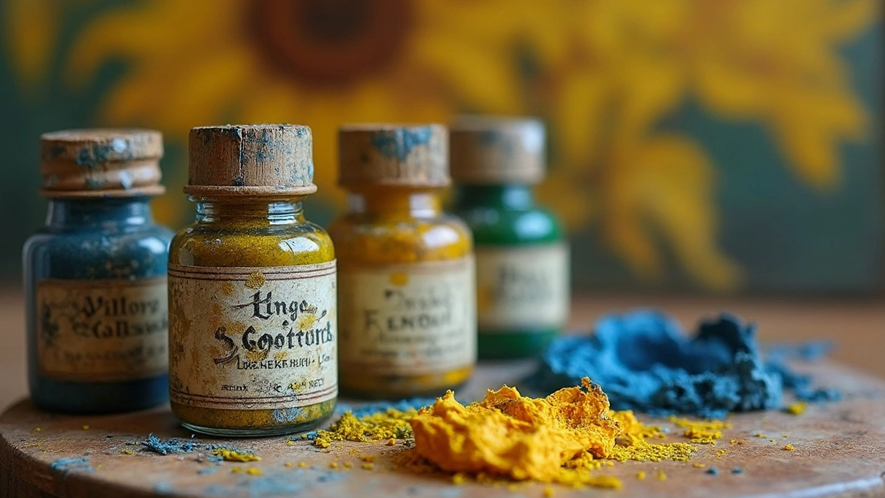
Van Gogh shook things up in the art world by chasing the brightest colors he could find. You can actually track which paints he bought because he mentioned them in his letters. And scientists have studied paint chips from his famous works to nail down the exact pigments.
Here’s something cool: a lot of Van Gogh’s color choices were the "new tech" of his day. Paint makers had just started rolling out man-made pigments that blew away the old, dull earth tones. That’s how he got those crazy vivid sunflowers and night skies.
- Chrome Yellow (lead chromate): This was Van Gogh’s go-to for bold yellows. It really made his sunflowers pop, even though it fades faster than other pigments.
- Emerald Green (copper acetoarsenite): toxic, but nobody knew the risks back then. He loved this green for its brightness in landscapes and backgrounds.
- Vermilion (mercury sulfide): His favorite for bright reds. It was expensive but gave a deep punch of color.
- Cobalt Blue (cobalt(II) aluminate) and Ultramarine: Both were used in starry skies and clothing. They cost more, but Van Gogh wanted those intense blues.
- Prussian Blue and Red Ochre: Used for depth and shading, especially when he wanted a strong contrast.
He didn’t just stick to primary colors—he mixed them right on the canvas, layering and blending for all those swirling, energetic effects you see up close. If you’re interested in what actually went into his paintings, check out this breakdown from a study of the pigments in his masterpiece, "Sunflowers":
| Pigment | Main Color | Used In |
|---|---|---|
| Chrome Yellow | Bright Yellow | Petals, Background |
| Emerald Green | Green | Leaves, Vase Details |
| Vermilion | Red | Petal Tips, Accents |
| Lead White | White | Mixing with Colors, Highlights |
| Red Ochre | Earthy Red/Brown | Stem Shadows, Layering |
If you ever wondered why some Van Gogh paintings look a bit faded or have weird color shifts, blame it on these unstable new pigments. Chrome Yellow, for example, can turn brownish over time when hit by a lot of sunlight. Still, those wild choices gave his art the punch and energy that you can spot from across a room. Want to try these colors out? Modern paint makers have "Van Gogh sets" with safer versions of most of his favorites—just check the labels for equivalents.
How Van Gogh Applied His Paint
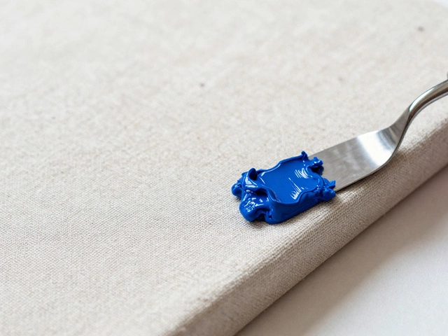
Van Gogh’s painting style stands out because he used his oil paint thick and fast. This wasn’t just a look he liked—he worked this way to capture energy and emotion on the canvas. His famous technique even got its own name: "impasto," which means he laid the paint on super thick so you can literally see and feel the brushstrokes when you look up close.
He didn’t stick to soft, blended strokes like classical artists. Instead, he loaded his brushes and palette knives with paint and worked quickly, sometimes straight from the tube. He rarely waited for layers to dry. If he messed up or wanted a different feel, he’d just paint right over it. This direct approach kept his colors bold and lively instead of dulling out from too much mixing—exactly why his sunflowers and skies just pop off the canvas.
- He often used hog-hair brushes for their stiffness, perfect for pushing around heavy, buttery oil color.
- Sometimes, he picked up a palette knife to spread thick globs or scratch in bits of detail.
- His brushwork changed depending on what he wanted—short, choppy dashes for things like grass, swirling lines for skies or water, and chunky dabs for those famous sunflowers.
Lab tests on his works, like those examined at the Van Gogh Museum, show layers up to 5 mm thick in spots. That's about the size of a stack of five credit cards! Scholars have even mapped out pressure marks where he pushed the brush so hard, the canvas gave way under his hand. Talk about painting with feeling.
| Tool | Usage Style |
|---|---|
| Hog-hair brush | Main tool for texture and bold strokes |
| Palette knife | Used for spreading, sculpting, and scraping paint |
| Tubes of oil paint | Sometimes applied straight to the canvas without mixing |
The way Van Gogh handled oil paint is a big part of what makes his art so striking. If you’re trying this yourself, don’t be shy—use more paint than you think, skip overthinking, and let the brush do the talking. You’ll end up with something fresh and packed with personality, just like he did.
Common Questions About His Materials
People have tons of questions when it comes to what Van Gogh actually put on his brush. Let’s clear up a few popular ones with solid facts and some numbers.
Van Gogh didn't make his own paint from scratch; he bought paint in tubes, which was kind of a new thing in his time. Before that, artists had to grind their own pigments and mix them with oil—messy and slow. Tubes made it portable and quick, so Van Gogh could toss them in his satchel and paint outside.
So, what were the tubes actually made of? The paint inside was basically pigment grounded fine and mixed with linseed oil. These brands stuck to formulas similar to what’s used for top artists’ oil paints now. Here’s a quick rundown of what was in his go-to colors:
| Color | Main Pigment Used | Notes |
|---|---|---|
| Chrome Yellow | Lead Chromate | Very bright, but can darken |
| Emerald Green | Copper Acetoarsenite | Toxic, but really vivid |
| Cobalt Blue | Cobalt(II) aluminate | Stable and rich color |
| Red Lake | Alizarin or Carmine | More prone to fading |
Another hot question: Did Van Gogh ever use watercolor or mix it with his oils? Not really. He did watercolor sketches, but his famous pieces, like ‘Starry Night’ or ‘Sunflowers,’ are all classic oils on canvas. There was no watercolor blended in—his textured brushwork comes straight from how thick he applied that oil paint.
If you’re wondering about the quality, Van Gogh often chose what he could afford, but he liked the higher-end stuff when he had cash. Some of his paints have faded or changed color over the years because pigments back then weren’t always stable or safe. For example, the stunning yellows sometimes went brown, and his reds lost some of their punch over the decades.
Lastly, what about the brushes and canvas? He wasn’t picky or fancy. Cheap boar bristle brushes, regular pre-primed canvases—nothing exclusive or bespoke. His magic wasn’t in high-end tools. It was the way he pushed what those simple materials could do.
- Most paint brands he used are still around in some form today.
- Modern paints are less likely to fade or darken, thanks to safer, more stable pigments.
- If you want to try painting like Van Gogh, skip fancy gear. Focus on bold colors and fearless brushwork.
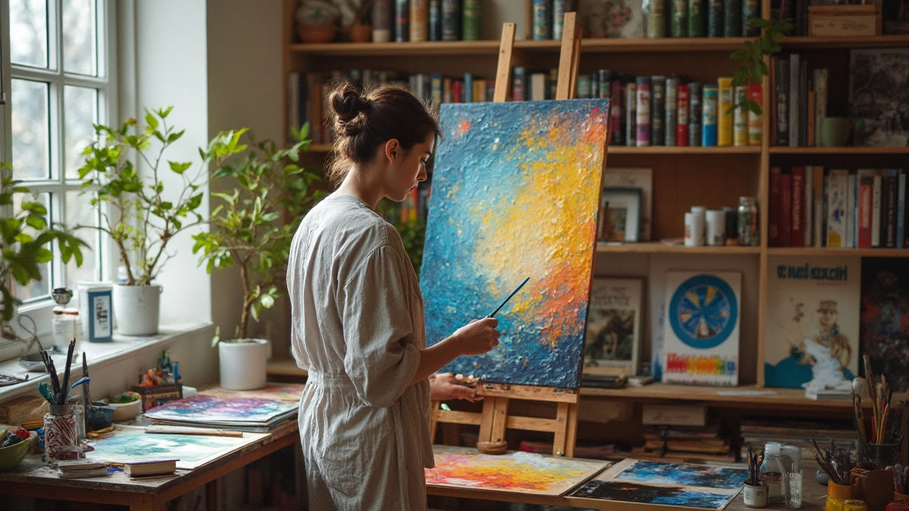
Tips for Modern Artists Inspired by Van Gogh
If you've ever wanted to paint with the same kind of energy that Van Gogh packed into his canvases, there are solid ways to get started. Don’t worry—you don’t need rare or expensive supplies. Here are practical tips drawn from what we know about his approach, so you can get close to his vibe using modern tools.
- Choose bold, saturated colors. Van Gogh wasn’t subtle with his palette. Modern equivalents of his favorites—like cadmium yellow, cobalt blue, and viridian green—are available from brands such as Winsor & Newton or Sennelier. Look for high pigment load in your paints, just like Van Gogh did.
- Use paint straight from the tube. He often skipped pre-mixing, laying colors down thick and letting them blend right on the canvas. Don’t be afraid of messy brushstrokes or visible texture—they’re part of the effect.
- Pick sturdy, high-quality brushes. Van Gogh was rough on his tools and used hog bristle for its durability, giving his work that trademark movement.
- Work wet-in-wet. He’d paint fast, adding new color before the layer underneath dried. This keeps the painting dynamic and lets colors bleed into each other in wild ways.
- Embrace affordable materials. Van Gogh used what he could afford. If budget’s an issue, remember he often painted over old canvases and used student-grade paint sometimes. Don’t let price hold you back.
“Van Gogh’s paint handling was, above all, direct and spontaneous—he squeezed colors straight onto the canvas and let his intuition take over.”
— The Van Gogh Museum, Amsterdam
Some artists wonder which of Van Gogh’s paint colors are still available today. Here’s a quick data table so you can match up modern tubes with his favorites:
| Van Gogh's Original Pigment | Modern Equivalent | Available Brands |
|---|---|---|
| Chrome Yellow | Cadmium Yellow | Winsor & Newton, Rembrandt |
| Emerald Green | Viridian | Gamblin, Sennelier |
| Ultramarine Blue | Ultramarine Blue | Michael Harding, Van Gogh by Royal Talens |
| Vermilion | Cadmium Red | Old Holland, Williamsburg |
| Lead White | Titanium White / Zinc White | All major brands |
Last tip—don’t stress about perfect technique. Van Gogh broke rules left and right. If you want your art to feel alive, take risks just like he did. That’s the real secret behind his legendary style.