What Color Looks Best in Portraits? A Practical Guide
Choosing the right color for a portrait can feel like a guessing game, but it doesn’t have to be. The colors you pick affect how the subject looks, how the mood feels, and even how the painting sells. Below are simple steps you can follow right now to pick the best hues for any portrait.
Understanding Skin Tones
The first thing to check is the sitter’s skin tone. Look at whether the skin leans warm (yellow, peach, golden) or cool (pink, blue, violet). Warm skins usually respond well to earthy reds, burnt oranges, and soft yellows. Cool skins often look brighter with blues, cool greens, or muted purples. A quick trick is to hold a white sheet next to the face; the color that makes the skin look fresher is the one to lean toward.
Don’t forget the undertones. If the subject has a lot of red in the cheeks, add a touch of orange or terra cotta in the background. If the cheeks are more pink, a cooler gray or blue can balance it out. Using a limited palette—three to five colors—helps keep the portrait cohesive.
Using Color to Set Mood
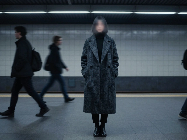
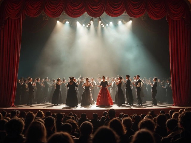
Color isn’t just about matching skin; it’s also about telling a story. Dark, muted colors like deep navy or charcoal can give a serious, contemplative vibe. Bright, saturated shades like turquoise or sunny yellow create a lively, energetic feel. Think about what the portrait is meant to convey and pick the dominant hue accordingly.
Background color matters too. A contrasting background makes the subject pop, while a harmonious background blends them together. For example, a warm orange shirt looks striking against a cool teal backdrop, but a soft beige wall lets a bright dress take center stage.
Lighting plays a huge role. In strong, directional light, cool shadows appear naturally, so adding a cool accent color can enhance realism. In soft, diffused light, warm tones feel more natural, so you might push the warm side of your palette.
Before you commit, make a small color test on a spare piece of paper. Mix a tiny amount of the chosen hue with the skin color you plan to use. If the mix looks flat or off, adjust the hue a bit until it feels right. This quick check saves a lot of rework later.
Finally, trust your eye. If a color feels right to you, it probably works. Portraits are personal, and there’s no one-size-fits-all answer. Use these guidelines, experiment a little, and you’ll find the color that makes every portrait shine.
Best Colors for Portraits: Expert Tips for Choosing the Right Hue
Find out which colors look best in portraits, whether for photos or paintings. Get expert advice, surprising facts, and easy-to-use tips to make your portraits pop.
Continue ReadingCategories
Most popular
-
 Decoding the Message Behind Abstract Art Nov 15 2024
 -
-
-
-