Ever notice how some portraits just make people look... more alive? I'm not talking about flawless lighting or retouched skin; it's the colors that make the difference. There’s this spark—whether you’re staring at a centuries-old self-portrait or your kid’s school photo, certain shades just hit harder. Color works magic in portraits: it can flatter, spark emotion, and even tell stories about the subject. But what are the rules? Is there a formula, or is it just about picking your favorite shirt and hoping for the best? Let’s break down what color actually works best in portraits, supported by facts, real-world examples, and some trial and error—yes, even some from family disasters involving Eldon's blinding neon green t-shirt on picture day.
The Science and Psychology Behind Color Choice in Portraits
The human eye is hardwired to respond to color. Artists and photographers have been using this trick for centuries, and modern color theory backs it up. Different colors not only set the mood but also play with our natural biases and visual tricks. For example, blue is consistently ranked as the world’s favorite color, with surveys in nearly 10 countries confirming this (including a 2015 YouGov poll showing blue as #1 for 6/10 countries polled). Blue communicates peace and trust—it’s why politicians pick blue ties. In portraits, a navy blouse or deep blue background can have the same effect: calm, confidence, balance.
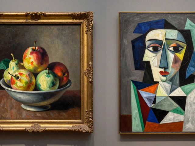
But there's more underneath the surface. Psychologists from the University of Lausanne found in a 2021 study that red is the most emotionally intense color, often linked to power or passion. Red pops in portraits, but it’s got bite: too much and the subject can look aggressive or overpowered. Greens and teals, often seen in Renaissance portraits, were chosen for one reason: they made skin tones look healthier, richer. The old Dutch masters weren’t fooling around; their subtle green backgrounds bring a “glow from within” effect, which is why modern photographers and painters still use those earthy backdrops today.
Want to see how color impacts mood in portraits across art history?
| Era | Popular Color Schemes | Effect on Portraits |
|---|---|---|
| Renaissance | Olive, earthy greens, golds | Healthy skin tones, subtle nobility |
| Impressionist | Pastels, soft blues, pinks | Youthful, airy, serene |
| Modern Era | Bold reds, deep blues, high-contrast neutrals | Dynamic, attention-grabbing |
Think about how you want someone to feel when they see your portrait—colors do at least half that talking for you. I learned this the hard way when Maris insisted on hot pink for a family pic—gorgeous kid, but the glare was real. Now, we plan our colors before any photos are snapped or brushes hit the canvas.
What the Pros Use: Flattering Colors for Portraits
Artists and photographers obsess about this question because the wrong color can destroy a masterpiece—or just turn a school photo into a yearlong embarrassment. The trick is finding hues that flatter skin and draw attention to the face, without stealing the show. Let’s dig into some tested advice from the pros.
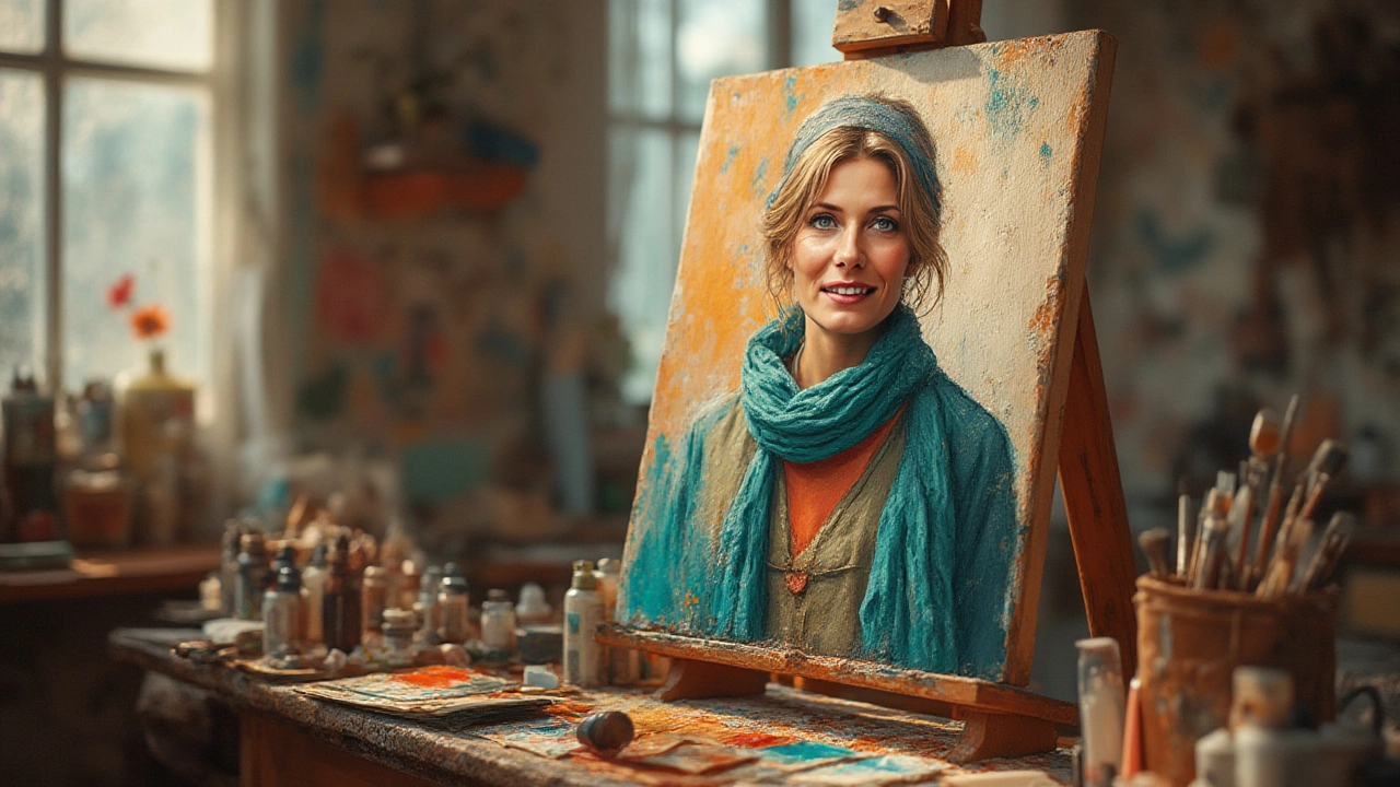
- Creams, beiges, and soft grays: Universally flattering, these colors never clash with skin. They let features pop instead of fabric. Most professional headshots use gentle neutrals so nothing distracts from the eyes.
- Jewel tones (emerald, sapphire, ruby): Bold but not neon, jewel tones work across many skin tones and feel sophisticated. National Portrait Gallery curators say rich blues and greens give a timeless look.
- Deep purple or eggplant: Not too flashy, but enough color to avoid looking washed out. Makes pale & medium skin pop, especially in winter months.
- Muted earth tones (olive, mustard, rust): These give a warm, organic vibe and are favorites among artists for painting and fall photoshoots. They don’t reflect weird colors onto the face—a big risk with bright yellow or orange.
Meredith Harris, a New York portrait photographer, once tested her theory by photographing 50 clients in different colored shirts. Her findings? Nearly everyone looked best in something from the jewel-tone spectrum or classic neutrals. Only two people out of fifty looked better in pure white or black—and that’s telling, since lots of folks insist on a white tee for photos. The lesson here? Pure white has a habit of washing people out, especially under bright light, and black, while classic, can swallow features unless the subject has very pale skin or the lighting is perfect.
The background’s color matters almost as much as clothing. Artists report that a simple, neutral backdrop—think warm gray or subtle taupe—brings forward the person, not the paint. But if you’re after more drama, a deep green or vintage blue can give portraits that “Old Master” vibe. Ever notice how Instagram trendsetters use dusky pinks and faded pastels behind their headshots? They’re taking a page from 19th-century painters who wanted subjects to glow against their surroundings.
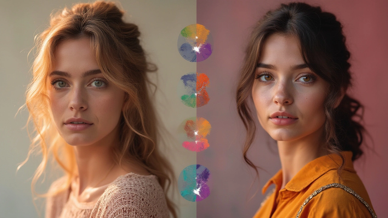
Skin undertones also play a big role. Cool undertones (think pink, rosy, olive) usually look incredible with blues, greens, and purples. Warm undertones (yellow, golden, brown) suit oranges, earthy reds, and amber shades. If you’re not sure about undertones, a quick tip: look at the veins on your wrist. If they look blue/purple, you likely have cool undertones; greenish veins point to warm. Of course, some folks land in the neutral camp and can pick either lane.
Some practical tips I’ve stolen from the pros for real-world success (and to avoid another neon disaster at home):
- Test colors in soft daylight, not harsh indoor light.
- Don’t pick everyone’s outfit in the family to “match”—complementary tones make for more natural portraits.
- Avoid loud patterns or heavy logos; keep it simple to highlight faces.
- If painting, choose a mid-tone background and build lighter or darker colors on top for depth.
- Try draping a scarf or cloth of different colors over your shoulders and check in the mirror which shade makes your eyes pop and skin glow. Trust that gut feeling.
Back in 2023, a group of portrait painters at the Royal Academy of Arts tested dozens of color swatches against live models. Their report? The most universally flattering combo for painted portraits was a warm, gray-beige background with touches of teal, burgundy, or emerald in clothing. Not exactly the rainbow, but it gets the job done every time.
Finding What Works For You: Personal Style Meets Classic Advice
So, what’s the best color for portraits? The truth is, it depends—on your story, your environment, your skin, even your mood on the day. But there’s a cheat code: look at the masters, grab the science, and try your favorites at home before committing to anything permanent (or at least public).
I used to think portrait colors were just about what looked sharpest or what’s in style. Then my son Eldon started picking his own shirts—first it was chartreuse, then a wild tie-dye phase. You start to see that portraits say as much about personality as they do about color rules. If your subject feels awesome in dusty rose or mustard, that energy shines through. Confidence trumps theory. But, if you care about the technical stuff, keep this quick summary in mind:
- Neutrals (gray, beige, taupe) = safe bets for all skin types and ages
- Jewel tones (blues, greens, purples) = rich, classic, flattering for both men and women
- Pure white or black = high contrast, but risky unless you know your lighting/skin undertones
- Earth tones = cozy, work well for indoor and outdoor portraits, especially in natural light
Now, color does more than make you look good. It hints at personality. Ever notice presidential portraits almost always feature blue somewhere? That’s not random. Blue says trust, gray shows wisdom, and a pop of red signals energy or boldness. For a family portrait on my wall, I pick calm, harmonious tones. But for an entrepreneur’s headshot, I’d vote navy or green.
Sometimes, the most memorable portrait breaks the rules on purpose. Artist Alice Neel was famous for painting her subjects in harsh, almost clashing colors, highlighting their quirks instead of smoothing them out. Those portraits are still talked about decades later. If you want your portrait to start conversations—try adding one “off” color, like a yellow scarf with a teal sweater, or placing the subject against a muraled wall rather than a boring gray.
Paintings and photos don’t have to follow the same rules, but the principles are close. Painters have more freedom to fudge skin tones and shadows, while photographers battle whatever weird light the day throws at them. But in both, picking colors that echo or gently contrast the main subject makes for standout portraits.
This isn’t all theory. A 2022 study by the American Society of Media Photographers found that 68% of their clients reported feeling happier about portraits shot with softer, harmonizing colors, compared to bold, high-contrast outfits. Turns out, being at ease with your color choices actually makes you look better—a tip for artists, photographers, and parents everywhere (trust me, I’ve chased plenty of sugar-fueled kids at photo shoots).
If you’re still unsure, look through the most shared portraits on social media or walk into a classic art museum. There’s a reason certain colors show up again and again. Find the shades that show who you are, or who you want the world to see, and run with them. Because nothing outshines a portrait where color feels like part of the person—not just what they’re wearing.