Landscape Color Mood Calculator
Visualize how color choices affect emotional impact in landscape paintings. The article emphasizes that "color is emotion, not reality." This tool demonstrates how limited color palettes create specific moods.
How to Use This Tool
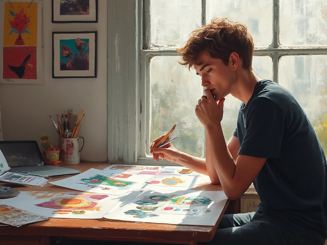
Select three colors for your landscape palette. See how they mix and what emotional mood they create. Try the article's technique: start with only 3 colors (like ultramarine blue, burnt sienna, and cadmium red).
Select colors to see emotional impact
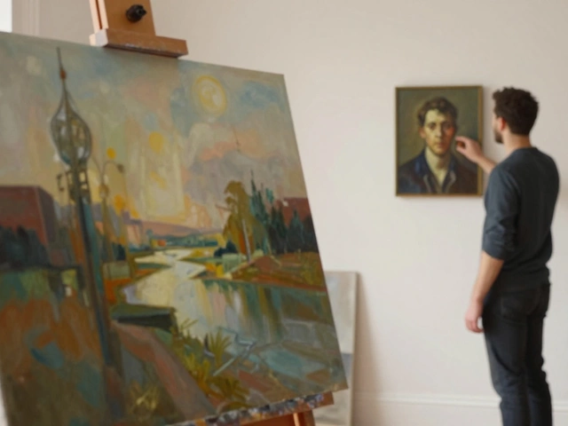
Anyone can paint a hill, a tree, and a sky. But making a landscape painting feel alive-like you could walk into it-is another thing entirely. It’s not about fancy brushes or expensive paints. It’s about seeing what’s really there, not what you think should be there. Too many painters copy photos or rely on clichés: perfect sunsets, overly green trees, water that looks like glass. Those don’t move people. Real landscape paintings do.
Start with Observation, Not Memory
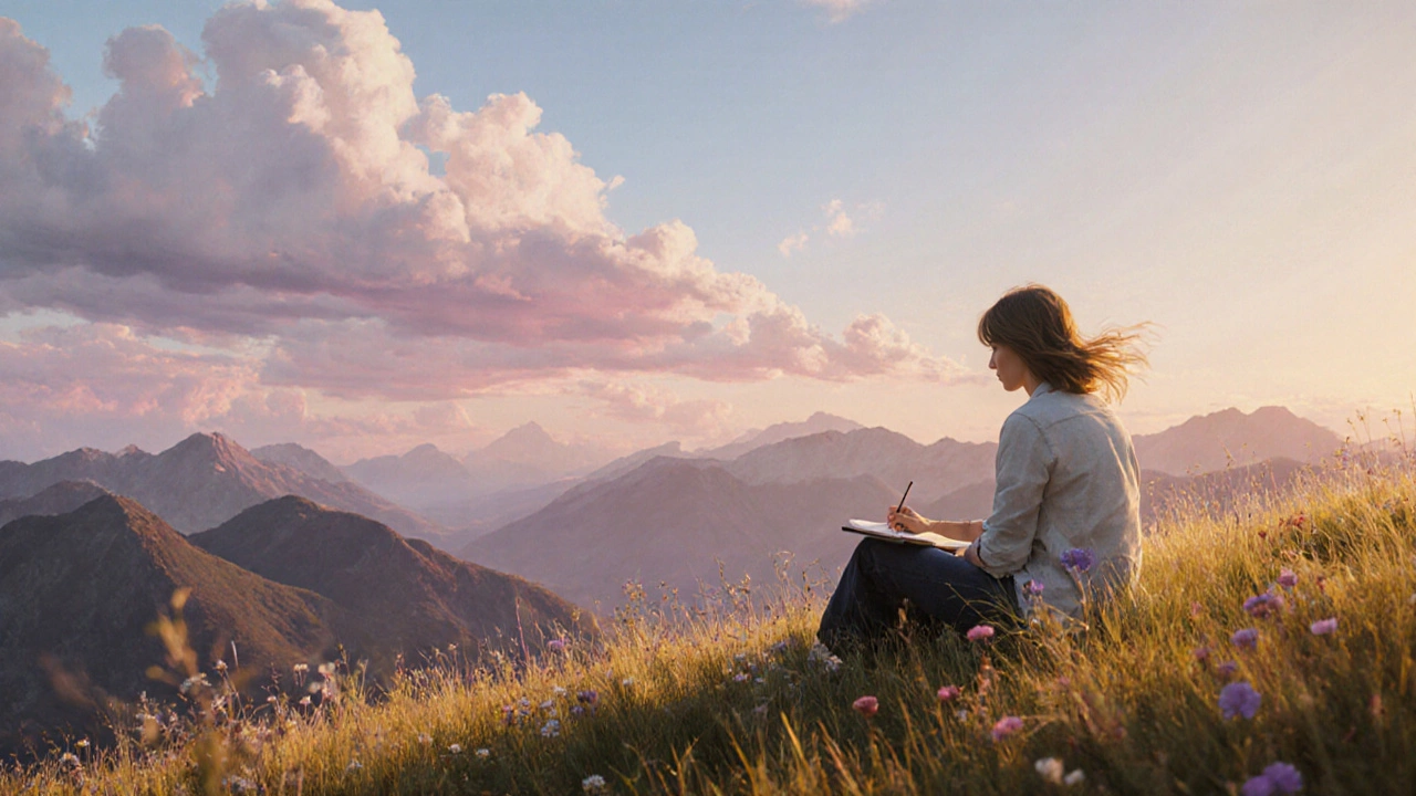
Don’t paint from what you remember. Paint from what you see. Go outside. Sit in front of your subject for at least 20 minutes. Don’t grab your sketchbook right away. Just watch. Notice how the light hits the grass near the edge of the woods-not just green, but gold, brown, even purple in the shadow. Watch how clouds don’t float evenly-they pile up, thin out, and cast irregular shapes on the ground. The sky isn’t one color. It’s layered. Blue near the horizon, cooler gray overhead, faint pink near the sun.
Most beginners skip this step. They think, "I know what a tree looks like," and paint a green cone with a brown trunk. That’s not a tree. That’s a symbol. Real trees have broken branches, uneven bark, patches of moss, leaves that catch light differently depending on their angle. Your painting will only feel real if you’ve spent time seeing those details.
Composition Is Your Secret Weapon
A great landscape doesn’t just show a scene-it guides your eye through it. Use natural paths: a winding river, a trail between trees, a row of rocks leading to the horizon. These aren’t just lines-they’re visual highways. Your viewer’s eye will follow them without realizing it.
Avoid putting the horizon right in the middle of the canvas. That splits the painting in half and kills the feeling of depth. Put it higher or lower. If the sky is dramatic-clouds rolling, sunset blazing-let it take up two-thirds of the space. If the land is full of texture-rocks, fields, wildflowers-let the earth dominate. Balance matters more than symmetry.
Try the rule of thirds. Imagine your canvas divided into nine equal boxes. Place your main subject-like a lone tree or a distant mountain-at one of the four intersection points. It creates tension, interest, and keeps the eye moving. This isn’t a rule you must follow. It’s a tool. Use it when it helps.
Color Is Emotion, Not Reality
Here’s the biggest mistake: thinking you need to match the exact color you see. Nature doesn’t work that way. A green field in morning light isn’t just green. It’s yellow-green near the light, olive-green in shadow, and maybe even a touch of blue where it’s wet. Shadows aren’t gray. They’re colored by what’s around them. A shadow on grass might have hints of purple from the sky, or brown from the soil.
Painters who get this right use color to create mood. A cool palette-blues, grays, muted greens-feels quiet, early morning. Warm tones-ochres, burnt siennas, soft reds-feel like late afternoon, golden hour. Don’t just mix green and brown. Add a touch of ultramarine to your shadow greens. Add a whisper of cadmium red to your sunlit earth. These small shifts make the difference between flat and alive.
Test this: paint a small area of your landscape with only three colors. Then add a fourth. Then a fifth. Notice how each new color changes the feeling. You’ll learn fast that less is often more. Too many colors muddy the scene. A strong, limited palette creates unity.
Texture Tells the Story
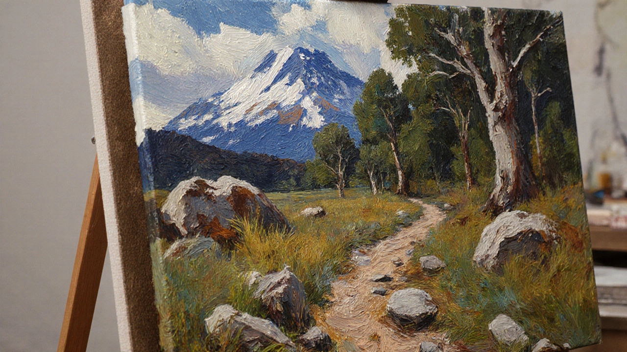
Flat paint looks dead. Texture brings land to life. Use your brush differently for different surfaces. For distant mountains, use soft, blended strokes. For rocks, dab with a stiff brush or even the edge of a palette knife. For grass, flick the brush upward in quick, thin lines. For water, drag the brush horizontally with barely any paint on it-let the canvas show through.
Don’t paint every blade of grass. Paint the suggestion of grass. Let the viewer’s mind fill in the rest. That’s how you create depth. If every detail is rendered, nothing stands out. The eye gets tired. Leave some areas loose. Let the brushstrokes show. A painting that looks too perfect looks like a photo. A painting that feels human feels real.
Light Is the Boss
Light doesn’t just illuminate-it defines. Where the light hits, things pop. Where it doesn’t, things disappear. The strongest landscapes have a clear light source. Is it the sun behind the hills? A break in the clouds? A moon just rising?
Once you know where the light is coming from, everything else follows. Shadows fall in the opposite direction. Highlights are sharp on edges facing the light. Colors shift depending on whether they’re in direct light or shadow. Paint the light first. Then paint what’s in shadow. Don’t start with the darks. That’s backwards.
Try painting the same scene at different times of day. Morning light is soft, cool, and diffused. Midday light is harsh, flat, and bleaches color. Evening light is warm, long, and dramatic. Each one tells a different story. Your painting should feel like it happened at a specific moment-not just "sometime outside."
Don’t Fear the Empty Space
Empty space isn’t wasted space. A wide sky with just one cloud. A quiet field with no animals. A still lake with no ripples. These moments create breathing room. They give the viewer’s eye a place to rest. Too many elements crowd the painting and make it feel chaotic.
Look at the work of artists like Andrew Wyeth or John Singer Sargent. Their landscapes aren’t full of detail. They’re full of feeling. One tree. One fence. One patch of light. That’s enough. You don’t need to paint everything to say something powerful.
Paint from Feeling, Not Perfection
The best landscape paintings aren’t technically flawless. They’re emotionally true. A slightly off-color tree. A brushstroke that goes too far. A shadow that’s too dark. These aren’t mistakes. They’re humanity. They’re the artist’s hand speaking.
Don’t try to make it look like a photograph. That’s not what painting is for. Photography captures what’s there. Painting captures how it felt. Did the wind feel cold? Did the air smell like wet earth? Did the silence make your chest feel heavy? Let those feelings guide your brush.
Paint the way you felt, not the way you think you should. That’s what makes a landscape look good-not perfect technique, but honest emotion.
Practice With Limits
Here’s a simple exercise: paint a landscape using only three colors. Pick one for sky, one for land, one for shadows. No white, no black. Just those three. Do this five times. Each time, change the mood-morning, storm, dusk. You’ll learn more about color relationships in one hour than in a month of mixing every shade.
Or paint a small landscape (6x8 inches) in 30 minutes. No overworking. No fixing. Just paint fast. This trains your eye to make decisions, not second-guess them.
Don’t wait for inspiration. Show up. Paint something, anything. Even if it’s bad. Bad paintings are lessons. Good paintings are practice.
Do I need expensive paints to make good landscape paintings?
No. You don’t need expensive paints. Many professional artists use student-grade paints and still create powerful work. What matters is how you use them. A single tube of ultramarine blue and burnt sienna can create a full range of landscape tones. Focus on learning color mixing and brush control before upgrading materials.
Should I paint from photos or real life?
Paint from real life whenever possible. Photos flatten depth, distort color, and remove atmosphere. They turn three-dimensional scenes into flat images. If you must use a photo, use it as a reference, not a copy. Change the light, the composition, the mood. Make it yours.
Why do my landscapes look flat?
Flatness usually comes from using the same value and color across the whole scene. Distant objects should be lighter, cooler, and less detailed. Foreground elements should be darker, warmer, and more textured. If everything looks equally sharp and colorful, there’s no sense of distance. Use atmospheric perspective to create depth.
How do I paint water without making it look like plastic?
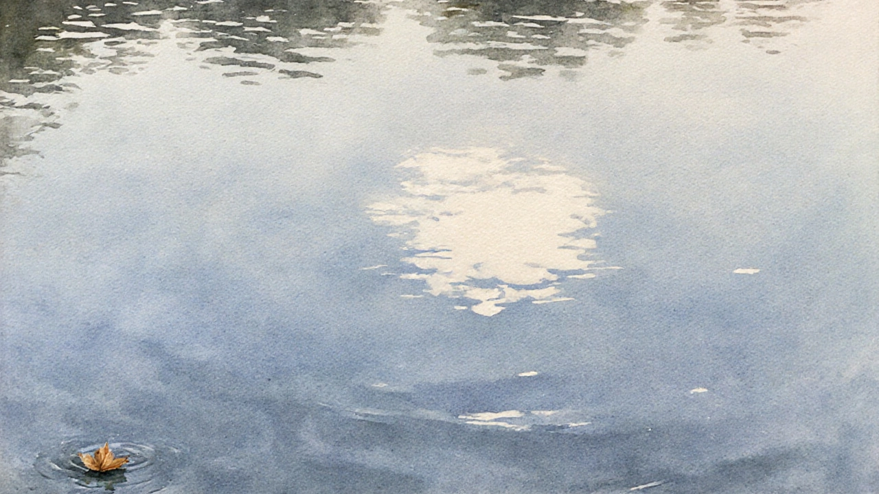
Water reflects its surroundings, but it’s never a mirror. Use broken strokes-short, irregular lines of different colors. Add a touch of the sky’s color where it’s calm, and ripples of darker tones where it moves. Leave small gaps of white canvas for highlights. Don’t blend everything smooth. Let the brushstrokes suggest movement, not copy it exactly.
How long does it take to get good at landscape painting?
There’s no set timeline. Some painters see real progress in three months with daily practice. Others take years. What matters is consistency. Paint at least three times a week, even if it’s just for 20 minutes. Focus on one thing each session-light, texture, color. Over time, these small improvements add up. Skill comes from repetition, not talent.
Don’t compare your work to others. Compare it to your last painting. Did the shadows feel deeper? Did the light feel warmer? Did you capture something you hadn’t noticed before? That’s progress. That’s what makes a landscape look good-not fame, not prizes, but the quiet truth of seeing and feeling.