Mastering Colors in Portrait Photography
Ever wonder why some portrait photos just grab your eye while others feel flat? It often comes down to color. The right hues can highlight a subject’s personality, set the mood, and make the image look more polished. Below are hands‑on tips you can apply right now, no fancy gear required.
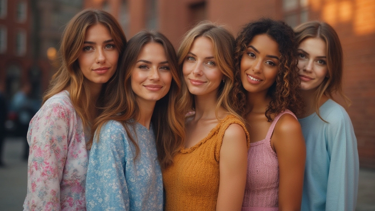
Pick Clothing Colors That Complement the Subject
Start with what the person is wearing. Warm tones like orange, red, or mustard work great on people with cool skin undertones, while cool blues and greens flatter warm skin tones. If you’re not sure, ask the subject to bring a few options in neutral shades (gray, navy, white) and one bold color. Shoot a quick test with each piece; the one that makes the eyes pop is your winner.
Use Backgrounds that Make the Subject Stand Out
A background should support, not compete with, the main subject. For a clean look, choose a muted backdrop—think light gray or soft pastel—and let a bright shirt or accessory become the focal point. If you want drama, go for a dark, saturated backdrop and dress the subject in lighter tones. Remember, contrast is your friend: a light subject against a dark background, or vice versa, instantly creates depth.
Lighting also plays a big role in how colors appear. Warm light (golden hour or a tungsten source) will shift blues toward teal and reds toward orange. Cool light (overcast sky or a daylight-balanced flash) keeps colors true but can make skin look pale if you’re not careful. Balance the light by adding a reflector or a gel to warm up the shadows if the scene feels too blue.
When you edit, keep the color adjustments subtle. A slight increase in saturation can make a green shirt look fresh without looking fake. Use the hue‑saturation tool to target only the color you want to enhance—avoid boosting the whole image and ending up with a cartoon look.
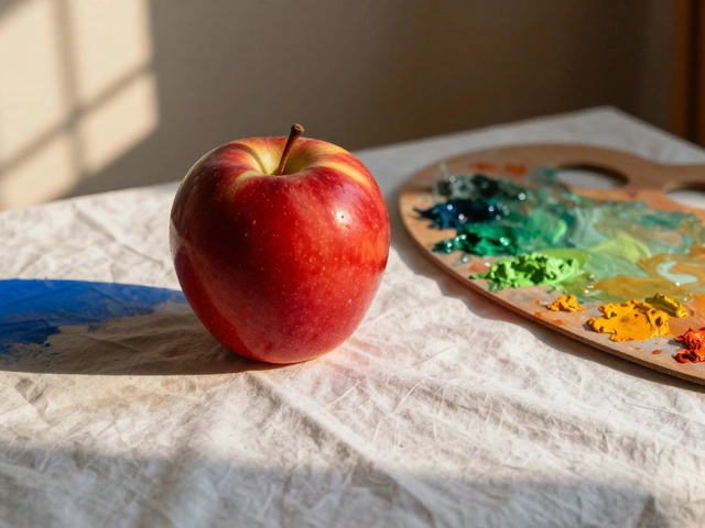
Don’t forget the power of complementary colors. If your subject wears a blue shirt, a background with a touch of orange or a prop in a warm tone will create visual tension that draws the eye. This technique works well for studio shoots where you control every element.
Lastly, test your color choices on different devices. A color that looks vibrant on your monitor might appear dull on a phone screen. Export a small JPEG and view it on a smartphone to catch any surprises before you share the final image.
By thinking about clothing, background, lighting, and post‑processing together, you’ll start seeing a noticeable lift in the quality of your portrait work. Try one or two of these tips on your next session and notice how the right color choices can turn an ordinary shot into a compelling portrait.
Best Colors for Portraits: Expert Tips for Choosing the Right Hue
Find out which colors look best in portraits, whether for photos or paintings. Get expert advice, surprising facts, and easy-to-use tips to make your portraits pop.
Continue ReadingCategories
Most popular
-
-
-
 How Much Should You Pay for a Portrait Session? Apr 13 2025
 -
-
 Start Your Oil Painting Journey: Dark vs. Light Mar 20 2025