You walk into a white gallery and there it is: a neat grid, a blank canvas, a single neon sentence humming in the corner. A five-figure price tag. And your brain whispers, “I could do that.” That itch is why you clicked. You want a straight answer to why is contemporary art simple, plus a way to tell depth from bluff.
Here’s what you’ll get: a clean, honest explanation of why so much contemporary work looks stripped back; a simple method for reading it; real examples (global and New Zealand); a checklist you can use in any gallery; and a no-nonsense FAQ about money, skill, and meaning. No jargon, no gatekeeping.
- TL;DR: Simplicity is often a choice, not a shortcut-artists moved the value from craft alone to ideas, context, and constraints.
- What to look for: the rule or constraint behind the work, the context it changes, and the history it talks to.
- How to judge: if it seems simple, ask what would change if one element moved-good work is tightly tuned.
- Use: a five-step read, a one-minute scan, and a pocket checklist to avoid getting snowed by art-speak.
- Proof: quick case studies (Malevich, Agnes Martin, Donald Judd, Colin McCahon, Gordon Walters, Ralph Hotere) and market context.
Why so much contemporary art looks simple (and what’s actually going on)
Start with the shift that broke the old rulebook. In the 1960s, many artists decided the idea mattered more than perfect brushwork. Sol LeWitt wrote it plainly in 1967: the idea becomes a machine that makes the art. Minimalists like Donald Judd cut down forms to let structure and space do the talking. Conceptual artists even “dematerialized” the object, a phrase Lucy Lippard and John Chandler used in 1968. That move often makes art look bare because the “action” has moved to the concept, the rule, the context.
Five grounded reasons you keep meeting “simple” work today:
- Concept first: A clean square, a single sentence, a repeated date-each is a way to focus your attention on the rule or idea. Example: On Kawara’s date paintings are a diary system, not a color study.
- Constraints as craft: Instead of carving marble, the hard work might be building a constraint and sticking to it. Agnes Martin’s hand-drawn grids look calm, but they’re a lifetime of tiny decisions about line spacing, tone, and breath.
- New materials and methods: LEDs, vinyl text, video loops, code. The “finish” looks industrial by design. Judd didn’t hide the factory polish; that candor is the point.
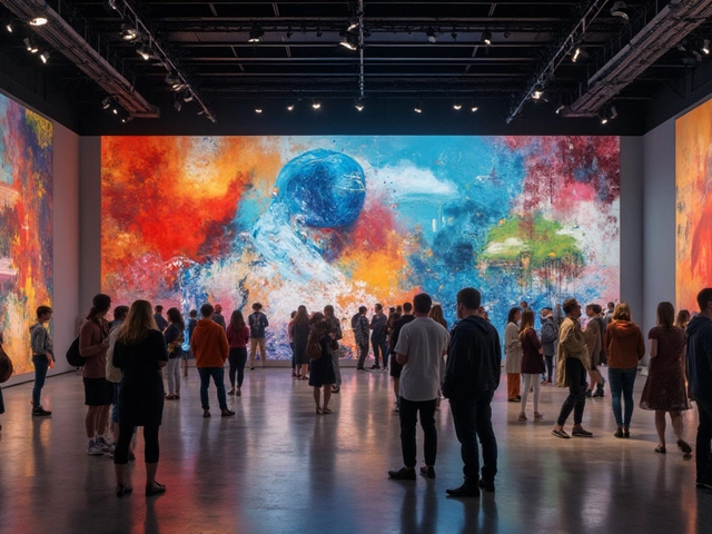
- Audience shift: When art moved from salons to museums and public space, clarity mattered. Simple forms read fast, photograph well, and hold up in rooms full of people and phones.
- Market and institutions: Museums and galleries need works that can ship, hang, and survive. Simpler-looking forms often meet those demands, but that doesn’t make them shallow.
Think of it like design. Apple’s home screen looks simple, but there’s heavy engineering under the glass. In a strong Agnes Martin painting, the visible simplicity is the last layer of a lot of hidden structure.
History set the stage. Marcel Duchamp put a urinal in a gallery in 1917 and asked us to look differently. Kazimir Malevich’s Black Square in 1915 said painting could reset to zero. Donald Judd’s “Specific Objects” essay in 1965 argued for art that was neither painting nor sculpture: simple boxes that make space visible. Each step stripped surface fuss to expose decision-making. It’s not that skill died; it grew sideways.
If you’re in Aotearoa New Zealand, this lands in familiar ways. Colin McCahon’s big text works look like blackboard scribbles until you sit with their rhythm. Gordon Walters’ koru forms look like tidy repeats, but they open a live debate about borrowing, lineage, and power. Ralph Hotere often left vast areas black, letting gold leaf, text, or a single cut carry weight. Simple on day one, complex on day three.
There’s also a practical reason: attention is scarce. A clean visual hit stands out in the scroll and in a gallery hallway. That doesn’t excuse laziness. It raises the bar. When artists use few moves, every move has to count.
How to read a “simple” artwork: a clear, repeatable method
Use this when a work looks too easy. It takes two minutes and works on paintings, objects, even text-on-wall pieces.
- Slow look (30-60 seconds): Stand still. Track your eye. Where do you land first? What repeats? What’s off-center?
- Find the rule: Name the constraint. Is it one color, one shape, a grid, a sentence, a system? Try to say the rule in a single line.
- Test the tune: Imagine moving one element. If you shift a line or change a word, does the whole thing wobble? Good simple works are tightly tuned-small edits break them.
- Pull the thread: What conversation is this in? Minimalism? Language art? Local histories? Use the label to get names, then recall a similar work you know. Connections raise stakes.
- Clock the material truth: Are there hand marks, pencil lines, seams, welds, print edges, tape ghosts? These “tells” signal labor and intention.
A one-minute scan you can do anywhere:
- What’s repeated, and how is the repeat broken?
- What’s the key constraint, and why that one?
- What changed in the room because this object is here?
Heuristics that keep you honest:
- If the work hangs on a single move, and that move can’t be changed without collapse, you’re looking at something composed, not casual.
- If the wall text only paraphrases what you can already see, the work might be slight. If it opens up context you couldn’t know-history, law, whakapapa-great, fold that in.
- Precision is a clue. With minimal means, edges, alignments, and intervals carry the meaning. Sloppy where it needs to be clean is a red flag-unless the slippage is part of the rule.
Common traps to avoid:
- Equating effort with time. A musician can play one note that wrecks you; same with a single painted bar.
- Thinking price is a proxy for quality. Market value tracks rarity, demand, and provenance. Plenty of deep works cost little; plenty of hot works fade.
- Letting “I could do that” end the thought. Try doing it-same scale, same constraint, same tuning. The copy usually exposes where the magic sits.
Want a formula? Try this quick composite score to decide if it’s worth more time:
- Constraint clarity (0-3): Can you state the rule clearly?
- Compositional tension (0-3): Do small changes break it?
- Context lift (0-3): Does history or place deepen it?
- Material truth (0-3): Do edges/marks support the idea?
8-12: dig in. 4-7: read the label and revisit. 0-3: maybe move on.
Examples that look simple but aren’t: what to look for, why it matters
Here are quick reads on works you might know, plus local anchors if you visit Te Papa or Wellington’s dealer galleries.
- Kazimir Malevich, Black Square (1915): Looks like a black square. Reading: reset button on painting; a claim that pure feeling could be non-figurative. Look for surface cracking and under-layers-he revised it, which undercuts the myth of a single easy gesture.
- Donald Judd, Untitled stacks (1967 onward): Aluminum and Plexiglas boxes, evenly spaced up a wall. Reading: turns architecture into an instrument. Look for how the boxes catch ceiling light and how the gap between boxes equals the box height-space is the material.
- Agnes Martin, grid paintings (1960s-2000s): Pencil lines on pale fields. Reading: a practice of attention. Look for line wobble, breath-like intervals, and where the grid drifts. The human hand keeps the serenity alive.
- On Kawara, Today series (1966-2013): Date painted in the local language. Reading: a ritual of being alive. Look for the storage boxes with newspaper clippings-the world sneaks in.
- Colin McCahon, I AM paintings (late 1950s-60s): Big black fields with Bible phrases. Reading: land, light, doubt, and faith in Aotearoa. Look for brush rhythm and spacing; the words are painted, not printed.
- Gordon Walters, koru works (from 1956): Black-and-white repeats of the koru form. Reading: a clean visual language with tangled cultural stakes. Look for interlock and figure-ground flips; also know the debate around appropriation and dialogue with Māori art.
- Ralph Hotere, Black Paintings (1960s-90s): Black fields with cuts, lines, gold leaf, or text. Reading: restraint as power. Look for light grazing the surface-black opens rather than closes.
Why include market context? Because money is part of the conversation, even if it’s not the point. The Art Basel & UBS Art Market Report 2024 estimated the global art market in the mid-$60 billion range and noted contemporary art as a leading segment by auction lots and fair booths. That doesn’t prove quality; it explains visibility. Simpler forms travel well, hang cleanly, and photograph in ways that drive demand.
| Artist & Work | Year | What Looks “Simple” | What to Look For | Why It Mattered |
|---|---|---|---|---|
| Kazimir Malevich, Black Square | 1915 | A single black square on white | Surface history, underpainting, placement high in corner | Declared a new start for painting; icon for abstraction |
| Donald Judd, Untitled (Stack) | 1967- | Identical boxes up a wall | Equal spacing, light play, industrial finish as content | Shifted focus to space, seriality, and objecthood |
| Agnes Martin, Untitled (grid) | 1960s | Pale grid, pencil lines | Line tremor, subtle color fields, edge breathing | Made attentiveness and restraint the subject |
| On Kawara, Today (Date Painting) | 1966-2013 | A date on a colored ground | Language choice, box with news, daily ritual | Turned time and survival into a form |
| Colin McCahon, I AM | 1950s-60s | Text on dark ground | Brush cadence, line breaks, scale vs viewer | Anchored a New Zealand voice in modern faith and landscape |
| Gordon Walters, Koru series | 1956- | Repeated koru forms | Interlock, negative space, cultural dialogue | Forged a minimal language tied to contested heritage |
| Ralph Hotere, Black Paintings | 1960s-90s | Large black fields | Surface light, cuts, gold leaf, text fragments | Used restraint to carry memory, politics, and lament |
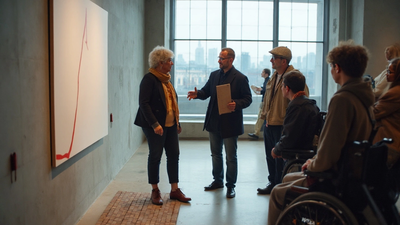
If you’re near Wellington, test this in the wild. Spend ten minutes with a Walters or Hotere in a quiet room, then step out to the harbor light. Go back in. The work will read differently because your eyes recalibrated-another good sign the simplicity is doing work, not masking a lack of it.
Checklist, mini‑FAQ, and your next steps
Use this pocket checklist whenever a work looks too easy.
- Rule: Can you phrase the work’s constraint in one line?
- Tension: Would moving one element break it?
- Edges: Do materials and finishes support the idea?
- Context: What history, place, or politics does it sit in?
- Body feel: Where does your eye rest? What’s the time scale-instant hit, slow burn, or both?
Decode the wall text with these prompts:
- If it names a movement (Minimalism, Conceptual art), ask: what’s the specific move here?
- If it leans on biography, ask: how does that show up in the object?
- If it lists materials, ask: what do those materials mean in the world?
Red flags for fluff:
- Vague claims of “interrogating” without showing how.
- Heavy theory with no visual evidence.
- Perfectly generic forms with sloppy execution where precision is central.
Mini‑FAQ
- Is simple art a scam? No. Scams exist in any market, but simplicity itself isn’t a tell. The right question is whether the work is tightly tuned, contextually alive, and materially honest.
- Why are prices high for works that look easy? Price reflects demand, rarity, author reputation, and provenance. Auction houses and galleries set those contexts. The Art Basel & UBS 2024 report shows contemporary art dominates fair offerings, which boosts visibility and prices, but that’s a market behavior, not a quality metric.
- Does skill still matter? Yes-just not only as realistic depiction. Today, skill often lives in composition, pacing, material choices, and building a system that holds meaning.
- How do I start enjoying this stuff? Set a tiny goal: spend five minutes with one work, then write two sentences about the rule and the tension. Do that three times. Your eye will change faster than you expect.
- What should I show kids or skeptical friends? Pick one strong example with a clear rule (a Judd stack, a Walters koru). Ask: what changed in the room because this is here? Keep it playful.
- Can I collect “simple” art on a budget? Yes. Look at prints, editions, and emerging artists. Editions by serious artists carry the same rules at accessible prices. Ask about print methods and edition sizes; smaller, well-made editions hold value better.
Next steps by persona
- The busy visitor: Choose one room, one work. Use the five-step read. Take a phone note: rule + one surprise. Done.
- The skeptic: Try a before/after test. Glance for 10 seconds, write a snap judgment. Read the label. Look again for 60 seconds. If your view doesn’t shift at all, move on without guilt.
- The learner: Build a tiny playlist: Malevich, Judd, Martin, Kawara, McCahon, Walters, Hotere. Look up one short text per artist (e.g., Donald Judd’s “Specific Objects,” Sol LeWitt’s “Paragraphs on Conceptual Art”).
- The parent/teacher: Give kids a constraint game. Make three 5-minute drawings: only circles; only straight lines; only one word. Then visit a show and spot artists’ constraints.
- The new collector: Focus on editions and works on paper. Ask galleries about the artist’s rule set and how a specific work fits a larger body. Document condition and provenance. Set a max price and sleep on it.
Pitfalls and fixes
- Feeling nothing? Try changing distance. Many minimal works snap into focus at 3-5 meters; others need nose-close inspection for pencil lines and edges.
- Room fatigue? Take a bench break facing a blank wall, then revisit one work. Eye reset helps more than you’d think.
- Wall text haze? Read the title, date, and materials first. Only then skim the rest. You’ll anchor the words to real evidence.
- Stuck on “I could do that”? Try it at home: same scale, same constraint. Share the result with a friend. The gaps will teach you where the original carries weight.
A last nudge from the floor: I live in Wellington, and the most reliable signal I’ve found is time. If a work that looks simple keeps tugging at you after lunch, that’s not an accident. It means the artist put the complexity where you couldn’t shake it off-inside the rule, inside the space, inside you.
Sources and touchstones to ground your eye: Donald Judd, “Specific Objects” (1965); Sol LeWitt, “Paragraphs on Conceptual Art” (1967); Lucy Lippard & John Chandler, “The Dematerialization of Art” (1968); major museum holdings and texts from MoMA and Tate; Art Basel & UBS Art Market Report 2024 for market context. These aren’t props-they’re the backbone of why the work looks the way it does.