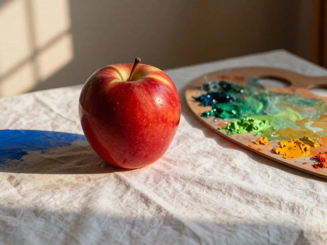
Green & Blue Landscape Color Mixer
Create Your Landscape
Adjust the green and blue ratios to see how they affect depth and atmosphere in landscape painting.
How This Works
In landscape painting, green dominates the foreground (grass, trees, vegetation) while blue creates atmospheric perspective in the background (sky, distant hills). As you adjust the sliders:
- Higher green values create lush, detailed foregrounds
- Higher blue values create deeper distance and sky effects
- Balance creates realistic atmospheric perspective
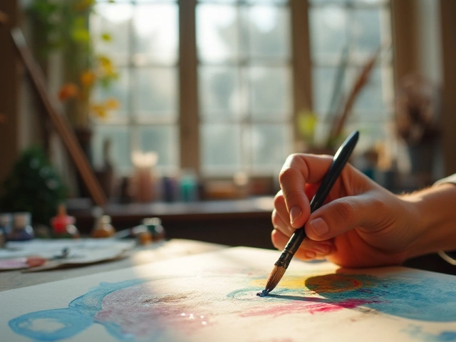
When you look at a landscape painting, what’s the first thing you notice? The sky? The trees? The hills? Chances are, two colors are doing most of the heavy lifting-green and blue. These aren’t just popular choices; they’re the backbone of how we see and remember the natural world. Artists have relied on them for centuries, not because they’re easy, but because they’re essential.
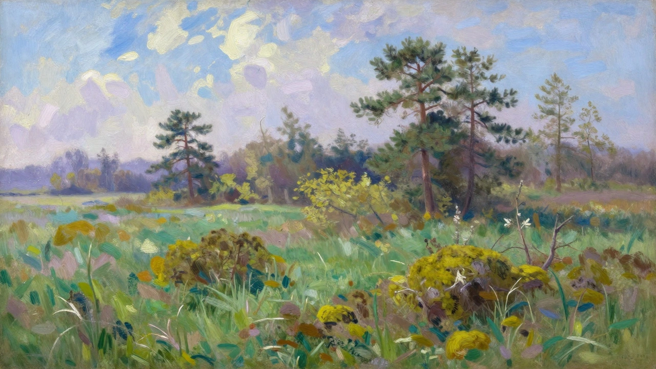
Why Green Dominates the Land
Green is the color of life. It’s not one shade-it’s a hundred. From the pale yellow-green of new spring leaves to the deep, almost black green of ancient pines, green carries the texture of the earth. In landscape painting, green isn’t just for trees. It’s for grass, moss, ferns, shrubs, and the distant haze of hills that fade into the horizon.
Think about the difference between a flat, single green and a landscape painted with layered greens. A Monet meadow doesn’t use one green-it uses at least ten, mixed with hints of yellow, gray, and even a touch of blue. The shadows under leaves? Not black. Not brown. A cool, muted green with a whisper of violet. The sunlight hitting grass? A yellow-green, almost golden. That’s how depth happens.
Historically, artists used natural pigments like verdigris, malachite, and later, viridian. Viridian, developed in the early 1800s, became a game-changer. It was stable, transparent, and perfect for glazing. You could layer it over other colors and still let light pass through. That’s why so many 19th-century landscape painters-Turner, Constable, Corot-used it so heavily. It didn’t overpower. It didn’t look artificial. It just felt real.
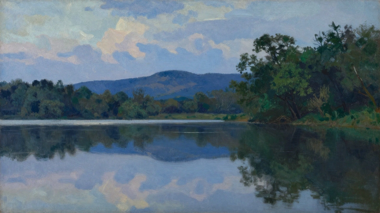
Blue: The Sky, the Distance, and the Shadow
Blue is the silent partner to green. It’s not just for the sky. It’s for the air between you and the mountain. It’s for the shadow in a valley. It’s for the reflection of sky in a still lake.
Early artists used azurite and lapis lazuli-expensive, rich, and hard to grind. Lapis lazuli was worth more than gold. By the 1800s, cobalt blue and ultramarine became more accessible. Cobalt blue, in particular, was perfect for landscapes. It didn’t turn gray in sunlight like some blues did. It held its cool tone, even in bright daylight.
Look at any painting of distant hills. They’re not brown. They’re not gray. They’re blue. Why? Because of atmospheric perspective. As objects get farther away, the air between you and them scatters blue light. That’s science. That’s why Turner painted distant mountains as pale blue washes. That’s why a New Zealand hillside at dusk looks like a soft bruise of indigo. Blue isn’t just a color-it’s a distance.
Even shadows in landscape painting aren’t dark. They’re blue. A shadow on grass? A cool green-blue. A shadow under a tree? A mix of blue and a touch of purple. If you paint shadows with black or brown, your landscape looks flat. With blue, it breathes.
How Green and Blue Work Together
Green and blue don’t compete-they talk. When green leans into blue, it becomes a forest shadow. When blue leans into green, it becomes a lake reflecting trees. Artists don’t paint green and blue separately. They blend them, layer them, glaze them, and scrape them back.
Take a simple scene: a field, a tree, a distant hill, and a sky. The field? A mix of yellow-green, sap green, and a little cobalt. The tree? Dark viridian with a touch of Payne’s gray and blue. The hill? A wash of ultramarine mixed with a hint of raw sienna. The sky? Cobalt blue, thin at the horizon, deeper above.
You don’t need a rainbow. You need two colors, used with intelligence. That’s why you’ll rarely see a landscape painting with bright reds, oranges, or purples dominating the scene. Those colors appear as accents-a single red barn, a patch of autumn maple-but they’re not the structure. Green and blue are the bones.
Modern Landscape Painting Still Follows the Same Rules
Even today, when artists use acrylics, digital tools, or spray paint, green and blue are still the foundation. Contemporary landscape painters like Andrew Wyeth, David Hockney, or even local New Zealand artists like Ralph Hotere didn’t invent new rules-they refined old ones.
Look at Hockney’s paintings of Yorkshire. They’re full of bright, bold greens. But look closer. The shadows in the hedgerows? Blue. The reflections in the ponds? Blue. The sky? A mix of cobalt and cerulean. He didn’t abandon tradition-he doubled down on it.
Even in digital painting, where you can pick any color from a palette, the most convincing landscapes still use green and blue as their base. Why? Because our eyes are wired to see them that way. We don’t see landscapes as a collection of isolated colors. We see them as a flow of light, air, and distance-and that flow is carried by green and blue.
What Happens When You Skip Them?
Try painting a landscape without green. Everything looks dead. Like a photo taken under fluorescent light. No depth. No life.
Try painting without blue. The sky looks like a flat white wall. The hills look like dusty brown mounds. The shadows look like stains. It feels wrong. Not because you’re breaking rules-but because you’re breaking how the world actually looks.
There’s a reason landscape painting survived for 500 years without digital cameras or GPS. It didn’t rely on realism. It relied on truth. And the truth is: green and blue are the colors of nature’s rhythm.
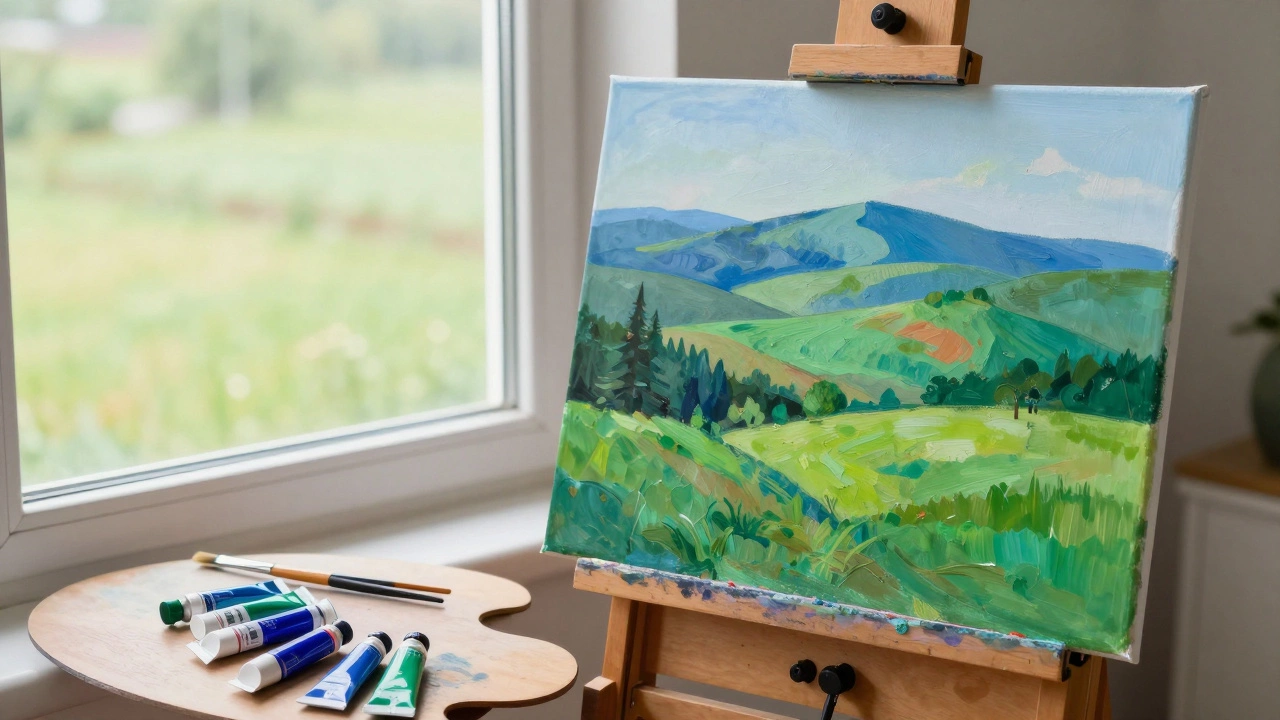
How to Practice Using Green and Blue
If you want to get better at landscape painting, stop mixing random colors. Start with just two:
- Choose one green-viridian or sap green.
- Choose one blue-cobalt or ultramarine.
- Paint a simple scene: a tree, a patch of grass, a distant hill, and a sky.
- Don’t add any other colors. Just use those two, mixed with white, black, or a touch of yellow.
- Notice how much you can do with so little.
After a few sessions, you’ll start seeing the world differently. You’ll notice how the green of grass changes with the light. You’ll see how the blue of the sky deepens as the sun sets. That’s when you’re not just painting-you’re seeing.
Final Thought
You don’t need to paint like a master to understand this. You just need to look. Walk outside. Look at a tree. Look at the sky. Look at the shadow under a bush. What colors do you see? Not the names you learned in school. The actual tones. The subtle shifts. That’s what green and blue are for-not to fill space, but to carry the feeling of the land.
Why are green and blue the most used colors in landscape painting?
Green represents the land-trees, grass, and vegetation-while blue represents the sky, air, and distant horizons. Together, they create depth, atmosphere, and realism. These colors mimic how light and distance naturally affect our vision, making landscapes feel alive without needing bright or unnatural hues.
Do landscape painters use only green and blue?
No. Other colors like yellow, ochre, and gray are used for details like sunlight, soil, or shadows. But green and blue form the structural base. Bright colors like red or orange appear only as accents-like a single red barn or autumn leaves-never as the foundation of the scene.
What pigments did historical landscape painters use for green and blue?
For green, artists used verdigris, malachite, and later viridian, which became popular in the 1800s for its transparency and stability. For blue, they used lapis lazuli (extremely expensive), azurite, and eventually cobalt blue and ultramarine, which were more affordable and reliable for outdoor scenes.
Can you paint a convincing landscape with just green and blue?
Yes. Many artists do. By mixing green and blue with white, black, and a touch of yellow or gray, you can create all the tones needed for sky, land, shadow, and distance. The key is layering and value contrast-not color variety. This limitation forces you to focus on light and form, which is the heart of good landscape painting.
Why do distant hills look blue?
This is called atmospheric perspective. As light travels through air, shorter blue wavelengths scatter more than other colors. So, distant objects appear bluer and less saturated. Artists use this natural effect to create depth-painting far hills in cool blue tones to make them feel miles away.