Flattering Portrait Hues: Choose Colors That Make Your Portraits Pop
When you start a portrait, the first question is often "what colors will make my subject look their best?" The answer lies in a few simple rules about skin tone, lighting, and clothing. Follow these tips and you’ll see a big jump in how alive your portraits feel.
Understanding Skin Tone Basics
Skin isn’t just one flat shade. It’s a mix of warm and cool undertones that shift with light. A quick way to spot the dominant undertone is to look at the veins on the wrist. If they look green, the skin leans warm; if they look blue, it leans cool. Warm skin generally loves yellows, oranges, and soft reds. Cool skin feels more natural with blues, purples, and muted pinks.
Once you know the undertone, pick a base color that matches it. For warm skin, a light ochre or peach works well as a mid‑tone. For cool skin, try a soft lavender or light gray. Then add a highlight that’s a few shades lighter and a shadow that’s a few shades darker. Keep the highlight and shadow in the same temperature family as the base – this keeps the skin looking realistic.
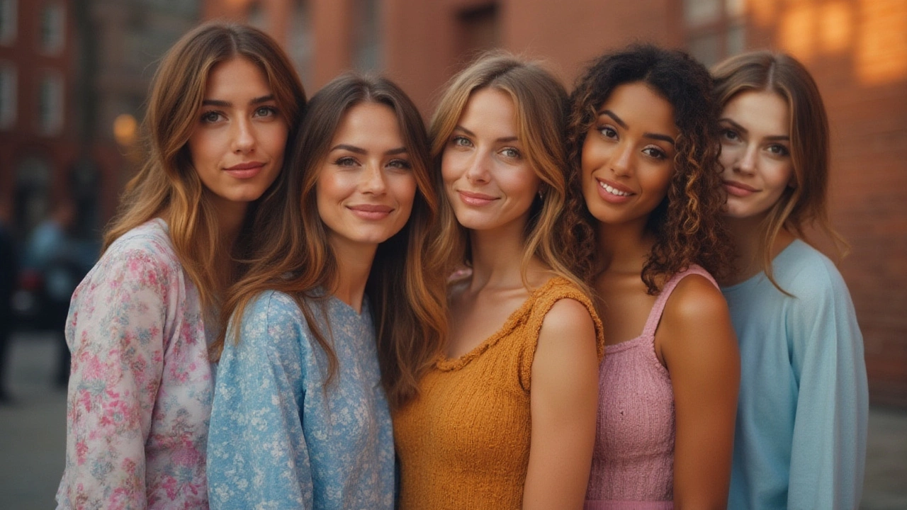
Balancing Background and Clothing
The background should support the skin, not compete with it. A classic trick is to choose a background that’s the opposite temperature of the skin’s undertone. For a warm‑toned face, a cool blue or teal background makes the skin pop. For a cool‑toned face, a warm tan or soft gold works nicely.
Clothing colors follow the same principle. If the subject is wearing a warm jacket, add a cool accent in the background or in a secondary garment. This contrast adds depth without overwhelming the portrait. Avoid stuffing too many bright colors on the same canvas – one or two accent colors are enough.
Lighting also changes how colors appear. In natural daylight, skin tones stay true, but in artificial light they can shift toward the light’s color temperature. If you’re painting from a photo taken under warm indoor lighting, add a tiny touch of cool blue to the shadows to bring balance back.
Finally, test your palette before you commit. Mix a small swatch of your base, highlight, and shadow on a scrap paper. Hold it up next to a reference photo and see if it feels right. Small adjustments now save a lot of reworking later.
With these straightforward steps – identify the skin’s undertone, pick a matching base, balance background and clothing, and adjust for light – you’ll choose flattering portrait hues every time. Your portraits will look more lively, and you’ll spend less time guessing which color works best.
Best Colors for Portraits: Expert Tips for Choosing the Right Hue
Find out which colors look best in portraits, whether for photos or paintings. Get expert advice, surprising facts, and easy-to-use tips to make your portraits pop.
Continue Reading