Composition Technique: Simple Tips to Strengthen Your Art
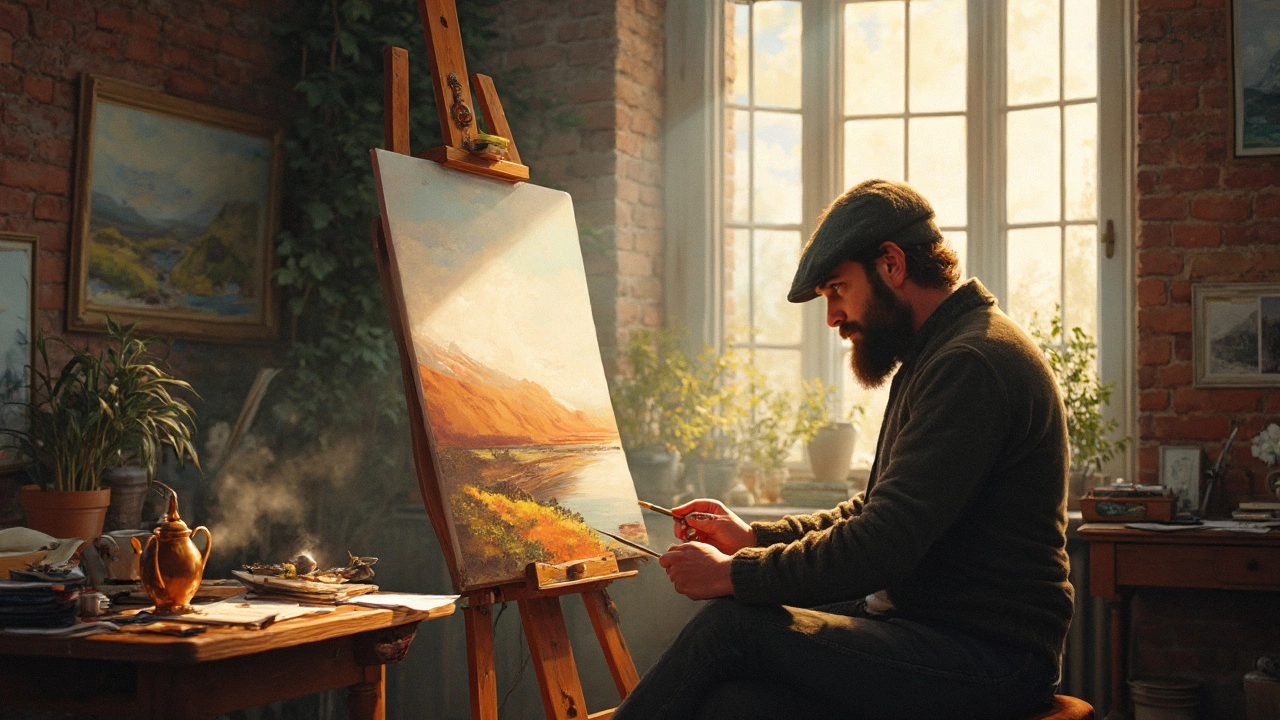
If you’ve ever stared at a blank canvas and felt stuck, the problem is often how you arrange the pieces, not the paint itself. Composition technique is the toolbox that helps you decide where to put shapes, colors, and subjects so the eye moves naturally and the story feels clear.
First off, think of your artwork as a conversation between the viewer and the image. The viewer’s eye wants a clear path—start with a focal point, guide them with lines, and finish with a satisfying balance. A strong focal point could be a bold color splash, a striking figure, or a splash of light. Once you know what draws attention, you can place supporting elements around it to keep the viewer engaged.
Three Easy Rules to Try Right Now
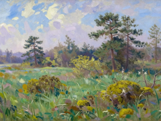
1. The Rule of Thirds. Imagine your canvas divided into a 3 × 3 grid. Place the main subject along one of the grid lines or at an intersection. This simple trick makes the scene feel more dynamic than a dead‑center placement. Try it next time you paint a portrait or a landscape and notice how the tension improves.
2. Lead‑in Lines. Use natural lines—roads, branches, or the curve of a body—to pull the eye toward the focal point. In our “Scrubbing Technique in Painting” article, the author shows how sweeping brush strokes can act as invisible arrows, guiding attention without a single line drawn.
3. Balance Light and Dark. Contrast creates weight. Dark shapes feel heavier, light shapes feel lighter. Place a dark area opposite a bright spot to keep the composition from ‘leaning’ to one side. This idea also appears in the “Slow Over Fast Rule in Oil Painting” piece, where layering dark under lighter helps control visual stability.
Putting the Rules to Work
Pick a piece from the tag list, like the “Famous Quotes About Abstract Art” post, and ask yourself: Where is the eye drawn first? If the quote sits on a plain background, add a subtle texture or a line that points to it. The goal isn’t to follow every rule perfectly but to use them as shortcuts until you trust your own instinct.
Another quick exercise: sketch a simple still life with three objects. Arrange them using the rule of thirds, then add a line—maybe the edge of a table—that leads to the largest object. Finally, check the contrast. If the biggest object is a light color, darken the surrounding area a touch. You’ll see an instant lift in visual impact.
When you’re comfortable with these basics, start experimenting. Break the rules on purpose to see what happens. Sometimes placing the focal point dead center creates a powerful, meditative feel—perfect for a minimalist abstract piece, like the one discussed in “Why Is Contemporary Art So Simple?”. The key is to know why you’re breaking a rule before you do it.
Remember, composition is a habit, not a one‑off decision. Each time you start a new canvas, take a moment to map out the eye path. Use a thumbnail sketch, a digital mock‑up, or even a quick charcoal outline. The more you practice, the more the eye will guide you without thinking.
Ready to test your new skills? Pick any article from this tag, apply the three rules, and compare the before‑and‑after. You’ll feel the difference in how the piece reads and, more importantly, how confident you feel about your choices.
Composition technique may sound technical, but at its heart it’s just common sense for the eye. Keep it simple, use these shortcuts, and watch your art become clearer and more compelling with every brushstroke.
Understanding the Rule of 3 in Portrait Painting
The Rule of 3 is a fundamental concept in portrait painting that helps artists create balanced and engaging compositions. By dividing the canvas into thirds, both vertically and horizontally, artists can position key elements at intersecting points to naturally draw the viewer's eye. This article explores how painters use this technique to enhance their work. Learn practical tips to apply the Rule of 3 and improve your portrait creations.
Continue ReadingCategories
Most popular
-

-

-
-
-
 Can Wealth Secure the Iconic Mona Lisa Painting? Jan 11 2025