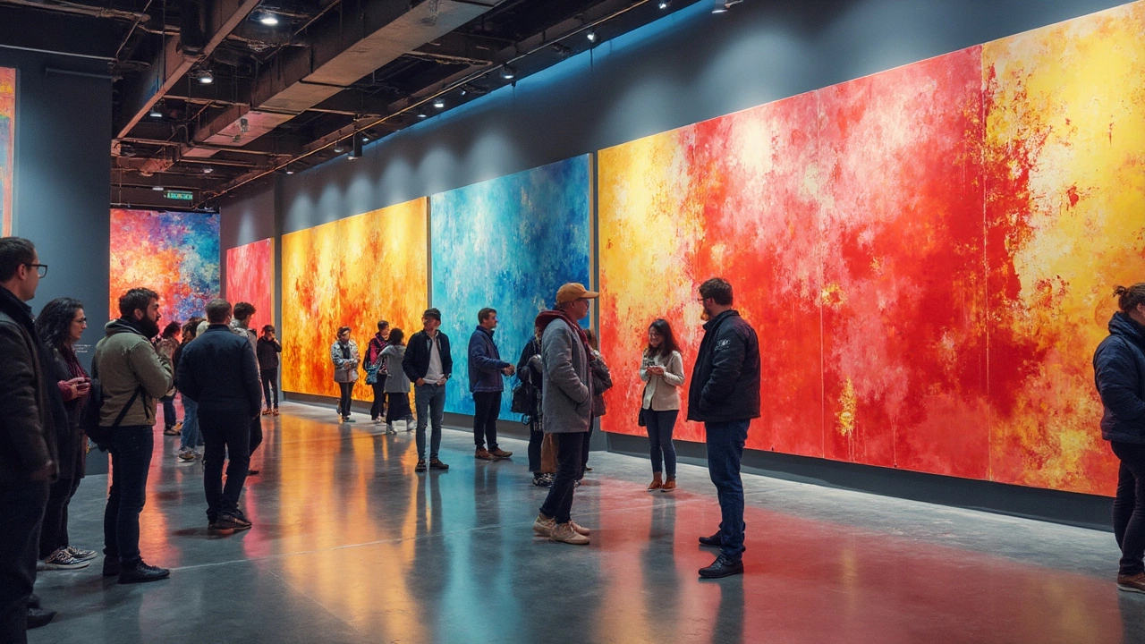
Have you ever wondered why certain colors seem to pop up over and over in abstract art? It's not a fluke. Colors can totally change the vibe of a piece, steering your eyes and feelings in all sorts of directions. We've all got our faves, but some colors definitely rule the abstract art world.
Believe it or not, there's more to it than just 'I like blue.' Artists use color to mess with your head—in a good way! They're tapping into psychological power plays and cultural shifts. Imagine how a bold red might give off heat and energy, while a soft blue could chill you out.
Over the years, some colors have edged their way to the forefront of trends, evolving with shifting tastes and insights into human psychology. But trends don't just drop out of nowhere. They tell stories about society and even about us as individuals.
- The Color Theory in Abstract Art
- How Colors Influence Mood
- Trends in Abstract Art Color Choices
- The Surprise Leaders: Unlikely Popular Colors
- Collector Preferences and Market Trends
- Tips for Choosing Colors in Your Art
The Color Theory in Abstract Art
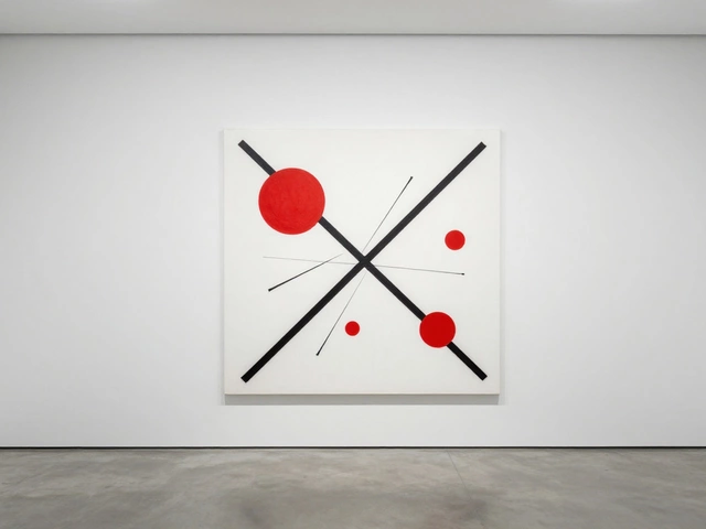
Colors! Abstract artists swear by them—not just for how they look but for what they make us feel. At its core, abstract art isn't just a splash of random colors. Nope, there's real science and thought behind every hue. Welcome to the world of color theory where each color packs a punch, tugging at our emotional strings.
Color theory explains how colors interact and what emotions they might evoke. Imagine warm colors like reds and oranges—they're full-on energetic, lively, and sometimes scream passion or urgency. On the flip side, cool colors such as blues and greens calm things down, acting as visual chill pills.
Primary and Secondary Colors
Let's break it down. Primary colors—red, blue, and yellow—are the building blocks. Mix these babies, and you're diving into secondary colors—like purple, green, and orange. Abstract artists play around these combos to create mood shifts or highlight certain parts of their work.
Complementary and Analogous Schemes
Artists love to pair complementary colors—those that sit opposite on the color wheel—to give that wow factor. It’ll grab attention, no doubt. Think of a bright yellow splashed against a deep purple. Then there’s the harmonious look of analogous colors, which sit next to each other on the wheel, like red, orange, and yellow, making everything look cohesive.
All of this isn’t just to please the eyes. It’s about grabbing, keeping, and directing your attention. For instance, a bold emdash of red in a sea of blues can make the red pop, turning into the main focus.
Facts and Findings
Diving into stats for a second: Across multiple art galleries, blues and greens are top picks in abstract art, taking up roughly 30% of all color use. These colors not only soothe but are also often more universally liked.
Knowing this, artists tailor their palette to match the vibe they’re aiming for. It’s more than just mixing paint—it’s an art in itself!
How Colors Influence Mood
It's wild how colors can mess with your mood, right? In abstract art, colors aren't just there to look pretty—they're crammed with meaning and emotional punch. Artists often use colors to steer your mood and make you feel something deep.
Each color seems to hit us in a different way. For example, blue is often linked to calm and tranquility. Ever notice how many spas and relaxation rooms go heavy on the blues? It's all about creating a soothing vibe.
The Energizers
On the flip side, think about red. This color shouts excitement and intensity. It's the kind of color you'd see in abstract art that wants to grab you by the shoulders and demand your attention. Talking about energy, yellow is another powerhouse, often associated with cheerfulness. It practically bounces off the canvas with positivity!
The Calmers
For those looking to chill out, colors like green and purple are the go-to. Green often brings thoughts of nature and growth. You know, those lush forests and fields that somehow make you feel refreshed. As for purple, it's a bit more complex. It has this luxurious, deeper feel that's even sometimes linked to mystery or spirituality.
So, why does this matter? Well, if you're diving into abstract art, keep these color vibes in mind. They can tell a story or give off a feeling with just a splash of paint. Understanding how colors work can turn a good piece into something truly magnetic. Next time you're in front of an abstract painting, try reading its mood—it might just talk back to you without saying a single word!
Trends in Abstract Art Color Choices
In the world of abstract art, color choices are like fashion trends—they ebb and flow with the times. But what's driving these trends? Let's break it down.
Color Preferences: What's Hot?
For a while now, bold colors have taken center stage. Think electric blues, fiery reds, and vibrant yellows. Artists might be picking these colors to wake up our senses or to make bold statements about the world we live in, like climate change or social justice issues. It's like dividing your attention between a big city billboard and a quiet meadow. Guess which one grabs you first?
On the flip side, there's a move towards softer tones too. Pastels and earthier shades like beige and taupe offer a more calming counterpoint in a noisy, hyper-digital world. Artists know that sometimes less is more, and using these shades can create a serene, meditative vibe.
The Influence of Digital and Social Media
Why do these hues matter so much now? A big part of it is what looks good online. Bold or stark contrasts tend to perform better on platforms like Instagram, where images need to pop in an endless scroll. So, artists are definitely considering art trends in digital spaces.
You might be surprised to know that collaborative tools and digital art communities allow artists from all over the globe to share and influence each other's work. This cross-pollination is faster and more impactful than ever before.
Market-Driven Influences
Don't forget the role of art collectors and galleries in shaping these trends. If collectors favor certain colors, you'll bet artists will pay attention. According to recent exhibitions, there’s been a marked interest in vibrant palettes. It's kind of like how your outfit choices might change depending on where you're going and who you expect to see there.
But phasing out dark colors in favor of brighter, more energizing shades isn't just a gut feeling; it's backed by some interesting stats as found in recent market reports.
| Color | Market Demand Increase |
|---|---|
| Vibrant Red | 15% |
| Bright Blue | 20% |
| Pastel Green | 10% |
The Surprise Leaders: Unlikely Popular Colors
When we think of popular colors in abstract art, vibrant reds and calming blues might pop into your head. But let's flip the script and talk about the underdogs—like muted pastels or even browns. Surprised? So were we!
Muted colors have sneaked into the limelight, their subtlety now a favored backdrop for artists looking to evoke emotion in a quiet but powerful way. Take brown, for instance. Often associated with earthiness and reliability, it's gaining traction as artists embrace themes of sustainability and raw natural beauty.
Nick Mittendorf, a curator at the Modern Art Institute, says,
"Brown might seem dull at first glance, but artists are finding innovative ways to make it resonate with deeper, more authentic stories."
Offbeat Colors Making Waves
- Dusty Rose: Once dismissed as too vintage, this color is riding a wave of revival, adding warmth and nostalgia.
- Olive Green: Evoking a natural and calming effect, it’s perfect for tranquil and harmonious compositions.
- Pale Mauve: This softer shade feels mysterious, adding layers of intrigue without overwhelming the art piece.
What's driving this trend? Some say it's a reaction against bright, saturated palettes that dominated the previous decades. Others point to a growing appreciation for subtlety and depth in storytelling.
Why Should I Care?
Well, understanding these trends can give your space—or your own artworks—a fresh and meaningful twist. Want to impress at your next dinner party? Talk about how muted colors in abstract art reflect complex human emotions and contemporary issues, like the push for environmental consciousness. You're bound to get some raised eyebrows—in a good way!
Collector Preferences and Market Trends
The world of abstract art isn't just about creating—it’s also about collecting. And collectors have their own quirks when it comes to color preferences. These are often influenced by current art trends, market values, and even cultural movements. Over the past decade, there’s been a significant uptick in the preference for artworks featuring bold primary colors. These colors are often seen as timeless and are believed to add vibrancy to both modern and traditional spaces.
According to a 2023 report by Art Basel and UBS, colors such as cobalt blue and carmine red are more likely to fetch higher prices at auctions. Part of this might come from the psychological impact or the energy these colors bring to a space. Contemporary collectors seem to be drawn to these dynamic colors because of their ability to make a statement.
“Colors in the abstract art market follow waves, influenced by both societal moods and design trends,” says Elizabeth Myers, a respected art curator. “Right now, we see vibrant colors leading the charge, coinciding with a cultural desire for positivity and change.”
To navigate these preferences, it helps to look at what galleries are showcasing and what’s getting top billing at art fairs. You’d find that works with popular colors aren’t just pleasing to the eyes, but also have a higher likelihood of being discussed in art circles.
The Impact of Cultural Events
Colors can also reflect society's broader cultural landscape. For example, during times of economic hardship, more subdued palettes tend to be more common as they might offer a sense of calm and reassurance. Conversely, periods of prosperity and innovation might see a rise in bold and daring color choices. If you’re thinking about collecting, keep an eye on how color tendencies shift with major global events.
Whether you're an emerging collector or a seasoned investor, staying updated with these market trends can not only help in making informed purchases but also in understanding the deeper emotional currents that drive art prices and popularity.
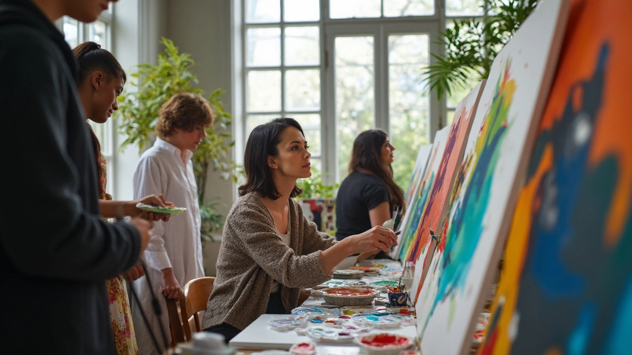
Tips for Choosing Colors in Your Art
Choosing the right colors can feel like picking the right playlist for a road trip—get it right, and you've got a masterpiece; miss the mark, and things can get a little bumpy. So, how do you decide what colors to splash onto your abstract art canvas? Let's break it down.
Understand Color Psychology
You probably know that colors can stir up emotions. Start by understanding how colors affect feelings. Warm colors like red, orange, and yellow often evoke feelings of energy and passion. In contrast, cool colors such as blue, green, and purple can create a calming effect. Keep this in mind when trying to convey a specific mood in your work.
Consider Your Theme
Your color choices should reflect the theme or message of your piece. Is your work inspired by nature? Earthy tones and greens might be your go-to. A piece on urban chaos might call for greys and metallics. Always think about how color can support your story.
Use Color Relationships
Take advantage of the color wheel—a tool every artist should be friends with. Complementary colors (like blue and orange) can make your art pop, while analogous colors (like blue and purple) provide harmony.
Test Swatches
Before you dive headfirst into painting, try sampling color swatches on a piece of scrap canvas. See how different combos work together and how they might change once they're drying.
Pay Attention to Current Trends
Keeping an eye on market trends is key if you want to sell your work. Right now, neutral tones with splashes of bold colors are having a moment in abstract art. But remember, trends are just a guide—not a rule.
Above all, choose colors that resonate with you. Your personal connection to your art will always shine through, no matter what shades you choose to explore.