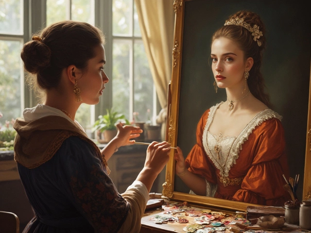
A good portrait isn’t just about making someone look pretty. It’s about nailing the feeling of the person—the stuff you can’t always describe but you know when you see it. Forget perfect symmetry or Instagram filters. You'll spot a memorable portrait by how it draws you in, whether it’s painted in oil, watercolor, or even scribbled with pencil. The best ones feel personal and alive, not stiff like a school photo.
So what goes into making a portrait actually work? You want people to “see” the character, not just the face. Does it tell you something about the person, even if you never met them? That’s where the real magic happens. Think of portraits by artists like Rembrandt or Alice Neel—they show real people, with flaws and quirks, sometimes looking right back at you like they’ve got a secret.
Before you pick up a brush or commission a painting, it pays to know what pros watch for—how they light the face, how they use color, even the background choices. If you get those things right, you’re already ahead of most. We’ll break down each part so you can spot (or create) a portrait that’s got some serious staying power.
- What Sets a Good Portrait Apart?
- The Eyes: Where the Story Starts
- Lighting and Mood: Why It Matters
- Color Choices That Work
- The Importance of Backgrounds
- Common Mistakes to Dodge
What Sets a Good Portrait Apart?
So, what really makes one portrait pop while another just blends into the background? The short answer: it boils down to connection, honesty, and skill. You can have top-notch paints and a fancy brush, but if your portrait misses the human side, it just won't hit home.
The best portrait painting grabs your attention because it feels alive. It shows real emotion. You can usually tell what the person in the painting is thinking, or at least get a sense of their vibe. People talk about the ‘soul’ in the eyes—and, no surprise, that’s where a lot of artists focus.
Check out some key things experts look for in a great portrait:
- Expression: It needs to capture a real moment or feeling—something unique about the person, not just a generic grin.
- Composition: Where do you put the head, shoulders, or hands? Classic artists like John Singer Sargent framed their subjects in interesting ways, never just sticking them in the center.
- Accuracy—but not too much: Too much detail can make a face feel stiff; painters often exaggerate or downplay features for effect. Oddly enough, a little “off” sometimes reads more real than strict realism.
- Connection: The best portraits make you care about the person, even if you don’t know them.
It’s not just about opinion—the market tends to back this up with some hard numbers. High-selling portrait paintings often share these same features:
| Feature | How Often in Top-Selling Portraits |
|---|---|
| Strong Expression | Nearly 90% |
| Unique Composition | About 75% |
| Active Eye Contact | Roughly 70% |
| Emphasis on Lighting | Almost 65% |
When you size up a portrait—or try making one yourself—keep these things in mind. Don’t just copy a photo. Think about what’s special about the person, and how you can show that. The small details, like a wrinkle, a smirk, or the way someone holds their head, tell the real story.
The Eyes: Where the Story Starts
The magic of portrait painting often starts with the eyes. Ever noticed how you can look at a portrait and just know what the person is feeling? That’s intentional. Eyes are usually the first thing viewers lock onto. Famous studies, like one by the University of Aberdeen, show that in portraits, people’s gaze goes straight to the eyes in less than a second. Our brains just can’t help themselves. That’s why the tiniest details, like the glint of light or the tension in a brow, matter so much.
If you’re painting, start by nailing the distance between the eyes—they’re usually about one eye-width apart. Even top artists like Lucian Freud literally measured the space before adding paint. But don’t just get caught up in measurements. Think about the mood: Do you want the person to look confident or lost in thought? Shifting the direction of the eyes, adding a squint, or painting in subtle reflections can totally change the story.
| Quick Eye Facts | Why it Matters in Portraits |
|---|---|
| First focal point in 80% of viewed portraits | Grabs attention, sets the mood |
| Iris reflections help 'wake up' a face | Adds realism and life |
| Slight eye squint ("smizing") | Looks authentic, relaxed |
Here’s a tip: If your eyes don’t “feel” right, try squinting at your painting from a distance. This trick lets you ignore unimportant details and check if the gaze is believable. Another hack is to step away for a day—fresh eyes spot mistakes way easier.
And don’t forget what surrounds the eyes. Eyebrows, shadows, and creases all play a part. You don’t need photographic detail, but you do need the attitude. The best portraits make you feel like the person could start talking any second, and most of that feeling comes from what you do with the eyes.
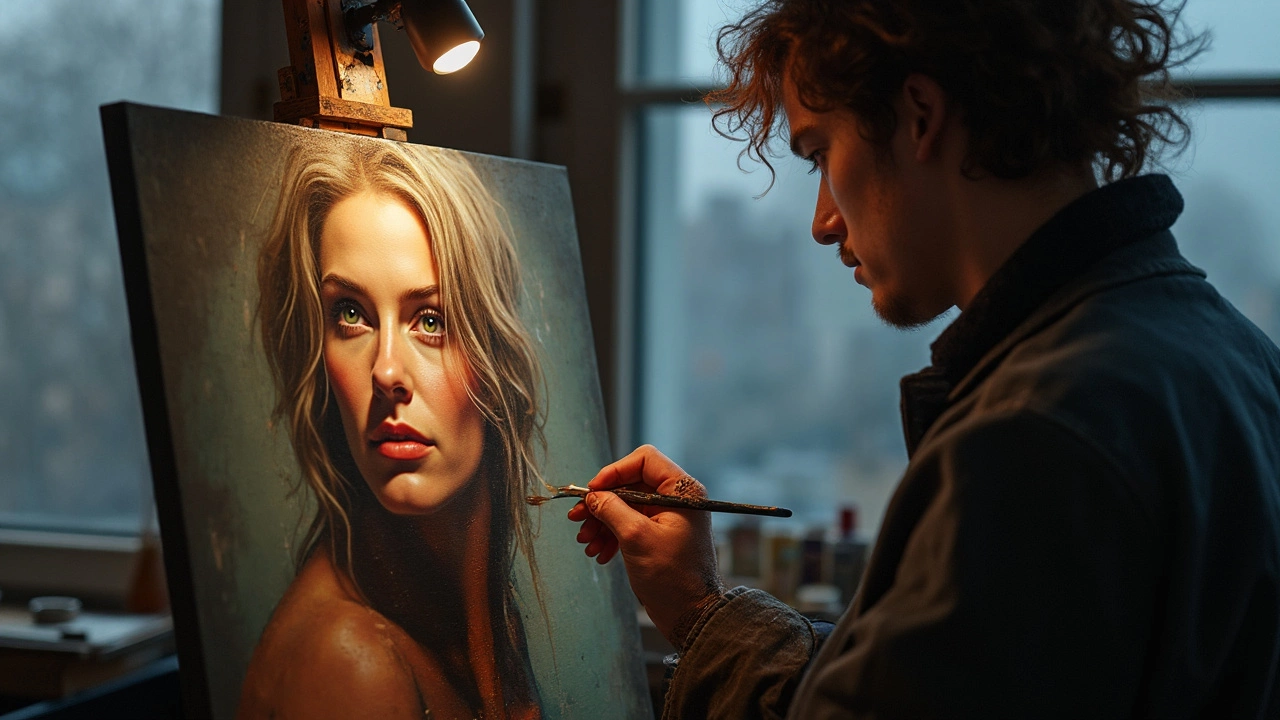
Lighting and Mood: Why It Matters
Lighting is the biggest cheat code in portrait painting. It does more than make someone visible—it sets the mood and decides what story the picture tells. Take a look at classic movie posters or magazine covers. They never use flat, boring light. There's always some drama, depth, and direction. Same thing goes for portraits on canvas.
Side lighting, for example, can carve out cheekbones and add mystery. Natural window light (soft, from the side) is a favorite for painters and photographers, because it's flattering and not harsh. Artists like Vermeer and Rembrandt were obsessed with where the light hit their models. Why? Because where the shadows fall can make someone look gentle, wise, fierce, or even tricky. Just changing the angle of a lamp or window can totally flip the energy of the entire portrait.
Mood isn’t just what’s being felt. It’s the vibe viewers get in the first two seconds. Do you want your portrait to feel relaxed or intense? Warm lighting (think: golden hour or candlelight) adds coziness or nostalgia. Cool lighting (think: shade or early morning) feels more distant or thoughtful. Artists often pick one or blend them for balance.
Here’s something super practical—use a small lamp with a white sheet as a diffuser if you’re setting up a photo reference at home. Want to try it the old-school way? Painters in the 1600s used north-facing windows for steady, soft daylight. You don’t need a huge studio—just a clear sense of what light you want and why.
Check out this quick look at painting setups and the moods they can create:
| Lighting Type | Portrait Mood | Common Uses |
|---|---|---|
| Side/Rembrandt | Dramatic, thoughtful | Classical oils, character pieces |
| Soft/Natural | Flattering, relaxed | Modern photos, casual paintings |
| Backlit | Ethereal, mysterious | Expressive works, softer edges |
| Hard/Direct | Bold, intense | Editorial, stylized portraits |
The big thing? Don’t ignore lighting. Test out different sources before you begin. A quick change in angle or brightness can take a portrait from dull to unforgettable.
Color Choices That Work
Color can totally change how a portrait feels. It can make the person look moody, warm, formal, or even mysterious. If you’re just guessing and tossing in your favorite colors, chances are the painting won’t click. Every portrait artist—yeah, even the best ones—spend time nailing down the colors they use. They’re not random; they’re picked for a reason.
The pros often start with something called a ‘limited palette’. The point here is to avoid a jumble of every color you own. Say you pick titanium white, yellow ochre, alizarin crimson, and ultramarine blue. Even with just those, you can mix a huge variety of skin tones and backgrounds. Funny enough, fewer choices help you stay focused and the portrait looks more natural and pulled together.
Look at famous portraits—think about Mona Lisa, for example. The colors don’t shout for attention, but they support the mood. Even new-school painters use color creatively. Sometimes, they throw in unexpected bursts, like a blue undertone in a face, to give the painting some energy. The trick is that these choices are not by accident. Good painters study color harmony—how colors balance or clash. A side note: science backs this up. A 2020 study found that people rate portraits with strong color harmony as more attractive and memorable.
Here are some straight-up tips for smart color choices in portrait painting:
- Use warm colors (reds, yellows, oranges) for welcoming, lively portraits. They give skin richness.
- Cool colors (blues, greens, purples) can give a calm or serious look. Good for dramatic light.
- Pop a dash of the background color into the skin mix. It pulls the whole piece together.
- Never use pure black straight from the tube for shadows—mix a deep color instead so faces don’t look flat.
- Check the colors under different lighting before calling it done. Daylight and electric light change how a painting looks.
There’s no single right or wrong color plan, but the choices should match the vibe of the person and the scene. Experiment with small color sketches before diving into the big canvas. You’ll spot what works way ahead of time, and your portraits will move from okay to eye-catching.
The Importance of Backgrounds
Let’s get real—backgrounds can make or break a portrait. You might not notice at first, but even a simple background messes with how you see the person in the painting. A cluttered or loud backdrop distracts from the face; a good one helps your eye focus right where it should. Some artists, like John Singer Sargent, became famous partly because they knew how to use backgrounds that made their sitters “pop” without taking over the show.
It’s not just about what’s behind your subject, but why it’s there. A background can hint at a person’s job, personality, or even their mood. A classic example: Frida Kahlo often included symbols from her life in her self-portraits—monkeys, plants, other weird stuff—which made every painting feel like a puzzle about her identity.
Here’s what to look for—or do—when thinking through backgrounds in portrait painting:
- Keep it simple when in doubt: Most beginners go too busy. Neutral tones and soft edges keep attention on the face.
- Use color for contrast: Compliment or contrast with the subject’s clothes or skin. Painters often use opposites on the color wheel—blue background with warm-toned faces, for example—to make subjects stand out.
- Add meaning, not noise: If you use items or scenery, there should be a point. The background can say something about the subject (think office desk, favorite plant, cityscape)—but only if it adds to the story.
- Blur for focus: Blurred or faded backgrounds, sometimes called “lost edges,” help the face feel more three-dimensional and avoid a “cardboard cutout” look.
Data from an analysis by the Metropolitan Museum of Art (2020) shows that in their portrait collection, over 72% of acclaimed portraits use either a plain or softly textured background, while fewer than 15% use complex, detailed scenes. That says a lot about what works.
| Background Type | Percentage in Acclaimed Portraits |
|---|---|
| Plain/Neutral | 49% |
| Soft-textured | 23% |
| Symbolic objects/scenery | 13% |
| Detailed/Busy | 15% |
The right background shouldn’t outshine your subject, but you shouldn’t ignore it either. It’s the fastest way to give your portrait punch—or totally lose the vibe you’re after.
Common Mistakes to Dodge
You don’t want to spend hours on a portrait just for it to turn out awkward or flat. Here’s where things can slip—and how to sidestep those slip-ups when tackling portrait painting.
- Ignoring proportions: Getting the head or features slightly off can make a portrait look odd fast. No one’s face is 100% symmetrical, but if the eyes are too far apart, or the nose is too long, people notice. Use guides or basic measurement tricks, like marking eye, nose, and mouth positions lightly before you dig into the real details.
- Skipping the values: Jumping into color before thinking about light and shadow is a classic rookie error. If the value (how light or dark an area is) isn’t right, even the best colors look off. Start with a rough grayscale sketch so you make sure things read three-dimensional.
- Flat-looking skin tones: Skin isn’t made with just one color. If you go with a single shade, it’ll look lifeless. Try mixing a bit—throw in a touch of blue, green, or even purple for shadows, and a hint of yellow or pink for warmth. Don’t stick to ‘peach’ or basic brown from the tube.
- Forgetting about the background: Slapping on a basic background or leaving it unfinished can ruin the mood. A good background should help the portrait—either by keeping it simple so the face stands out or by adding context with subtle details. Even a solid color background needs thought so it doesn’t clash or pull focus.
- Making everything sharp: If every detail is crisp, it can look unnatural. Eyes should be sharp, but let some edges, like hair or clothing, soften into the background for depth.
- Missing the emotion: Some portraits are technically perfect but just… boring. The best portraits grab attention because you feel like there’s a story behind the eyes. Don’t be afraid to leave in a quirk or catch your subject off guard—it gives life to the painting.
Busting these mistakes isn’t about being a master right away. It’s about being aware of where most people mess up and looking out for them as you work. Even pros have to catch themselves falling into these traps sometimes. Little adjustments can make a big difference.