Portrait Tips – Simple Tricks to Boost Your Portrait Paintings
Want your portraits to look more alive without spending weeks on theory? You’re in the right spot. Below are hands‑on tips you can start using today, whether you work in acrylic, oil or digital.
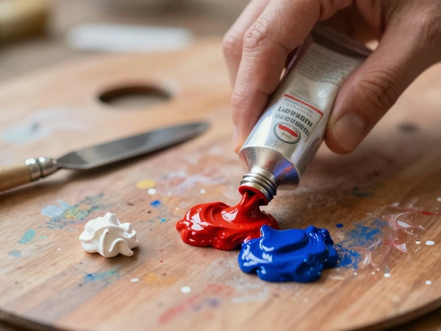
Pick Colors That Make Skin Pop
First thing – skin isn’t just one shade. Mix a base of warm ochre or yellow‑ochre with a hint of red for the cheeky glow, then add a touch of cool blue or violet to pull back the highlights. When you’re unsure, grab a photo and sample the mid‑tone. Use that as your "middle" and build lighter and darker values around it. The result? A portrait that looks three‑dimensional without looking flat.
Remember, the background color can boost or mute your subject. A soft gray or muted teal often makes skin tones stand out more than a bright white wall.
Choose the Right Medium (and Know Your Prices)
Acrylic dries fast, so you can layer quickly – great for beginners who want to work fast. Oil gives you more blending time, which helps when you’re smoothing transitions on a face. If you’re still on the fence, try a mixed approach: start with acrylic underpainting, then add oil glazes on top.
Pricing a portrait can feel scary. A simple rule is to calculate your time, material costs and a profit margin. For a 12×16 inch portrait, many artists charge $300‑$600 depending on experience. Look at recent commissions on our site for real‑world numbers and adjust for your skill level.
Don’t forget to factor in shipping or framing if you offer those add‑ons. Clear pricing builds trust and avoids awkward negotiations later.
Other quick tips – keep lighting simple. A single soft light source (like a window) creates clean shadows and reduces guesswork. Position your subject so the light hits the front‑45‑degree angle; you’ll get natural shading without harsh contrasts.
Composition matters just as much as color. Place the eyes on the upper third line of the canvas and leave a little space above the head. This “rule of thirds” gives your portrait a balanced feel and draws the viewer’s eye right where you want it.
Finally, practice with quick sketches. Spend five minutes a day drawing just the eyes or mouth. Those tiny studies sharpen your observation skills and make full‑size portraits flow smoother.
Combine these habits – thoughtful color mixing, the right medium, honest pricing, simple lighting, and regular sketching – and you’ll see noticeable improvement fast. Keep experimenting, and remember a great portrait is as much about feeling as technique.
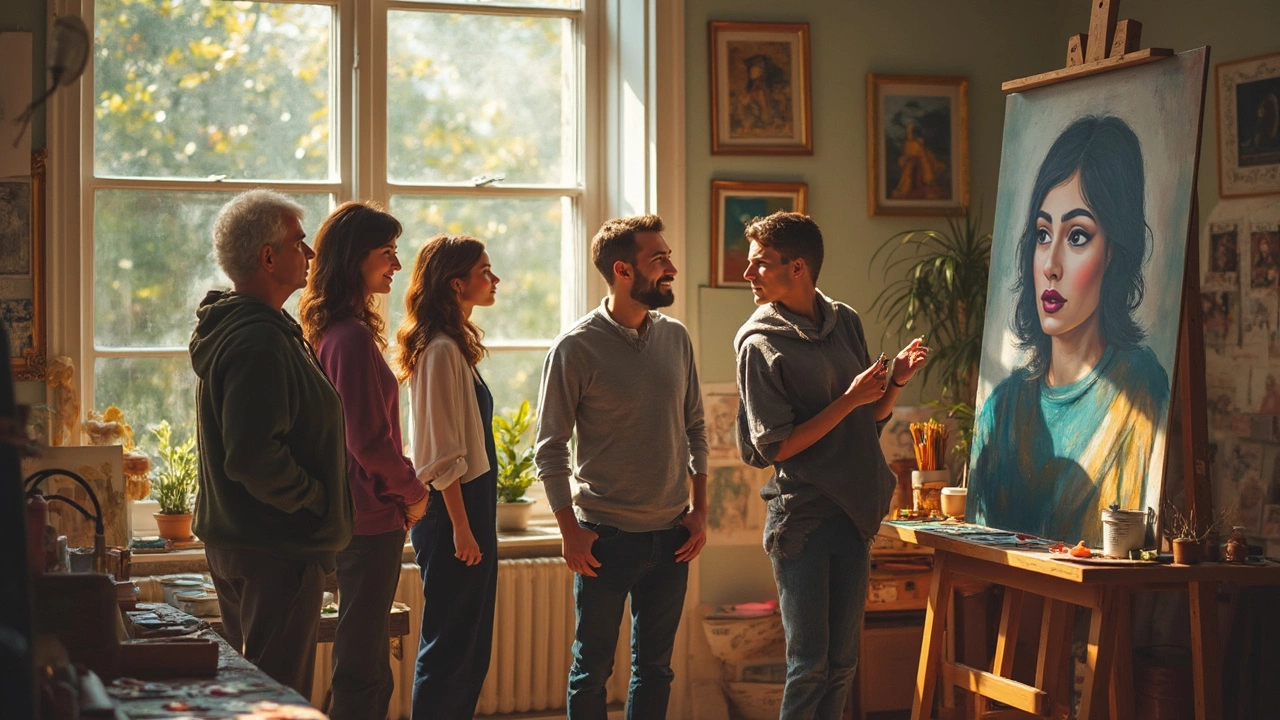
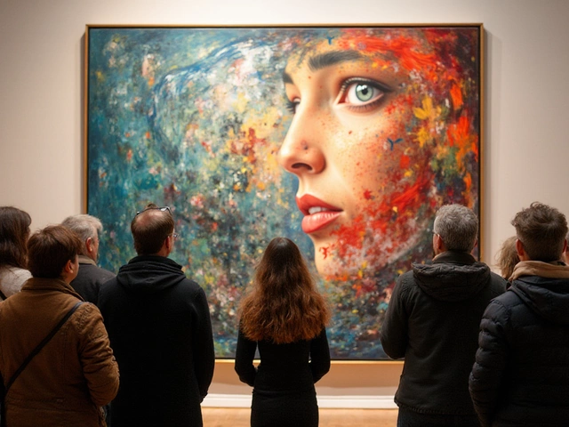
What Does a Good Portrait Look Like? Breaking Down Portrait Painting
Ever wonder what makes a portrait stand out? This article digs into what separates a good portrait from a forgettable one. We'll talk about the things pro painters watch for, like capturing emotion and using color smartly. There's no one-size-fits-all answer, but there are a few clear signs when you’re looking at an effective portrait. If you ever wanted to paint—or just understand—better portraits, you’ll find useful, down-to-earth info here.
Continue ReadingCategories
Most popular
-

-
-
-
 Is It Legal to Print Art for Personal Use? Feb 9 2025
 -