Popular Colors: What Artists Use Most and Why
Ever wonder why some paintings just pop while others feel flat? The secret is often the colors you pick. Below you’ll find the hues that keep showing up in portrait work, modern art, and even photography. Knowing these trends helps you decide fast and avoid endless trial‑and‑error.
Why Certain Colors Keep Winning
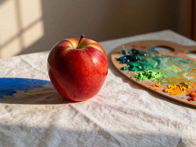
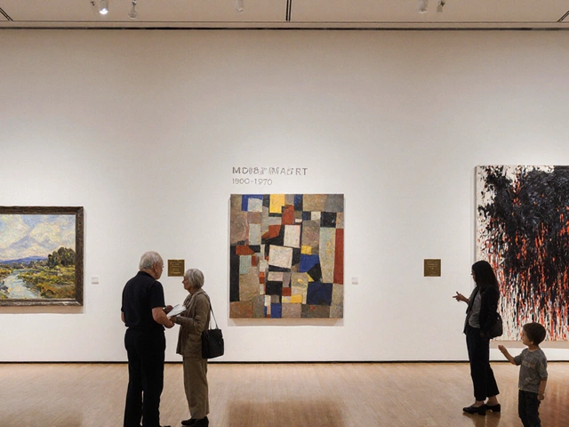
Artists gravitate toward colors that are versatile and flattering. Warm reds and deep blues, for example, create contrast without clashing. Neutral grays and ochres give a calm background that lets the subject shine. These shades also reproduce well in prints and online, so they sell better on platforms like Etsy.
Top Hues for Portraits
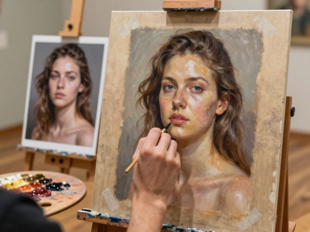
If you’re painting a face, start with a muted teal or sage for the background. It makes skin tones look fresher. For the skin itself, a mix of peach, rose, and a hint of yellow creates natural warmth. When you need a pop, add a splash of burnt orange or cobalt blue to the clothing – it draws the eye without stealing focus.
Remember the advice from our "Best Colors for Portraits" post: test a small swatch against your subject’s lighting. If the color looks too harsh, tone it down with a little white or a complementary hue. This quick tweak can save hours of reworking later.
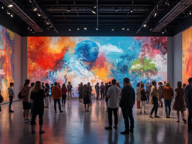
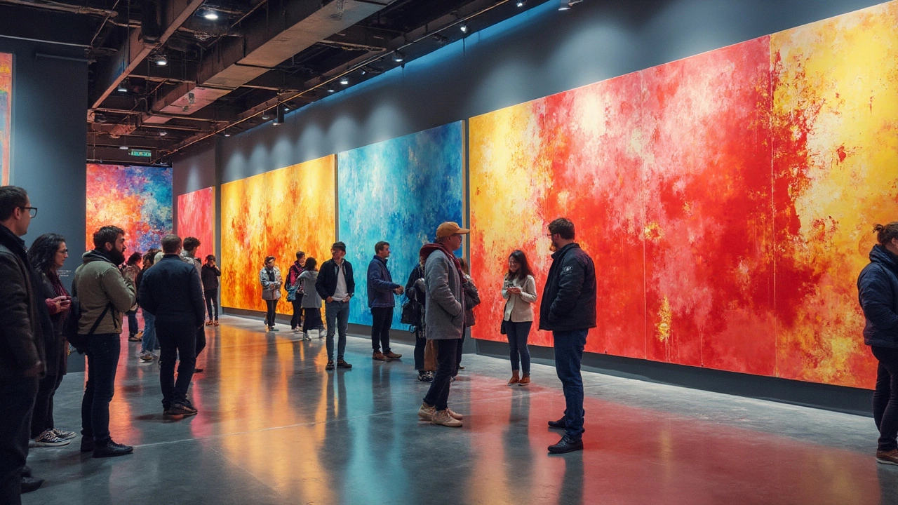
Beyond portraits, abstract artists love bold primaries. Bright yellow, electric blue, and vivid magenta set a strong emotional tone. Pair them with a dark grounding color like charcoal to keep the piece from feeling chaotic. This combo is a favorite in galleries and sells well in the current market.
When you’re working with watercolors, the "Rolling Watercolor Paintings" guide reminds us that some papers handle bright colors better than others. Heavy‑weight paper will keep the pigment from bleeding, preserving the crispness of your popular hues.
Digital artists also benefit from these color choices. Our "Turn Your Art into Digital Art" guide notes that the same popular palettes translate well into RGB values, keeping the look consistent whether you’re printing or sharing online.
Finally, keep an eye on trends. In 2024, pastel greens and muted lavenders surged in popularity for interior‑style art. If you’re aiming for a commercial vibe, blending those softer tones with a striking accent can make your work feel fresh and market‑ready.
Pick a few of these proven colors, experiment with your own twist, and watch your art get noticed faster. The right hue isn’t just a pretty choice – it’s a practical tool for better paintings and better sales.
Most Popular Colors in Abstract Art: What's the Deal?
What's the most popular color in abstract art? It's not just about preference, but also about psychological impact and cultural shifts. This article digs into how certain colors speak volumes in the abstract art scene. You might be surprised at what leads the pack.
Continue ReadingCategories
Most popular
-
-
-
-
 How Much Does a Realistic Portrait Cost in 2025? Dec 18 2025
 -