Picturesque Landscapes Made Easy: Tips for Painting and Capturing Outdoor Beauty
Ever stared at a hill, river, or sunrise and thought, "I could turn that into a painting right now"? You’re not alone. Artists of all levels chase that perfect landscape feel, and you can get there without a mountain of theory.
First, pick a simple focal point. It could be a lone tree, a winding road, or a rock formation. That piece anchors the eye and stops the canvas from feeling empty. Once you have it, sketch it lightly with a pencil or a thin charcoal line. Keep the lines loose—you’ll refine them later.
Choose Colors That Echo Real Light
Landscape color isn’t just green and blue. Look at the sky at sunset: it’s a mix of pink, orange, and deep violet. Bring those hues into your palette. If you’re using acrylics, start with a warm base (like a touch of cadmium yellow) and add cooler tones (ultramarine blue) for depth. For watercolors, try a wet‑on‑wet technique: splash a light wash of sky color, then drop in deeper shades as the paper dries. This mimics how the atmosphere softens distant objects.
Don’t forget the "warm‑cool" rule. Warm colors (reds, yellows) advance, making foreground elements pop. Cool colors (blues, purples) recede, pushing hills and mountains further back. A quick test: paint two identical shapes, one in warm and one in cool—your eyes will do the rest.
Layering Tricks for Realistic Depth
When you work in oils, the "slow over fast" rule saves you from cracking later. Let the first layer dry a bit, then add slower‑drying paint on top. It keeps the paint flexible and the colors vivid. If you’re using acrylics, a quick dry time means you can add texture right away. Use a palette knife to scrape in rocks or tree bark—those rough edges add realism without hours of brushwork.
For a quick win, try the "scrubbing" technique on watercolors. Drag a damp brush across dried paint to lift highlights and suggest light hitting leaves or water. It’s a small step that makes a big visual impact.
Composition matters as much as color. The classic "rule of thirds" works well: place the horizon line either 1/3 or 2/3 from the top of the canvas. This gives the sky or land more breathing room and guides the viewer’s gaze naturally.
Finally, think about atmosphere. A light mist over a lake can be achieved with a thin glaze of gray mixed with a bit of the sky color. Let it sit a moment, then gently lift with a clean, damp brush. The result looks like a soft veil, adding mood without heavy paint.
Want to practice without buying supplies? Use your phone camera to capture a scene, then print it in black‑and‑white. Sketch the values first—light, mid, dark—before adding color. This value‑first approach trains your eye and speeds up the painting process.
Whether you’re a beginner or a seasoned painter, these straightforward steps—pick a focal point, use warm‑cool color logic, layer wisely, and respect simple composition—will help you create picturesque landscapes that feel alive. Grab your brushes, step outside, and let nature guide your next masterpiece.
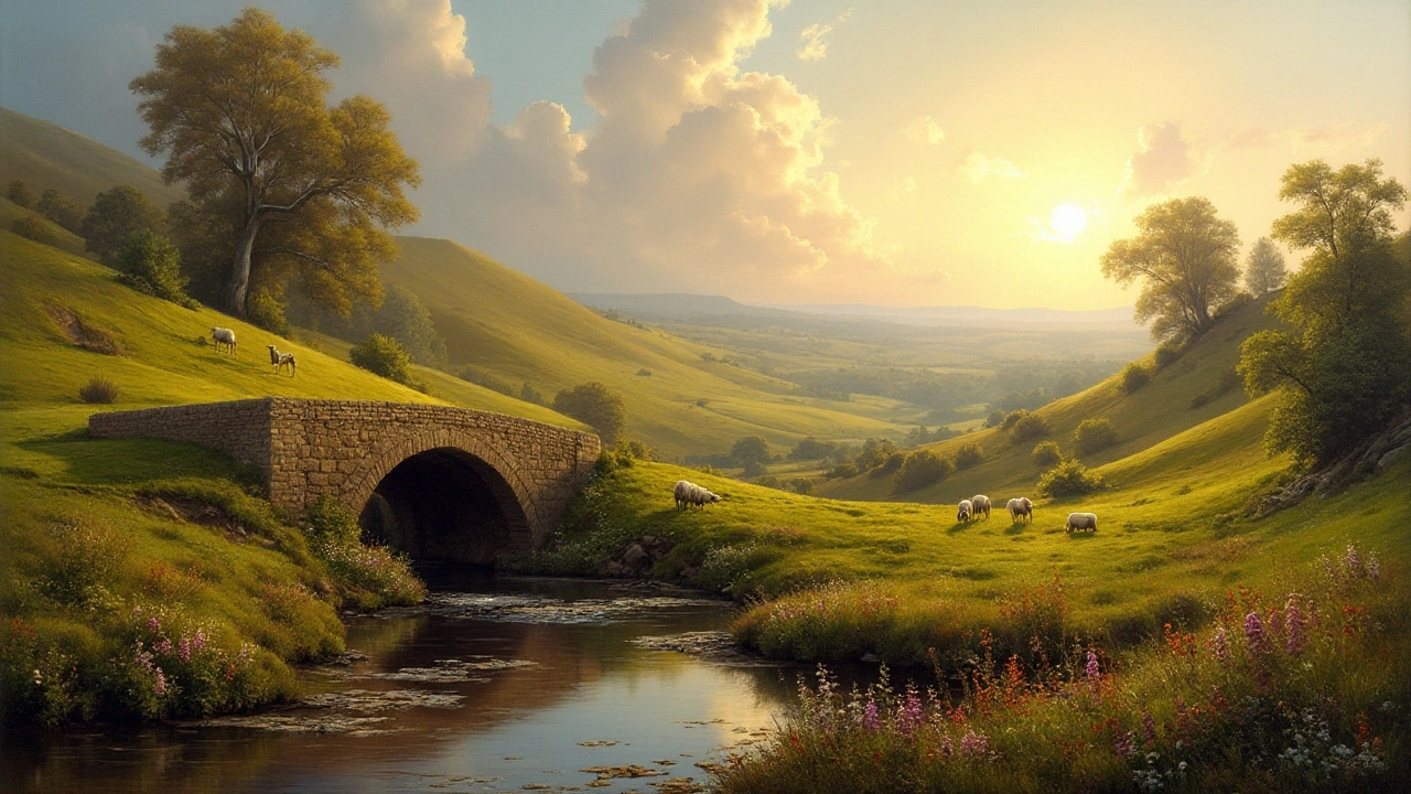
Unlocking the Charm of Picturesque Landscape Paintings
Exploring the world of picturesque landscape painting involves delving into an artistic style that romanticizes the natural beauty of the world. These paintings evoke emotions and connect the viewer to peaceful vistas and stark natural contrasts by emphasizing light, shadow, and form. From its roots in the 18th century to its modern interpretations, picturesque landscape painting remains an essential part of art history. Discover the unique techniques used by artists and how these paintings continue to inspire modern creators. Whether you are an artist or an art lover, understanding this genre can enhance your appreciation of nature and artistry.
Continue ReadingCategories
Most popular
-
 What Draws People to Abstract Art? Nov 17 2025
 -

-
 Is It Legal to Print Art for Personal Use? Feb 9 2025
 -
 Who Is the Highest Paid Digital Artist in 2025? Oct 10 2025
 -