Understanding Key Differences in Art: Styles, Mediums, and Techniques
Ever wonder why one painting feels timeless while another feels fresh and modern? The answer often lies in the subtle differences between styles, materials, and methods. This guide breaks down the most common contrasts you’ll meet on our site, so you can spot them fast and decide what works best for you.
Spotting the big style splits
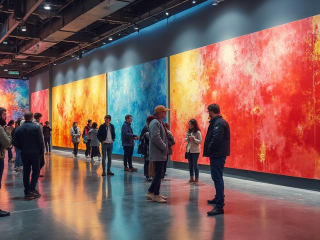
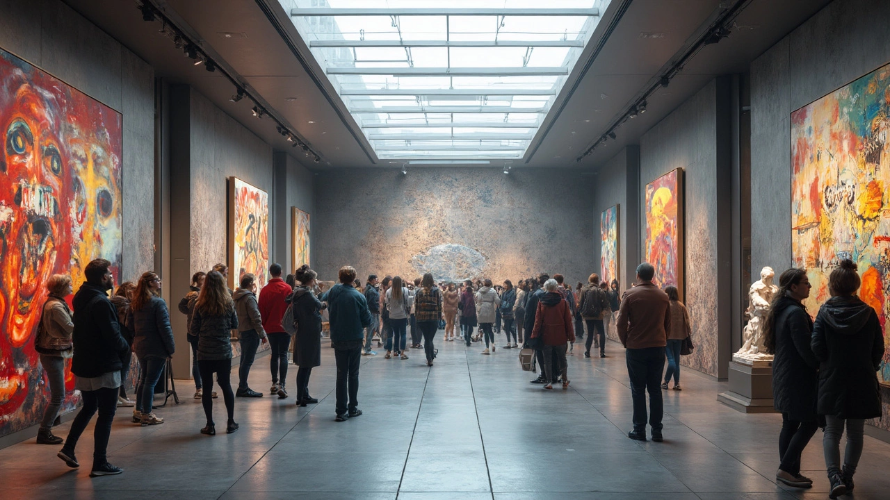
Two of the most talked‑about differences are classic versus contemporary design. Classic art leans on symmetry, muted palettes, and historical references. Think of a Renaissance portrait with careful proportions and a calm mood. Contemporary work flips that script – it embraces bold colors, abstract forms, and a ‘less is more’ attitude. If you scroll through our "Classic vs Contemporary Style" post, you’ll see how the two handle space, detail, and even the way they dress a room.
Another hot comparison is abstract versus realistic art. Abstract pieces often strip away recognizable subjects and focus on shape, color, and emotion. Realistic art tries to replicate what you see in the world – the exact shade of a sunset or the texture of a leaf. Our "Why Is Contemporary Art So Simple?" article shows how minimalism can feel simple but actually follows a set of visual rules that differ from traditional representation.
Even within a single medium, you’ll find interesting contrasts. For example, the difference between a rolled watercolor and a flat‑mounted one matters for storage and display. In the "Can You Roll Watercolor Paintings?" guide we explain when rolling is safe, how to protect the paper, and when a flat approach is smarter.
Choosing the right medium
Medium differences can change the whole workflow of a painting. The classic showdown is acrylic versus oil, highlighted in our "Acrylic vs Oil: Which Is Easier for Portrait Painting?" post. Acrylic dries fast, lets you layer quickly, and cleans up with water. Oil, on the other hand, stays wet longer, blends smoothly, and needs solvents. If you’re a beginner, acrylic might feel less messy, but oil offers that buttery finish many portrait artists love.
Even within oil painting, there are rules that separate good from great. The "Slow Over Fast" rule tells you to put slower‑drying layers on top of faster‑drying ones, preventing cracking. Knowing this difference helps your paintings last longer, a tip we expand on in the "Slow Over Fast Rule in Oil Painting" article.
Digital art differences matter too. Turning a hand‑drawn sketch into a digital file involves choices – scan or photograph? Each method affects color accuracy and file size. Our "How to Turn Your Art into Digital Art" guide walks you through the pros and cons, so you can pick the workflow that fits your budget and skill level.
Finally, pricing differences can make or break an art business. The cost of a portrait, a print, or a sculpture varies based on time, material, and market demand. In the "How Much to Charge for a Portrait Painting" and "What Should I Charge for My Art Prints?" articles, we lay out real numbers and formulas, helping you set prices that reflect your effort and the market.
Understanding these differences lets you make smarter choices whether you’re creating, collecting, or selling art. Dive into the linked posts for deeper details, then experiment with the ideas that feel right for you. The more you notice the contrasts, the easier it becomes to develop your own style and workflow.
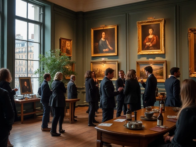
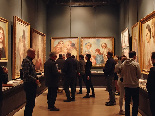
Contemporary Art vs Fine Art: What's the Real Difference?
Are contemporary art and fine art the same thing? This article breaks down what each term actually means, why people mix them up, and how you can tell the difference when you're at a gallery or scrolling online. Get the scoop on how art schools, museums, and even the art market treat these two worlds. You'll also pick up tips on how to spot contemporary trends and classic fine art features, so you won't get lost in art jargon. If you've ever wondered where spray paint murals or digital installations fit in, you're in the right place.
Continue Reading