Design Differences: Why They Matter for Every Artist
Ever wonder why two paintings of the same subject can feel worlds apart? The answer lies in design differences – the choices you make about style, medium, and composition. Understanding these differences helps you decide what works best for your idea and audience. It also makes you a sharper critic, so you can spot what’s effective in others’ work.
Why Spotting Design Differences Matters
When you can name the difference between abstract and realistic, you can use that knowledge to guide your own projects. For example, a minimalist composition uses negative space to create calm, while a busy collage builds energy. Knowing when to apply each effect saves time and reduces trial‑and‑error. It also lets you talk confidently with clients or teachers, because you can explain why a certain look fits the brief.
Design differences also affect how viewers feel. A warm colour palette can make a portrait feel intimate, while cool tones might suggest distance. The same principle works with texture: a rough brushstroke adds grit, a smooth glaze adds polish. By matching visual cues to the mood you want, you turn a flat image into a storytelling tool.
Common Design Differences You Should Know
Medium vs. Technique: Oil paint dries slowly, letting you blend colours on the canvas. Acrylic dries fast, which is great for crisp edges. Watercolour relies on paper quality; too much water can cause warping. Knowing each medium’s strengths helps you pick the right tool for the job.
Style Choices: Abstract art focuses on color, shape, and gesture rather than recognizable objects. Realism aims for accurate representation. A mixed‑media piece might combine both, using realistic details as a base and abstract accents for emphasis.
Composition Rules: The rule of thirds divides an image into nine equal parts; placing key elements on the intersections creates balance. The golden ratio offers a more fluid, natural flow. Some modern designers break these rules on purpose to create tension.
Scale and Proportion: A sculpture that occupies a small corner of a room feels intimate, while a towering installation commands attention. In two‑dimensional work, exaggerating proportions can convey humor or surrealism.
Color Relationships: Complementary colours (red‑green, blue‑orange) create high contrast, ideal for focal points. Analogous colours (blue‑green‑teal) produce harmony, good for backgrounds. Knowing which relationship you need guides your palette choices.
Putting these differences into practice is easier than you think. Pick a simple subject, like a fruit bowl, and try three versions: a realistic oil painting, an abstract acrylic splash, and a minimalist digital sketch. Compare the mood, the effort, and the visual impact. You’ll see how each design decision shifts the whole piece.
Finally, keep a visual notebook. Whenever you see a design that catches your eye, note the medium, style, colour scheme, and any rules that seem broken. Over time you’ll develop an instinct for what works and why. This habit turns observation into a powerful tool for your own creations.
Design differences are not just academic jargon – they’re everyday choices that shape the story you tell with art. By learning to recognize and apply them, you give yourself a richer toolbox, faster results, and stronger communication with any audience.
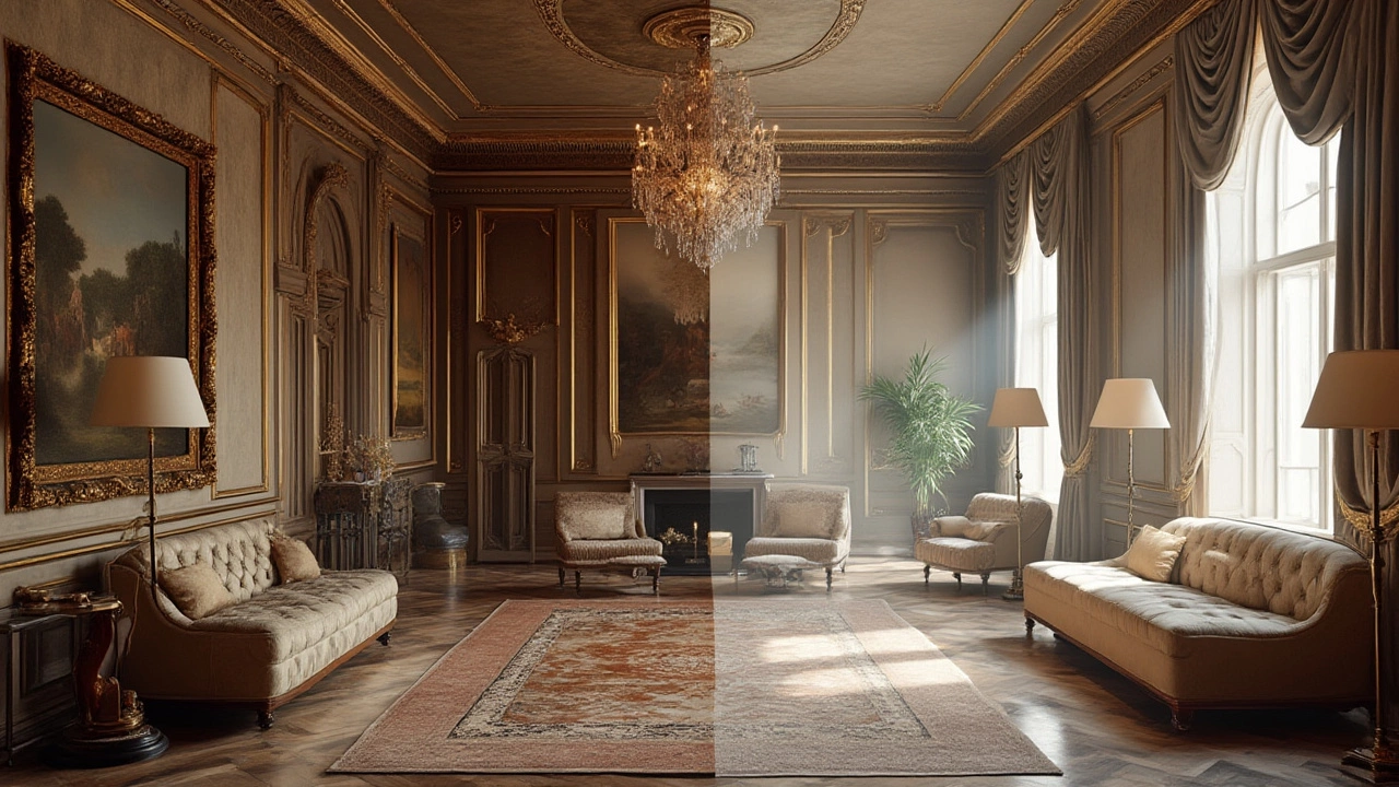
Classic vs Contemporary Style: Key Differences in Art, Design, and Everyday Life
Dive into the distinct worlds of classic and contemporary style—exploring key differences in art, design, and how they shape everything from interiors to everyday life.
Continue ReadingCategories
Most popular
-

-
 How to Get Free Music on Your Phone Mar 15 2025
 -
-
-
 What Is the Best Meaning of Music? Jan 15 2026