Color Theory Made Simple for Every Artist
Ever stared at a blank canvas and wondered which hue will make your piece pop? You’re not alone. Color theory is the toolbox that helps you choose, mix, and place colors so they feel right together. Grab a brush, open a digital palette, or just look at a wheel – we’ll show you how to get confident fast.
Understanding the Color Wheel
The color wheel is basically a circle that lines up all the primary, secondary, and tertiary colors. Primary colors – red, blue, yellow – can’t be created by mixing anything else. Blend two of them and you get the secondary colors: orange, green, and purple. Mix a primary with a neighboring secondary and you land on the tertiary shades, like red‑orange or blue‑green.
Why does this matter? Because the wheel lets you see relationships at a glance. Complementary colors sit opposite each other – think blue and orange – and they create a strong contrast that grabs the eye. Analogous colors sit side‑by‑side, such as blue, blue‑green, and green; they give a harmonious, calm vibe.
When you pick a palette for a portrait, for example, you might use a split‑complementary scheme: choose a main skin‑tone hue and pair it with the two colors next to its opposite. This keeps the contrast lively without being jarring.
Practical Tips for Mixing and Using Color
Start with a limited palette. Pick one warm (red or orange) and one cool (blue or green) plus a neutral (white, black, or gray). Mixing from a small set forces you to understand how pigments interact, and you’ll end up with more cohesive results. Test a tiny amount on a scrap before committing to the whole canvas.
Watch the value – the lightness or darkness of a color – separately from its hue. A dark blue and a light blue are still blue, but they convey very different moods. Use a grayscale strip next to your colors to see if you’re getting enough contrast for readability.
Don’t forget temperature. Warm colors (reds, yellows) feel forward and energetic; cool colors (blues, greens) recede and calm. Layer warm tones in the foreground and cool tones in the background to create depth without adding extra perspective lines.For digital artists, the same rules apply but you have extra tools like HSL sliders. Adjust the hue to shift color, saturation to control intensity, and lightness for value. Play with blending modes to see how colors interact in ways paint can’t, then bring those discoveries back to the physical medium.
Lastly, trust your eye. While theory offers a map, your personal taste decides the final route. Sketch a quick color study, step back, and ask yourself: does this feel balanced? Does it support the story I’m trying to tell? If the answer is yes, you’ve applied color theory the right way.
Keep experimenting, and soon choosing colors will feel as natural as drawing a line. Happy painting!
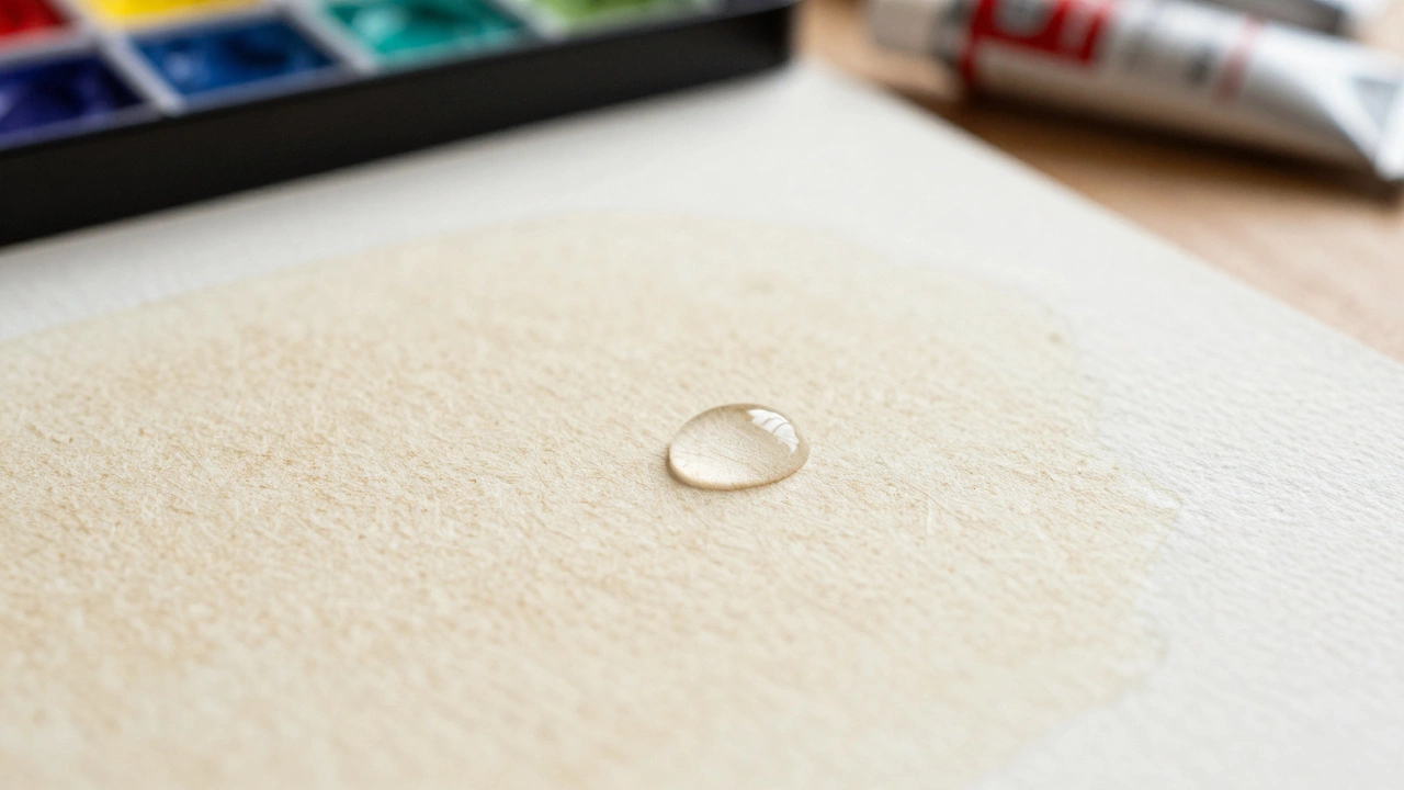
How to Make Watercolor Paintings Look Professional: A Complete Guide
Learn how to create professional watercolor paintings by mastering paper selection, water control, and color theory.
Continue Reading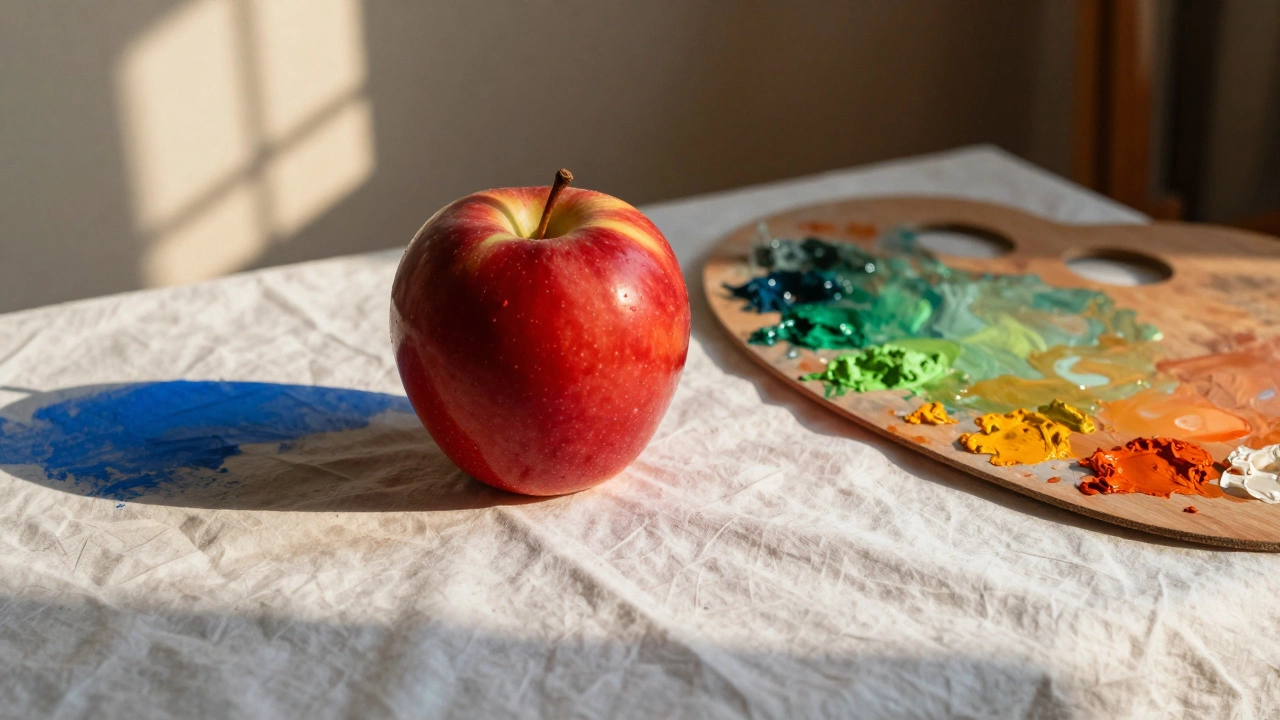
What Are Complementary Colors in Oil Painting? A Practical Guide
Complementary colors in oil painting create powerful contrast and depth. Learn how red and green, yellow and purple, or blue and orange work together to make your paintings glow naturally without looking artificial.
Continue Reading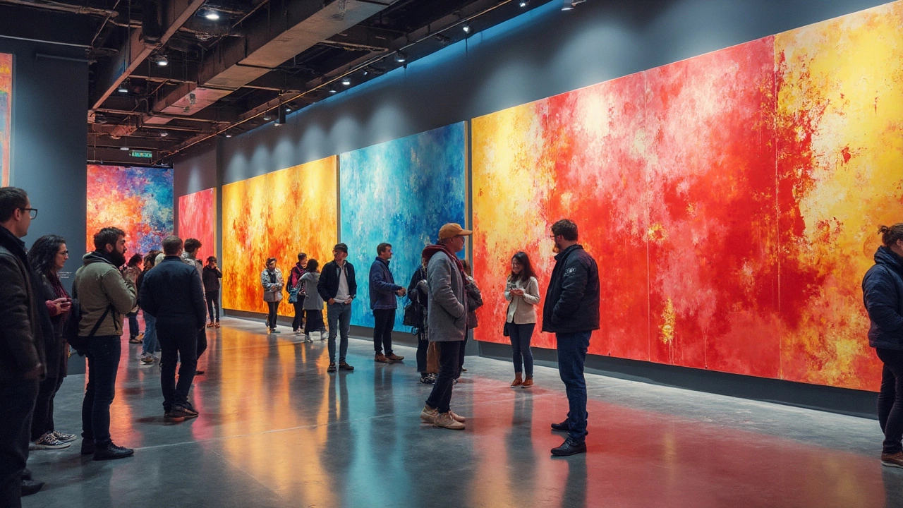
Most Popular Colors in Abstract Art: What's the Deal?
What's the most popular color in abstract art? It's not just about preference, but also about psychological impact and cultural shifts. This article digs into how certain colors speak volumes in the abstract art scene. You might be surprised at what leads the pack.
Continue ReadingCategories
Most popular
-
 Best Programs to Create Digital Art in 2025 Nov 20 2025
 -

-
-
 Is It Legal to Print Art for Personal Use? Feb 9 2025
 -
 Exploring the Dynamic Styles in Sculpture Art Jan 26 2025