Color in Landscapes: How to Use Hue, Value, and Saturation to Create Powerful Outdoor Paintings
When you look at a landscape painting that pulls you in, it’s rarely because of the trees or the sky—it’s because of how color in landscapes, the intentional use of hue, value, and saturation to evoke emotion and depth in outdoor scenes is handled. It’s not about copying what you see. It’s about choosing what to emphasize, what to mute, and when to let one color scream while another whispers. A red barn in a green field doesn’t work because red is bold—it works because the artist understood how much brighter that red needs to be to stand out against the muted greens, and how much cooler the shadows around it must be to feel real.
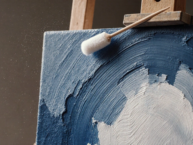
That’s where value, the lightness or darkness of a color, independent of its hue becomes your secret weapon. Most beginners focus on picking the right green for grass or blue for water, but they forget that a dark shadow next to a light hillside creates more depth than any fancy pigment ever could. You can paint a perfect blue sky with muddy gray, and if the value is right, it still reads as sky. But get the value wrong, and even the most brilliant cobalt will look like a flat stain. Then there’s saturation, the intensity or purity of a color, ranging from dull to vivid. A field of wildflowers doesn’t need every petal to be neon. In fact, the magic happens when most are soft, and just one or two burst with full color—like a red poppy in a field of dusty lavender. That’s how you guide the eye without shouting.
And color harmony? It’s not some rulebook you have to memorize. It’s about relationships. Warm colors move forward. Cool colors pull back. A distant mountain doesn’t need to be blue—it needs to be less saturated, lighter, and slightly cooler than the trees in front of it. That’s how you create space. You don’t paint distance—you create the illusion of it by controlling how colors behave next to each other. The posts below show you exactly how real artists do this. You’ll see how they mix sky tones that feel like wind, how they make shadows look like they’re breathing, and how they avoid turning a sunset into a mess of orange sludge. No theory overload. No fluff. Just what works when you’re standing there with a brush in hand, trying to make the world on the canvas feel as real as the one outside.
How to Make Landscape Paintings Look Good: Simple Techniques for Realistic and Emotional Art
Learn how to make landscape paintings feel alive with simple techniques for composition, color, light, and texture. No fancy tools needed-just observation and honest expression.
Continue ReadingCategories
Most popular
-

-
-
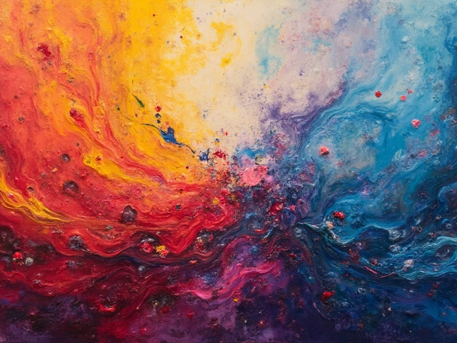 Understanding the Meaning of Abstract Art Apr 6 2025
 -
-