Atmospheric Perspective Simulator
Visual Guide: Notice how the Background becomes paler and bluer, while the Foreground retains deep colors and sharp contrast as you adjust the "Haze" level.
Painting Controls
Quick Wins for Your Next Canvas
- Atmospheric Perspective: Make distant objects lighter, bluer, and less detailed.
- The Rule of Thirds: Avoid putting your horizon line dead center; shift it up or down.
- Underpainting: Start with a thin wash of color to kill the white of the canvas.
- Edge Control: Keep distant edges soft and foreground edges sharp.
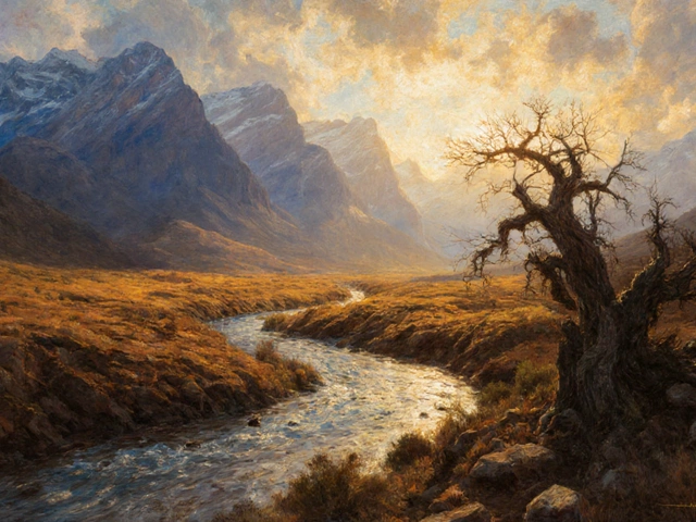
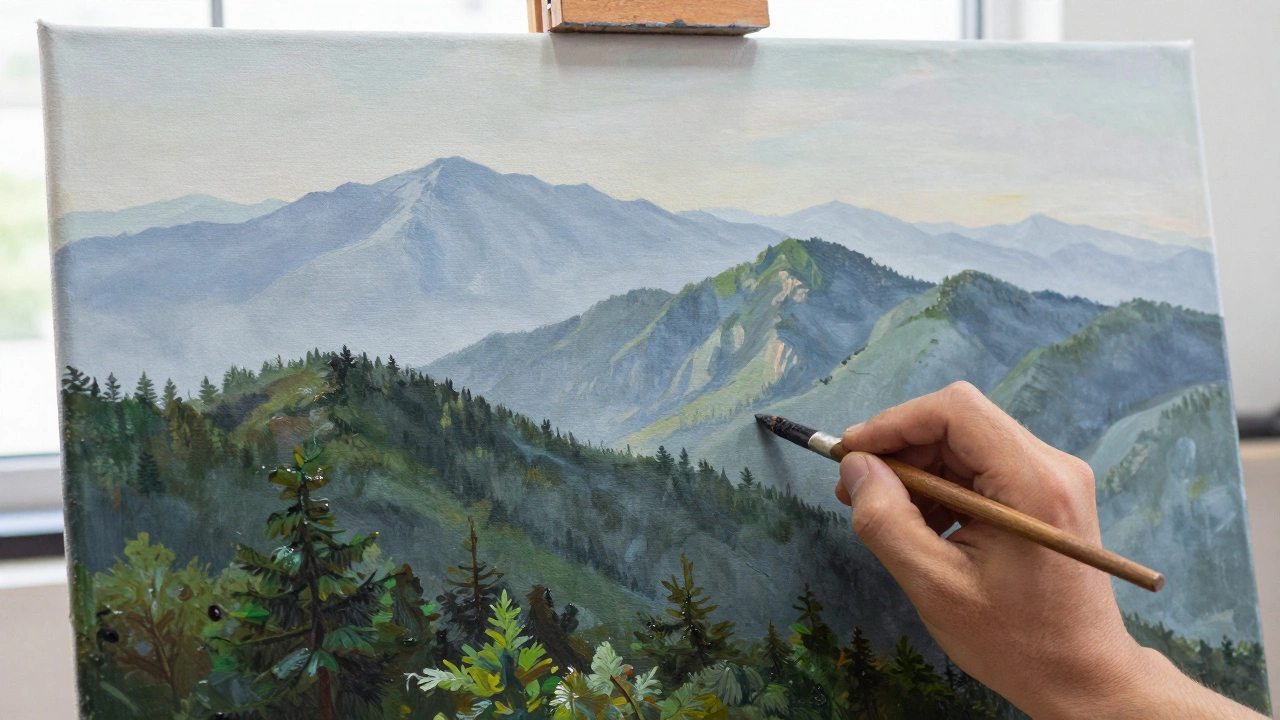
Creating Depth with Atmospheric Perspective
If you paint a distant forest with the same dark green you use for a tree right in front of you, the painting will look like a cardboard cutout. This is where Atmospheric Perspective comes in. This technique mimics how the Earth's atmosphere-filled with dust and moisture-scatters light.
Think about it: when you look at a mountain range in the distance, the peaks look pale blue or grey, not deep purple or green. To achieve this, you need to reduce the contrast in your background. Your values (the lightness or darkness of a color) should get closer together as things move away from the viewer. If your foreground has a deep black and a bright white, your background should stay in a narrow range of mid-tones.
A pro tip here is to add a tiny bit of white and blue to your distant colors. This mimics the "haze" of the horizon. If you're painting a sunset, that haze might turn pink or orange, but the principle remains: less detail and lower contrast in the back equals more depth.
Choosing Your Medium: Oil vs. Acrylics
The tools you choose change how you apply these techniques. Most professionals lean toward Oil Painting because of its slow drying time. This allows for "wet-on-wet" blending, which is essential for smooth gradients in a sky or the soft transition of a cloud.
On the other hand, Acrylic Paint dries incredibly fast. This is great if you want to layer sharp details on top of each other without them smudging. However, blending a sky with acrylics can be a nightmare unless you use a "retarder" medium to slow the drying process down. Many modern artists now use a hybrid approach, starting with acrylics for the base and finishing with oils for the fine details.
| Feature | Oil Painting | Acrylic Painting | Watercolor |
|---|---|---|---|
| Drying Time | Slow (Days/Weeks) | Fast (Minutes) | Very Fast |
| Blending Ease | High (Seamless) | Moderate (Requires Speed) | Low (Fluid/Organic) |
| Durability | High (Long-lasting) | High (Flexible) | Moderate (Fragile) |
| Best Use Case | Classical Realism | Modern/Graphic Style | Quick Studies/Travel |
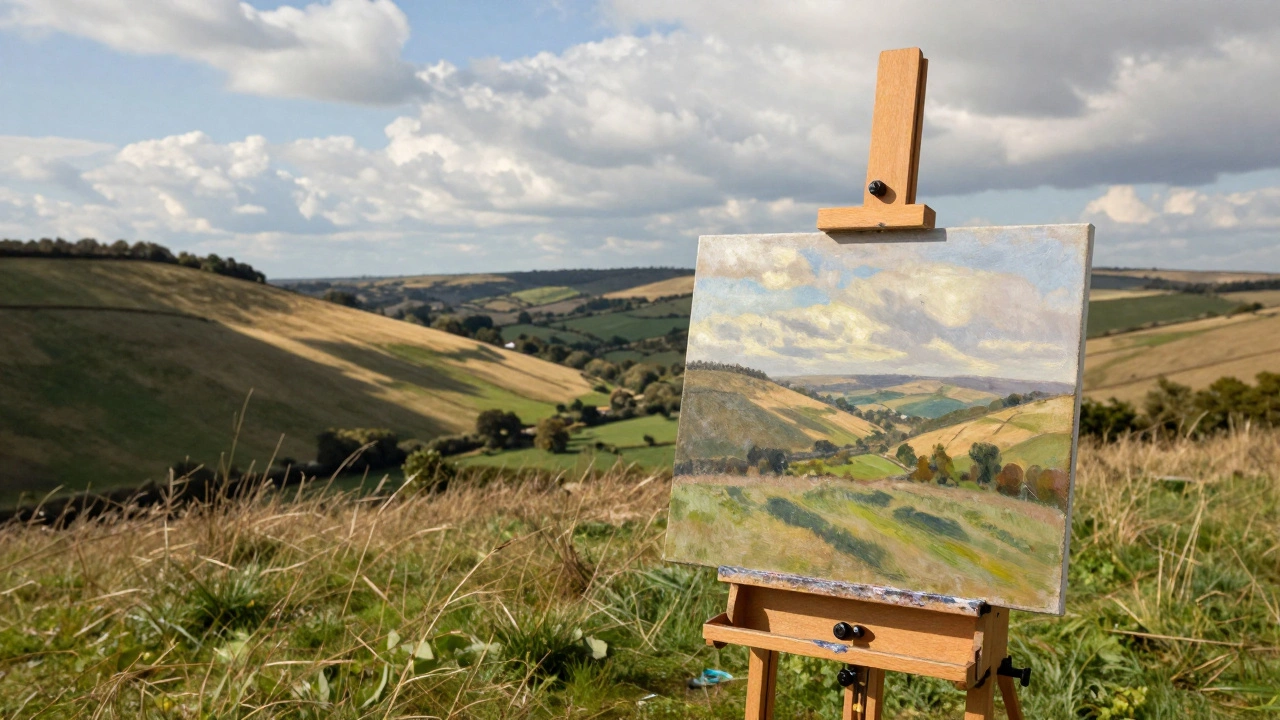
The Art of Plein Air Painting
There is a massive difference between painting a photo in a studio and Plein Air Painting (painting outdoors). When you're actually in nature, you're dealing with shifting light. A cloud might move, and suddenly the lighting on the hillside changes from bright yellow to deep shadow.
The key to successful outdoor painting is "blocking in." Don't start with the leaves on a tree; start with the big shapes. Squint your eyes until the landscape becomes a series of simple light and dark patches. Map those shapes out first. If you spend an hour detailing one branch, you'll find that by the time you move to the next tree, the sun has shifted, and your colors no longer match.
Using a French Easel-a portable, three-legged stand-allows you to move quickly and set up in various terrains. The challenge here is the clock. You have about two to three hours of consistent light before the atmosphere changes completely, so efficiency is everything.
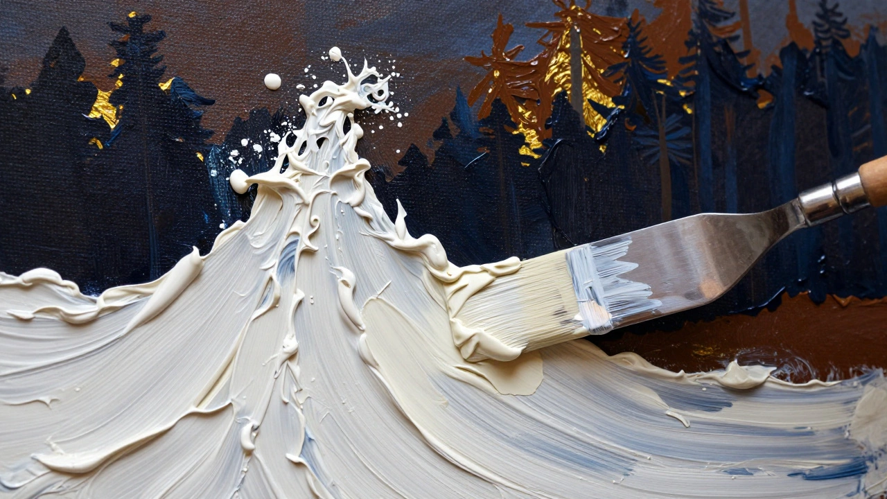
Mastering Texture and Brushwork
Texture is what gives a painting its tactile quality. If every part of your canvas is smoothed out, it looks like a photograph, not a painting. To avoid this, artists use Impasto, a technique where paint is applied very thickly, often with a palette knife instead of a brush. This creates physical ridges on the canvas that catch real light, perfect for the crest of a wave or the jagged edge of a rock.
For foliage, stop painting individual leaves. Instead, use "scumbling." This involves using a dry brush with a small amount of light-colored paint and lightly scrubbing it over a darker underlayer. This creates a flickering effect that mimics how light hits a canopy of trees. When you combine a dark, soft base with sharp, bright scumbled highlights, the trees suddenly feel 3D.
Don't forget about your edges. In a real landscape, things rarely have a hard black outline. Use "lost and found edges," where the edge of a hill blends almost invisibly into the sky. This creates a more natural, organic feel and prevents the painting from looking like a coloring book.
Composition and the Viewer's Journey
A great landscape painting acts as a map, leading the viewer's eye from the front to the back. You can do this using Leading Lines. A winding river, a dirt path, or even a row of fence posts can act as a visual arrow pointing toward your focal point.
Consider the "S-Curve" composition. Instead of a straight line, a curved path creates a sense of grace and movement. It slows the viewer down and makes them explore the painting. If you place your main subject-perhaps a lone cabin or a striking tree-at the intersection of the rule-of-thirds grid, it creates a natural balance that feels comfortable to the human eye.
Avoid the "bullseye" effect, where the most interesting thing is exactly in the center. This often feels static and boring. By offsetting your focal point, you create a dynamic tension that keeps the viewer engaged.
Common Pitfalls to Avoid
One of the biggest mistakes beginners make is using pure black for shadows. In nature, shadows are rarely black; they are usually deep blues, purples, or burnt sienna. Using a "chromatic black" (mixing dark blue and brown) makes your shadows feel airy and luminous rather than like a hole in the canvas.
Another common error is overworking the painting. When you keep brushing the same area, you destroy the texture and the colors become muddy. Knowing when to stop is a skill in itself. If a section looks "good enough," leave it alone. The magic of landscape art often lies in the suggestions you leave for the viewer's imagination to fill in.
Which is better for landscapes, oils or acrylics?
Neither is "better," but they serve different goals. Oils are superior for realistic blending and rich, deep colors due to their slow drying time. Acrylics are better for artists who want to work fast, layer colors quickly, or prefer a matte finish without the smell of solvents.
How do I make my mountains look far away?
Use atmospheric perspective. Make the mountains lighter in value, reduce the contrast between light and shadow, and shift the hue toward a pale blue or grey. Avoid adding sharp details like individual rocks or trees in the far distance.
What is the easiest way to paint clouds?
Start with a gradient sky. For the clouds, use a soft brush or a sponge to dab on white and light grey. Remember that clouds have a bottom (usually in shadow) and a top (where the sun hits). Avoid using pure white for everything; use a hint of yellow or pink for highlights and a touch of blue-grey for the undersides.
How do I stop my landscape from looking flat?
Focus on three distinct planes: foreground, middle ground, and background. Give the foreground the most detail, the darkest darks, and the brightest highlights. As you move back, simplify the shapes and mute the colors. Adding leading lines, like a path or stream, also helps pull the eye into the distance.
What are the best brushes for nature painting?
Flat brushes are great for blocking in large areas of sky or grass. Filbert brushes (rounded edges) are perfect for blending and creating organic shapes like clouds. Fan brushes are excellent for painting clusters of leaves or pine needles, and detail liners are used for the final, thin branches or distant birds.
Next Steps for Developing Your Style
If you've mastered the basics, try a "limited palette' challenge. Pick only three colors plus white and see how many variations you can create. This forces you to understand color mixing rather than relying on a tube of pre-mixed paint.
For those struggling with realism, try painting the same landscape at three different times of the day: dawn, noon, and dusk. Notice how the colors of the same rock or tree change completely. This will train your eyes to see light as a living element rather than a static color.
Finally, don't be afraid to fail. Landscape painting is as much about the process as the result. Every "ruined" canvas is just a lesson in what doesn't work, bringing you one step closer to a masterpiece.