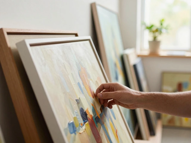
You can convert a sketch on cheap paper into a crisp file ready for Instagram, prints, or a client portfolio-without buying a $2,000 scanner. The trick isn’t magic software; it’s picking the right capture method for your piece, then doing a few precise edits. Expect 30-60 minutes per artwork once you learn the rhythm. I live in Wellington where the light changes its mood hourly, so I learned to build a dependable, repeatable setup you can count on-rain, wind, or perfect sun.
TL;DR
- Choose the capture method based on size and finish: scanner for flat/medium sizes, camera for large or glossy, tablet redraw for clean vector-like lines.
- Scan at 300-600 dpi, 16-bit if possible. For photos, use two lights at 45°, manual white balance, and shoot RAW.
- Edit non-destructively: crop, straighten, levels/curves, color correct with a gray card, clean dust, remove glare/paper texture if needed.
- Export masters as TIFF/PSD. Web: JPEG/PNG in sRGB. Prints: 300 dpi at final size; 600 dpi for line art.
- Back up and name files consistently. If you sell prints, soft-proof and check ICC profiles from your print lab.
Pick the right capture method (and avoid common traps)
The method you pick can save you hours-or wreck the color you worked for. Think about your piece’s size, surface, and how you plan to use the digital version.
- Scanner (flatbed): Best for drawings, watercolors, gouache, prints, and anything matte up to the bed size (A4/A3 on common consumer models). Pros: even light, sharp focus edge-to-edge, predictable color. Traps: specular highlights on textured media (metallic ink, thick impasto), bed size limits, stitching required for bigger work.
- Camera (DSLR/mirrorless/smartphone): Best for large pieces, canvases, gloss/varnish, mixed media. Pros: captures big works, control over light, great dynamic range (especially with RAW). Traps: glare, perspective warp, lens distortion, uneven lighting.
- Tablet redraw (iPad with Pencil, display tablet): Best when you want clean vector-like ink lines, recolor quickly, animate, or remix. Pros: unlimited undos, layers, fast edits. Traps: you’re redrawing, not capturing the original pigment; different vibe.
- Vectorization (Illustrator/Inkscape): Best for logos, graphic posters, line art. Pros: infinite resolution, tiny files. Traps: watercolor gradients and soft shading look chunky unless manually refined.
Rule of thumb: if surface texture is subtle and size fits the scanner, scan. If it’s glossy, textured, or big, photograph with controlled lights. If you need scaleless lines and flat fills, redraw or vectorize.
Step-by-step workflows that actually work
I’ll give you reliable sequences you can repeat. Use what maps to your piece.
Scanner workflow (Epson/Canon, etc.)
- Dust the glass and your artwork. A blower and microfiber cloth are your friends. One stray hair looks like a telephone pole at 600 dpi.
- Disable auto filters in the scan software (auto contrast, sharpening). Set color to 24-bit color (or 48-bit/16-bit per channel if available), TIFF format, and turn off compression.
- Resolution: 300 dpi for color artwork at final print size; 600 dpi for line art or if you might print larger; 1200 dpi for pen-and-ink with tiny hatching.
- White balance: if your scanner supports a color target, scan a gray card or ColorChecker in the same pass for reference. If not, we’ll fix it later.
- Preview, set crop just outside the art, and scan. If the piece is larger than the bed, scan in overlapping tiles (25-30% overlap) to stitch later.
- Stitch big pieces: use Lightroom Photography Plan (Photo Merge > Panorama, perspective mode) or Photoshop (File > Automate > Photomerge) or Affinity Photo’s Stitch Panorama. Keep the layer masks; nudge seams if needed.
Camera workflow (DSLR/mirrorless or phone)
- Mount the art vertical on a wall or flat on the floor. Keep it flat without warps. If framed behind glass, remove the glass to avoid reflections.
- Lighting: place two identical lights at roughly 45° to the artwork, equal distance, same height. LED panels with high CRI (95+) are ideal. If you see hot spots, move lights farther and angle them until glare disappears.
- Camera setup: use a 50mm or longer focal length on full frame (35mm+ on APS-C) to reduce distortion. Mount on a tripod. Center the lens perpendicular to the artwork’s center. Use a spirit level or the camera’s level overlay.
- Color: place a gray card or ColorChecker near the piece for one reference shot. Set manual white balance using the card, or correct later in RAW.
- Exposure: shoot RAW. Use base ISO (100-200), aperture around f/5.6-f/8 for sharpness, shutter speed as needed. Use a remote or self-timer to avoid shake.
- Take a bracket: one at meter reading, one -0.7 EV, one +0.7 EV. It’s cheap insurance for tricky whites and darks.
- For glossy/varnished surfaces: add polarizing filters to both the lights (linear films) and a circular polarizer on the lens for cross-polarization. Rotate the lens polarizer until glare vanishes.
Phone-only setup (works surprisingly well)
- Use a stable stand or DIY rig (books + a board). Enable the grid and level in camera settings. Lock exposure and focus (AE/AF lock) after tapping the art.
- Light the art evenly-window light from a bright but overcast day in Wellington works a treat. Avoid direct sun. If you see shadows, rotate the art until it disappears.
- Shoot in RAW (ProRAW/RAW on iPhone/Android). Keep ISO low; prop the phone so you can use a slower shutter without blur.
- Take a gray card shot first, then the art. Don’t use HDR if it creates halos; compare both.
Tablet redraw (Procreate 2024/2025, Clip Studio, Affinity Designer)
- Photograph or scan your sketch lightly. Import it as a top layer, reduce opacity to 15-25%, set to Multiply.
- Create a new layer underneath and ink with a pressure-sensitive brush. Keep a consistent canvas: at least 4000 px on the long edge at 300 dpi if you plan to print.
- Use vector layers if your app supports them (Affinity Designer, Illustrator on iPad) for perfect curves and easy recolors.
- Export a master (PSD/Procreate file/Affinity file) and a flattened TIFF/PNG as needed.
Vectorization (Illustrator 2025, Inkscape 1.3+)
- Start with a high-contrast scan or photo. Clean dust first.
- Illustrator: Window > Image Trace. Try Presets: “Black and White Logo” for line art or “6 Colors”/“16 Colors” for posters. Adjust Threshold (line art) or Colors/Paths/Noise (color art). Expand to convert to paths.
- Inkscape: Path > Trace Bitmap. Use “Brightness cutoff” for line art or “Color quantization” for color. Tweak Smoothing and Stack Scans if layering colors.
- Manually correct trouble spots with the Pen tool. Vector looks clean but merciless-simplify paths for a natural feel.
Clean up, color-manage, and export like a pro
This is where your capture becomes a polished asset you can send to a client or a print lab. A few small moves here do more than expensive gear.
Non-destructive edits (Photoshop, Affinity, or free: GIMP/Krita)
- Crop and straighten first. In Photoshop: Crop tool with “Straighten.” In Affinity: Crop with straightening handle.
- Levels/Curves: set true whites and blacks without nuking midtones. In Levels, alt/option-drag the white/black sliders until pixels just begin to clip.
- White balance: use a Gray Point picker on your gray card shot. No card? Find a neutral area in the art (paper edge) and sample carefully.
- Remove dust and specks: Spot Healing/Heal Brush. For heavy paper texture you don’t want, duplicate layer > High Pass with low radius > blend modes or use Frequency Separation for precise texture control.
- Perspective fix (if photographed): use Perspective Warp/Transform. Match the frame edges to the canvas edges.
- Line art cleanup: convert to grayscale, then use a Levels push or Threshold for crisp black ink. For antialiased lines, try a gentle Unsharp Mask after resizing.
- Noise and sharpening: noise first (light if needed), then a modest sharpening (0.5-0.8 radius). Zoom to 100%-sharpening at fit-to-screen lies.
Color management in plain English
- Work in a color-managed app. Set your working space to sRGB for web, Adobe RGB if you shoot/edit RAW and intend to print. Keep profiles embedded.
- Soft-proof for prints using your lab’s ICC profile (ask them; reputable labs provide this). Toggle “Simulate Paper & Ink” to see how whites and blacks will shift.
- CMYK? Let the print shop convert unless they ask for CMYK. If you must convert, use their CMYK profile (e.g., ISO Coated v2) and check for gamut clipping.
- Standards exist for a reason: ICC profiles define how colors translate between devices; many print houses align with ISO 12647 process control. Use their guidance before you hit export.
File formats: what to keep, what to send
- Master: TIFF (no compression) or PSD/AFPHOTO with layers, 16-bit if you captured that way.
- Web/social: JPEG (quality 80-90) or PNG for transparency/flat graphics. Always in sRGB.
- Print: TIFF or high-quality PDF. 300 dpi at final size (600 for line art). Embed profile.
- Vector deliverables: SVG, PDF/X-4, or AI; keep a simplified path version for cutting/plotting.
PPI vs DPI
PPI is pixels per inch in your file. DPI is dots per inch in printing hardware. For your prep, think in PPI. Here’s a quick size-to-pixels cheat sheet.
| Print size (inches) | Pixels @ 300 PPI | Pixels @ 600 PPI (line art) |
|---|---|---|
| 5 × 7 | 1500 × 2100 | 3000 × 4200 |
| 8 × 10 | 2400 × 3000 | 4800 × 6000 |
| A4 (8.27 × 11.69) | 2481 × 3508 | 4961 × 7016 |
| 11 × 14 | 3300 × 4200 | 6600 × 8400 |
| 16 × 20 | 4800 × 6000 | 9600 × 12000 |
| 24 × 36 | 7200 × 10800 | 14400 × 21600 |
Quick formula: pixels = inches × target PPI. So a 12-inch width at 300 PPI needs 3600 pixels across. If your capture falls short, use a top-tier upscaler (Photoshop’s Enhance Super Resolution, Lightroom’s Denoise + Upscale, or dedicated tools) before sharpening.
AI helpers (smart, not magic)
- Upscale: Photoshop/Lightroom Enhance or Topaz Gigapixel can double resolution cleanly for most pieces.
- Dust/scratch removal: AI-powered Remove Tool in Photoshop 2024/2025 or Affinity 2’s inpainting saves time on specks.
- Glare reduction: no AI beats proper lighting. Fix it at capture.
Checklists, examples, FAQ, and next steps
Fast gear checklist
- Scanner workflow: flatbed scanner (Epson/Canon), microfiber cloth, blower, ruler for straightening, gray card/ColorChecker (optional but helpful).
- Camera workflow: camera + 50mm+ lens, tripod, two matching lights (CRI 95+), polarizing filter (and polarizing film for cross-polarization if glossy), gray card.
- Phone workflow: phone with RAW, stable stand, window light or two lamps with the same bulbs, gray card (credit-card size works).
- Editing: Photoshop or Affinity Photo (paid), or GIMP/Krita (free). For vector, Illustrator 2025 or Inkscape.
Capture checklist (pin this)
- Clean glass/artwork. Turn off all auto “enhance” features during capture.
- Check alignment and level. Keep the camera perpendicular to the art.
- Manual white balance with a gray card if possible.
- Shoot/scan a little larger than needed to allow clean cropping.
- Take a bracket (photos) or a second scan at higher dpi for line work.
Edit/export checklist
- Crop/straighten, levels/curves, remove dust, fix perspective, gentle sharpen.
- Embed sRGB for web; use your lab’s ICC for soft-proofing and export.
- Master file: layered TIFF/PSD, 16-bit if available.
- Client/web: JPEG/PNG; Prints: TIFF/PDF at 300 PPI (600 for line art).
- Back up to two places (local + cloud). Name files consistently: 2025-09-Title-Size-v01.tif.
Real-world examples
- Watercolor on cold press: scan at 600 dpi to capture grain; in edits, lower texture if it fights the image; soft-proof for a matte paper profile to keep the gentle whites. In Wellington’s changeable light, a scanner beats sunlit photos every time for this.
- Glossy acrylic on canvas: photograph with cross-polarization. Without it, you’ll chase glare forever. Warm lights can shift blues; a gray card fixes that in one click later.
- Pen-and-ink comic page: scan at 1200 dpi, convert to bitmap (50% threshold) or keep grayscale and sharpen. Export two files: a transparent PNG for layout and a 1200 dpi TIFF master for print.
- Poster with flat colors: vectorize in Illustrator with 16 Colors, expand, and clean corners with the Pen tool. Export as PDF/X-4 for print, SVG for web.
Common pitfalls (and quick fixes)
- Colors look dull on the web: you exported without sRGB. Re-export with sRGB embedded.
- Muddy blacks: you clipped shadows or used too much noise reduction. Revisit Levels; watch the histogram; add modest contrast with Curves.
- Wavy edges/warped lines: camera wasn’t squared to the art. Use Perspective Warp, but it’s better to re-shoot correctly.
- Paper looks gray: wrong white balance. Sample a gray card or the paper margin with the Gray Point tool.
- Haloing on lines: heavy sharpening at low resolution. Upscale first, then sharpen gently.
Mini-FAQ
- How big can I print from a 12 MP phone photo? A 12 MP image is about 4000 × 3000 pixels. At 300 PPI, that’s roughly 10 × 13 inches. For larger, upscale with a good algorithm, then sharpen.
- Should I scan in RGB or CMYK? Scan in RGB. Convert to CMYK only if your printer requests it and provides a profile. RGB keeps more color until the last step.
- Do I need a color-calibrated monitor? It helps a lot. A basic hardware calibrator once a month keeps you aligned with print labs. If you don’t have one, proof small prints and adjust by eye.
- Best affordable scanners right now? Flatbeds with good optical resolution (not interpolated) and 48-bit color depth are safe picks. Models in the Epson Perfection and Canon LiDE lines remain solid in 2025.
- What DPI should I choose for social media? Don’t think in DPI-think pixel dimensions. 2048 px on the long edge looks clean on most platforms; export JPEG quality around 80-90 in sRGB.
Next steps
- Build a repeatable capture corner: two lights, a backdrop, tripod marks on the floor. Saves time every session.
- Create export presets: one for web (sRGB JPEG 85, 2048 px long edge), one for shop prints (TIFF, 300 PPI, embedded lab ICC), one for archives (TIFF 16-bit, layers kept).
- Document your workflow: a simple checklist taped to your desk prevents missed steps on busy days.
- Test your print lab: order a small test print with a calibration chart and your art. Adjust once, then you’re dialed.
I’ve messed this up before-years ago I scanned a charcoal piece at 72 dpi and only realized when a gallery asked for a print. Had to photograph it again in a rush before a southerly slammed into town and took my light with it. Don’t learn that one the hard way. Save a master, name it clearly, and you won’t have to redo anything when opportunities show up.
One last thing: consistency beats fancy gear. Whether you scan or shoot, aim to capture the same way every time. Edit with a light touch, export for the exact use, and back everything up. That’s how you turn art into digital art you can rely on-today, next month, and when the big client finally emails.