Difference in Art: Spotting Key Contrasts Across Styles, Mediums, and Techniques
Ever wonder why some paintings look flat while others feel alive? The answer often lies in the subtle differences between styles, materials, and methods. Knowing those differences can make you a smarter viewer, a more confident creator, and a better buyer. Below are the most common contrasts you’ll run into on our site.
Classic vs Contemporary: What Really Sets Them Apart?
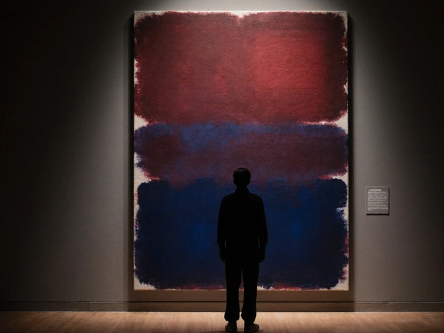
Classic art leans on tradition. Think realistic portraits, balanced composition, and a muted color palette rooted in centuries‑old rules. Contemporary work throws those rules out the window. It plays with abstraction, bold colors, and unconventional materials like plastic or digital projection. Look at a Renaissance portrait and a 2020 installation side by side – the classic piece tells a story with careful detail, while the contemporary piece asks you to feel a concept.
One practical way to tell them apart is the use of space. Classic pieces often create a clear foreground, middle ground, and background. Contemporary artists might flatten the picture plane, making the entire surface feel like a single moment. If you spot a lot of texture, mixed media, or a statement about today’s culture, you’re likely looking at contemporary art.
Acrylic vs Oil: Which Medium Wins for Portraits?
Acrylic dries fast, so you can layer colors in minutes. That speed is great for beginners who don’t want to wait days for a painting to set. However, the quick dry time can make blending skin tones tricky. Oil paint stays wet longer, giving you more time to smooth transitions and create realistic depth. The trade‑off is patience – you’ll wait weeks for layers to cure.
If you’re deciding which to try, ask yourself how you work. Do you like fast, energetic sessions? Grab acrylics. Prefer a slower, more contemplative process? Oil paint is your friend. Also, consider cleanup: acrylics use water, oil paints need solvents, which adds cost and ventilation concerns.
Other Everyday Differences You’ll Find
Scanning a drawing versus photographing it changes the final look. Scanners capture flat, even lighting but can miss texture. Cameras let you showcase brush strokes and canvas grain, but lighting becomes your responsibility. When you read about “rolling watercolor paintings,” the difference lies in paper type – thick, heavy paper tolerates rolling, while thin paper crinkles.
Even terms like “slow over fast” in oil painting highlight a practical difference. Applying slow‑drying paint over fast‑drying layers prevents cracking. It’s a rule that keeps your work stable for years. Forgetting it can ruin a masterpiece, so treat it like a safety tip.
Understanding these differences doesn't require an art degree. Just pay attention to the details the author points out, compare a few examples, and practice the technique yourself. Next time you browse a gallery or start a new project, you’ll notice the little tweaks that make a huge impact.
So, whether you’re choosing a medium, deciding between classic and modern, or figuring out the best way to digitize your work, remember that the difference is often in the process, not just the final product.
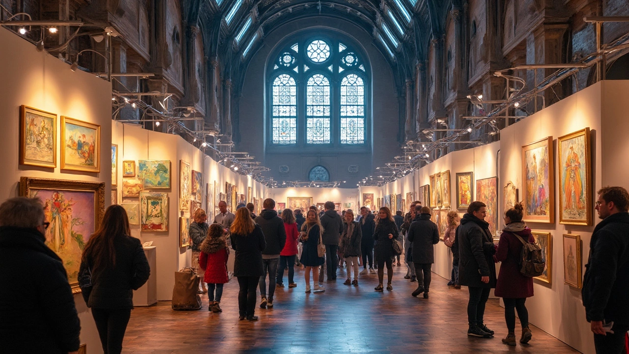
Art Fair vs Art Exhibition: What Sets Them Apart?
Ever wondered what makes an art fair different from an art exhibition? Both showcase art, but their purposes, setups, and vibes aren't the same at all. This article cuts through the confusion with real-world examples, tips, and honest comparisons. By the end, you'll know exactly where you want to spend your Saturday (or your next paycheck). Get ready to see the art world with fresh eyes.
Continue Reading
Understanding the Differences: Art Prints vs Regular Prints
Dive into the intriguing world of prints, distinguishing art prints from regular prints. This article explores the unique characteristics and production methods that set these two apart, while offering insights into their uses. Ideal for art enthusiasts and collectors, gain a deeper understanding of how these prints differ in presentation and value. Detailed yet accessible, it’s an engaging read for anyone interested in art.
Continue ReadingCategories
Most popular
-
 Beginner Sculpture Ideas: What to Make First May 18 2025
 -

-
 What Draws People to Abstract Art? Nov 17 2025
 -
-
 Are Art Prints Just Posters? Mar 17 2025