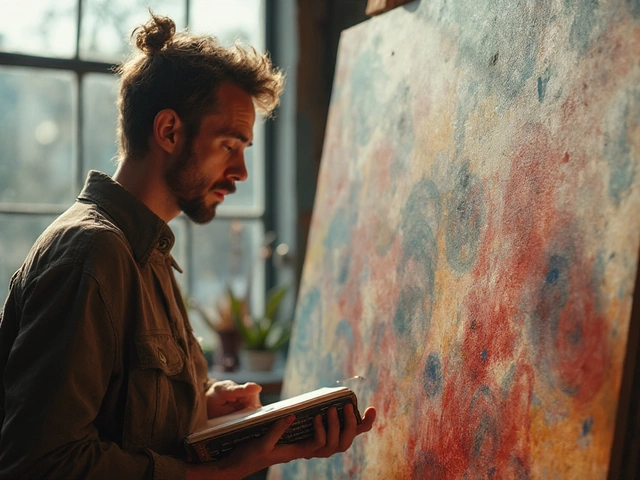
Dark vs Light in Art: Mastering Contrast for Stronger Visuals
Ever wondered why some paintings hit you with an instant emotional punch while others feel flat? A big part of that impact comes from how the artist handles dark vs light. By playing with contrast, you can guide the viewer’s eye, create drama, and suggest depth without adding extra details.
Think of contrast like a conversation between shadows and highlights. When you let the dark areas speak loudly, the bright spots become more noticeable, and vice‑versa. This simple push‑pull can turn a basic still life into a compelling scene.
Quick Ways to Boost Dark vs Light in Your Work
1. Start with a Value Sketch. Before you reach for color, block out the lightest and darkest shapes using just a pencil or charcoal. This forces you to see where the biggest gaps are.
2. Use a Limited Palette. Pick two or three colors and mix them to get a range of tones. Fewer colors make it easier to judge how light and dark relate.
3. Flip Your Canvas. Turn the artwork upside down and step back. Suddenly you’ll spot areas that look too flat or overly busy.
4. Introduce a Single Light Source. Decide where the light is coming from—window, lamp, sunrise—and stick to it. Consistent lighting keeps shadows believable.
Everyday Exercises to Train Your Eye
Grab a coffee mug and a phone flash. Snap a photo, then recreate the scene using only charcoal. Notice how the dark coffee stains and the bright gleam on the metal create a natural rhythm.
Another easy drill: take a printed page, cover half with a piece of paper, and shade the uncovered half with a pencil. Compare the contrast you achieve with the natural contrast on a black‑and‑white photo. The goal is to feel the weight of darkness and the lift of light.
When you start to see how dark vs light works in everyday objects, you’ll bring that instinct into your paintings, drawings, and even digital art. Remember, you don’t need fancy gear—just a willing eye and a few minutes of practice each day.
In the end, mastering dark vs light is about listening to what each tone says. Let the shadows tell a story, let the highlights celebrate the subject, and you’ll find your art gaining a new level of depth and mood.
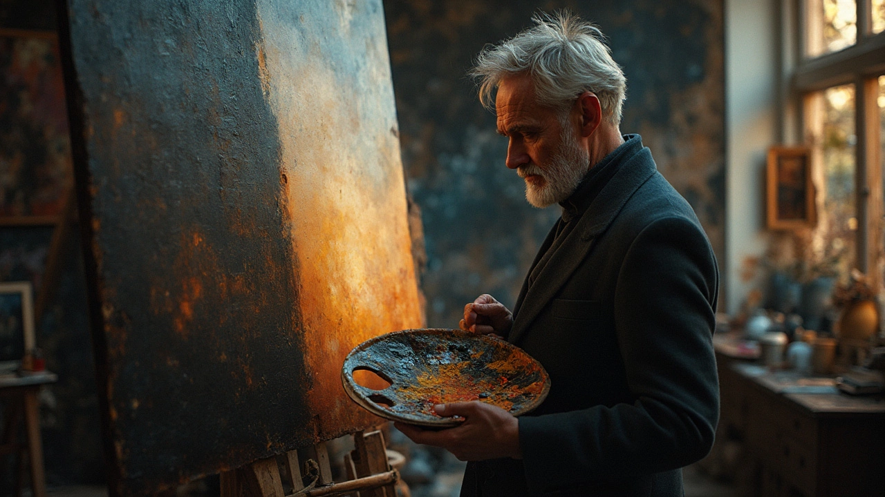
Start Your Oil Painting Journey: Dark vs. Light
In the world of oil painting, understanding whether to start with dark or light hues can influence the outcome of your art piece. This article explores the benefits of each technique, offering practical tips and insights to help you find the approach that suits your style. Discover how these foundational choices affect mood, depth, and composition. Follow along to enhance your painting with advice that's as colorful as your palette.
Continue ReadingCategories
Most popular
-
 Is It Legal to Print Art for Personal Use? Feb 9 2025
 -
-
-

-