Key Takeaways
- Start with the background to establish values, color harmony, and atmosphere.
- Use a quick underpainting or value study to lock in composition before adding details.
- Work from thin to thick, light to dark, keeping the wet‑on‑wet technique for large areas.
- Reserve glazing for depth and mood after the main forms are dry.
- Adapt the order to your style, but follow a logical workflow to avoid rework.
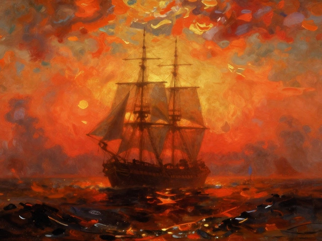
When you pick up a brush for a Landscape painting is a genre that depicts natural scenery such as mountains, valleys, trees, rivers, and forests, the first question that pops up is: should I block in the sky and hills first, or jump straight into the trees and rocks? The answer isn’t a hard‑and‑fast rule, but a well‑tested painting order that many artists swear by. By following a step‑by‑step workflow you’ll save time, keep your canvas clean, and end up with a more cohesive piece.
Why the Order Matters
Painting is a layered process. Each layer depends on the one underneath for support, value, and color relationships. If you start with the foreground and later realize the background needs a shift in hue, you’ll end up scrubbing away details you just spent hours perfecting. A logical order helps you:
- Establish the overall value structure early.
- Set a consistent light source that guides every element.
- Maintain a clean workflow that limits over‑painting.
- Control drying times, especially when using oil or acrylic mediums.
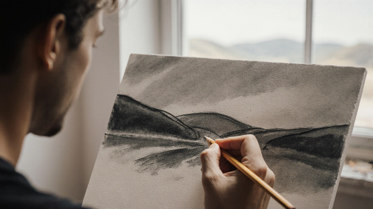
Step 1 - Value Study (The Skeleton)
Before the first dab of pigment, grab a charcoal pencil or a thinned acrylic wash and sketch a quick value study is a grayscale layout that shows light and dark areas without color. This step is the backbone of any good landscape. Focus on:
- Where the brightest highlights sit (often the sky or water reflections).
- The darkest shadows (usually under trees, rocks, or in low‑lying valleys).
- The middle‑tone masses that will become your base colors.
Keep the study loose-think 5‑minute gesture drawing. When you later translate those values into color, you’ll have a reliable roadmap.
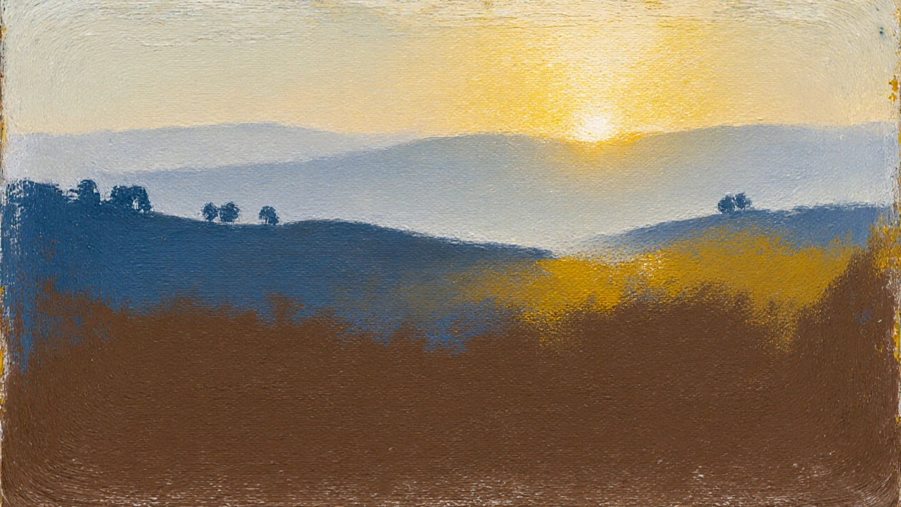
Step 2 - Underpainting the Background
The next move is to lay down an underpainting is a thin, monochrome layer that defines tonal relationships before color is added for the sky, distant hills, and far‑off foliage. Use a limited palette (often a mix of burnt umber, ultramarine, and a touch of yellow ochre) to keep the tones unified. Techniques that work well here include:
- Wet‑on‑wet: Apply a thin glaze of sky color while the canvas is still damp for smooth gradients.
- Dry brush: Roughly suggest distant tree silhouettes without worrying about detail.
This layer should stay thin enough to see through; the goal is to establish atmosphere and depth, not finish the scene.
Step 3 - Blocking In Major Color Shapes
With the underpainting set, start adding the first color washes for the background. Keep the palette limited-think three to four colors that relate to each other (a warm ochre, a cool blue‑green, a muted violet). By grouping similar hues you’ll avoid a chaotic mess and keep the overall harmony consistent.
Remember the rule of color harmony is the balanced arrangement of colors that creates visual cohesion. Complementary pairs (like blue/orange) work well for sky‑ground contrast, while analogous shades (green‑yellow‑blue) help blend distant foliage.
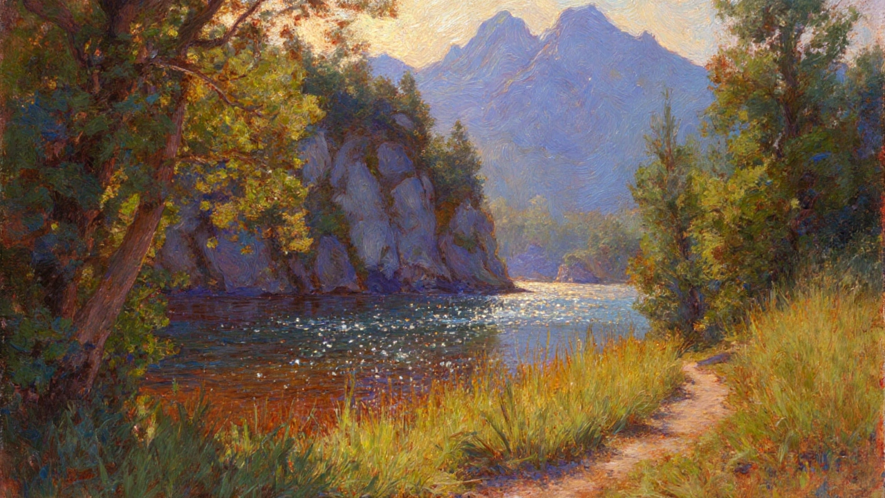
Step 4 - Defining the Midground
Now you can start shaping the midground elements-trees, rocks, water bodies-using slightly thicker paint. At this point you’ll switch from broad washes to more confident strokes. Techniques to consider:
- Palette knife: Scrape in the texture of rocky cliffs or bark.
- Scumbling: Lightly drag a dry brush over wet paint to suggest leaf clusters.
Keep your brushwork looser the farther the object is from the viewer. This mimics atmospheric perspective: distant forms appear softer and bluer.
Step 5 - Foreground Details and Highlights
The foreground receives the most attention. Here you’ll add the fine details that draw the eye-individual leaves, grass blades, water ripples. Since the foreground sits in front of everything else, you can afford to use higher contrast and richer saturation.
Pay close attention to edge softness. Hard edges give the impression of objects that are close; soft edges suggest depth. When you paint a path or a riverbank, use a slightly darker value for the edge that catches the light and a lighter reflectance for the opposite side.
Step 6 - Glazing for Depth and Mood
Once the main forms dry (usually after a few hours for acrylics, a day for oils), apply thin glazes to enrich colors and unify the piece. A glaze of burnt sienna over distant foliage can add a warm, sun‑kissed feel, while a cool blue glaze over water can deepen its sense of depth.
Mix your glaze with a medium (like a glazing fluid or a small amount of linseed oil) to keep it transparent. Apply in thin layers, allowing each to dry before adding the next. This builds luminous depth without muddying colors.
Comparing Two Common Approaches
| Approach | Pros | Cons |
|---|---|---|
| Background‑First | Establishes value & light early; easier to fix color shifts later; supports atmospheric perspective. | May feel slower for artists who like to dive into details first. |
| Foreground‑First | Gives instant visual impact; good for sketch‑style works. | Risk of reworking background to match foreground; can cause color clashes. |
Common Pitfalls and How to Avoid Them
Pitfall 1: Ignoring the Light Source - If you paint a bright sky but then add dark foreground elements without a consistent light direction, the scene looks flat. Always decide where the sun (or moon) sits before you begin.
Pitfall 2: Over‑Blending - Trying to make every transition seamless leads to a “muddy” look. Keep some texture in the background, especially in atmospheric layers.
Pitfall 3: Too Many Colors Early On - Introducing a full palette at the first step overwhelms the value structure. Stick to a limited range, then broaden later with glazes.
Tips for Faster, Cleaner Workflow
- Prep a limited palette on a separate mixing surface; add new hues only when the base layers are dry.
- Use masking fluid or tape for crisp horizon lines, then remove once the background dries.
- Keep a wet‑edge when applying large washes; this avoids hard lines between strokes.
- Label your brushes by size and shape, so you can quickly grab the right tool for each stage.
Adapting the Order to Your Style
Not every artist follows the exact sequence above. Some painters favor a more plein air approach-sketching quick color blocks on site, then refining in the studio. Others might start with a thick impasto foreground for expressive effect and let the background emerge later. The key is to understand why a traditional order works, then tweak it consciously rather than stumbling into chaos.
Frequently Asked Questions
Do I always have to start with the background?
Most artists find a background‑first approach helps lock in values and light, but it isn’t a rule. If you’re comfortable painting a strong foreground first and can later adjust the background, go for it. Just be prepared to rework the back layers if needed.
What medium works best for the layered workflow?
Acrylics dry fast, making the layered method easy for beginners. Oils stay wet longer, allowing more blending, but you’ll need longer drying times between layers. Both work; choose the one that matches your schedule.
How many colors should I limit myself to in the first stage?
Aim for three to four base colors plus a neutral (like burnt umber). This keeps the underpainting harmonious and prevents color clashes when you add details later.
Can I use the same workflow for watercolor?
Watercolor demands a more fluid approach because the paper can’t handle heavy rework. Still, start with a light wash for the sky and distant forms, then build up to darker, more detailed areas-mirroring the background‑first concept.
What’s the best way to keep the paint from becoming too muddy?
Clean your brush between color changes, work with thin layers, and let each glaze dry before adding the next. Also, avoid mixing complementary colors directly; instead, place them side by side for visual contrast.