Portrait Proportion Calculator & Guide
Stop guessing where the eyes go! Use this calculator to determine standard facial landmarks based on head height, and get personalized tips based on your chosen medium.
1. Calculate Proportions
Your Facial Map:
- Eye Line: Exactly at from top.
- Nose Base: At from top.
- Mouth Center: At from top.
- Chin: At from top.
2. Choose Your Medium
Recommended Workflow for
Step-by-Step Guide
Pro Tip
Visualize the Proportions
Note: These are idealized averages. Always observe your specific reference!
Staring at a blank canvas while trying to capture a human face can feel like trying to nail jelly to a wall. You know what a face looks like, but the moment you put brush to paper, the eyes slide apart, the nose grows three inches, and the result looks less like your friend and more like an alien who’s never seen Earthlings before. If that sounds familiar, you’re in good company. Portrait art is one of the most challenging genres in visual arts because humans are hardwired to spot imperfections in faces instantly. We notice when an eye is slightly off-center or a jawline feels too sharp. But here’s the secret: it’s not about magic talent. It’s about breaking the face down into shapes, understanding light, and practicing specific techniques that bypass our brain’s tendency to draw symbols instead of reality.
The Mental Shift: Stop Drawing Symbols
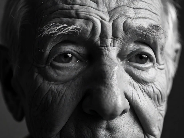
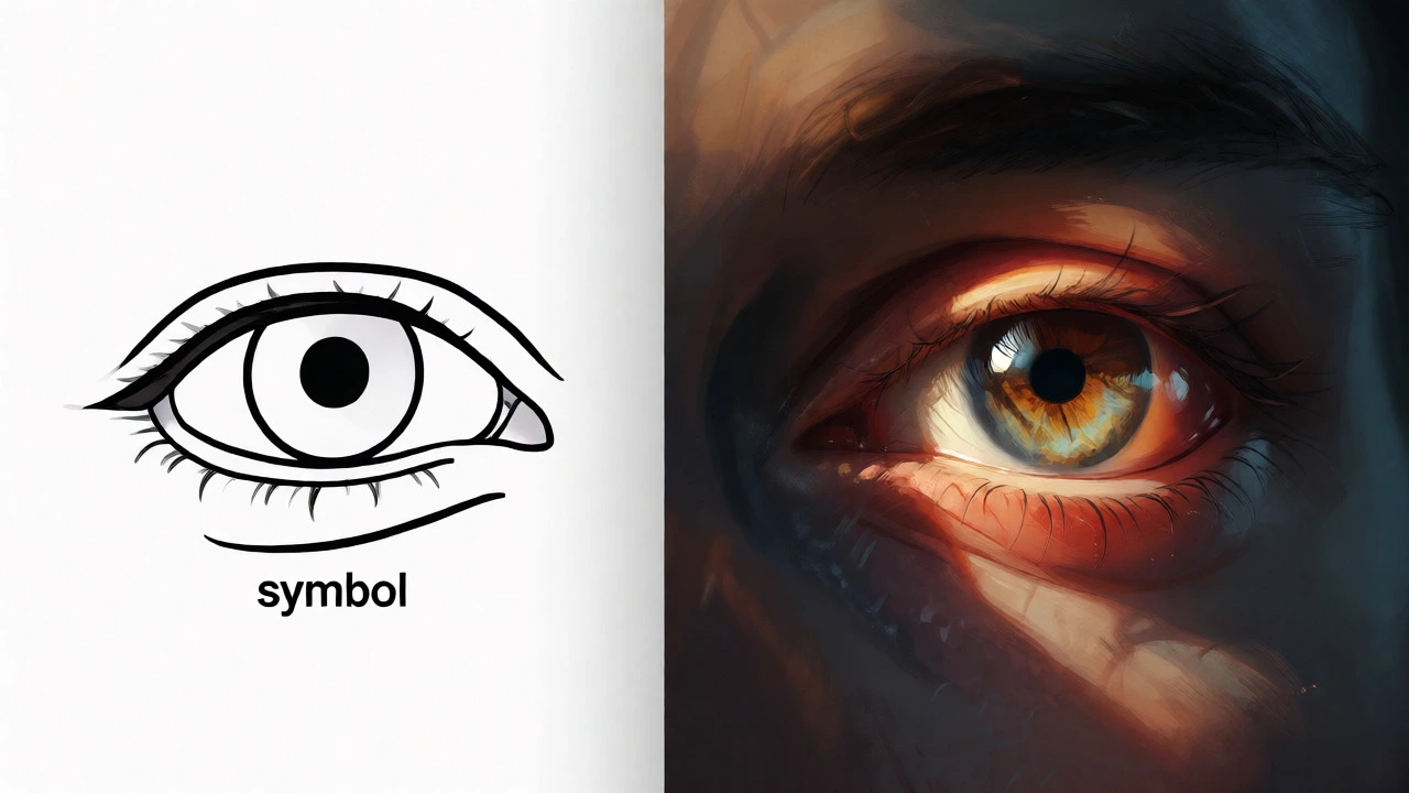
Most beginners fail at portraits because they draw what they think they see, not what is actually there. When asked to draw an eye, most people draw an almond shape with a circle inside. That’s a symbol. A real eye is a complex arrangement of lids, lashes, highlights, and shadows that rarely look like a perfect almond. To start portrait art effectively, you have to unlearn these shortcuts. Look at a photo of a face and squint. Notice how the eye socket is often darker than the eyeball itself? See how the nose isn’t a triangle sitting on the face, but rather a play of light and shadow where the actual lines might be invisible?
This shift from symbolic thinking to observational thinking is step one. Grab a mirror. Look at yourself for five minutes without drawing. Just observe. Where does the light hit? Where do the shadows pool under the chin or beside the nostrils? This simple act of seeing correctly saves hours of frustration later. Your goal isn't perfection yet; it's accuracy in observation.
Choosing Your First Medium
You don’t need expensive oils to start. In fact, starting with graphite pencils is often better for learning structure. Graphite allows you to erase mistakes easily, which is crucial when you’re still figuring out proportions. Once you’re comfortable with pencil shading, you might move to charcoal for its dramatic contrast, or pastels for a softer, painterly look. Oil paints offer rich colors and slow drying times, giving you time to blend, but they require solvents and ventilation. Acrylics dry fast, which can be tricky for blending skin tones unless you use retarders.
For a total beginner, I recommend a set of graphite pencils (HB through 6B) and a sketchpad. Why? Because low stakes encourage experimentation. If you ruin a page, you just turn it over. There’s no guilt about wasting expensive paint. Once you can render a convincing grayscale face, moving to color becomes significantly easier because you’ve already mastered value-the relative lightness or darkness of a tone-which is actually more important than color in portraiture.
| Medium | Learning Curve | Cost | Best For |
|---|---|---|---|
| Graphite Pencil | Low | $10-$20 | Structure, Proportions, Shading |
| Charcoal | Medium | $15-$30 | Dramatic Contrast, Gesture |
| Colored Pencils | Medium | $30-$80 | Detail, Controlled Color Blending |
| Acrylic Paint | High | $40-$100 | Fast Layering, Mixed Media |
| Oil Paint | High | $60-$150+ | Realistic Skin Tones, Blending |
Mastering Facial Proportions
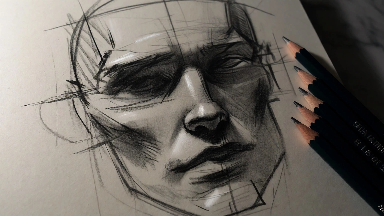
Before you worry about lighting, get the map right. Human faces follow predictable patterns, though everyone has unique variations. The standard rule of thumb taught in art schools is that the eyes sit halfway down the head. Yes, halfway. Most beginners place them too high, making the forehead look tiny and the chin look enormous. Measure from the top of the skull to the bottom of the chin. Mark the midpoint-that’s where the eyes go.
Next, divide the space between the eyes and the chin into thirds. The first third ends at the bottom of the nose. The second third ends at the base of the lower lip. The final third is the chin. The mouth usually sits two-thirds of the way down from the nose to the chin. These guidelines aren’t rigid laws-some people have longer chins or wider foreheads-but they provide a safe starting grid. Draw this grid lightly on your paper before adding any detail. If the grid is wrong, the portrait will always feel "off," no matter how well you shade the cheeks.
Understanding Value and Light
Color is secondary to value. If your values are correct, a black-and-white drawing will look realistic. If your values are wrong, even perfect colors will look flat. Think of a face as a collection of planes. The forehead, cheekbones, nose bridge, and chin catch the most light. The sides of the nose, the area under the lips, and the neck fall into shadow. When you start painting or shading, identify the single strongest light source. Is it coming from above? From the side? From behind? Shadows tell us where the form turns away from the viewer. Don’t just fill in shadows with gray. Use cool grays for shadows and warm tones for lights if the light is warm (like sunlight). This temperature contrast creates depth. A common mistake is making all shadows uniform. Real shadows reflect light bouncing off nearby objects, so they often contain hints of color from the environment.
Step-by-Step Workflow for Your First Portrait
Ready to try? Follow this workflow to keep things organized:
- Reference Selection: Choose a photo with clear, directional lighting. Avoid harsh flash photography that flattens features. Natural window light is ideal.
- Ghost Lines: Lightly sketch the overall oval of the head. Then add the crosshair for eye level and vertical center line. Check symmetry against your reference.
- Block In Shapes: Roughly outline the hairline, eyebrows, nose, and mouth. Keep lines loose. Do not commit to details yet.
- Establish Values: Squint at your reference. Block in the darkest darks (pupils, nostril openings, deep shadows). Leave the brightest lights white (or unpainted).
- Mid-Tones: Fill in the middle values. This is where the skin texture and form emerge. Blend carefully to avoid muddy transitions.
- Details Last: Only add eyelashes, stray hairs, and skin pores once the big forms are solid. Details should enhance the illusion, not create it.
Common Pitfalls and How to Fix Them
One major issue is the "floating ear." Beginners often forget that ears align with the eyes and nose vertically. Another trap is ignoring the hairline. Hair frames the face; getting the hairline shape wrong distorts the entire head proportion. Also, watch out for "dead eyes." Eyes need a highlight-a tiny reflection of the light source-to look alive. Without it, they look glassy and lifeless. If your portrait looks distorted, flip your image horizontally (if digital) or hold it up to a mirror (if traditional). This reverses the orientation and makes errors jump out immediately. It’s a trick professional artists use constantly because our brains adapt to our own mistakes after staring at them for too long.
Building a Daily Practice Routine
You won’t get good by doing one masterpiece every six months. You’ll get good by doing ten quick studies a week. Set aside 15 minutes daily. Draw a hand. Draw an ear. Draw just the nose from different angles. These isolated exercises build muscle memory and confidence. Over time, assembling these parts into a full face becomes intuitive. Remember, progress in portrait art is non-linear. You’ll have days where everything clicks and days where nothing looks right. Push through the bad days-they’re part of the process.
Do I need to learn anatomy before starting portrait art?
You don't need to memorize every muscle name initially. However, understanding basic bone structure (skull shape) and major facial muscles helps predict how skin folds and moves. Start with surface anatomy guides rather than medical textbooks.
What is the best reference material for beginners?
High-resolution photos with single-source lighting are best. Avoid blurry images or those with multiple conflicting light sources. Websites like Unsplash or specialized art reference sites offer free, high-quality portraits suitable for study.
Why do my portraits look flat?
Flatness usually comes from insufficient value range. Ensure you have true blacks and bright whites. Also, check if you are rendering edges too softly everywhere; crisp edges suggest focus and form, while soft edges suggest distance or blur.
Can I start with digital art instead of traditional media?
Absolutely. Digital tools allow for unlimited undo options and layer management, which reduces anxiety for beginners. However, mastering fundamental skills like proportion and value applies equally to both mediums.
How long does it take to become proficient at portraits?
With consistent daily practice (30-60 minutes), you can produce recognizable likenesses within 3-6 months. Proficiency, defined by capturing personality and subtle expression, typically takes several years of dedicated study.