Watercolor Technique Simulator
Ensure your paper won't buckle or dry too fast.
Great choice! Cotton cold press at 300gsm provides stability and absorption time.
Adjust sliders to visualize paint density.
Balanced mixture suitable for standard strokes. Neither overly transparent nor muddy.
There is a specific frustration that comes with watercolor paintinga method of painting using pigments suspended in water-soluble binders. You mix a perfect color, apply it with confidence, and then watch it spread where it shouldn’t. Or worse, the paper buckles, and your edges turn out hard instead of soft. Making watercolor work isn’t just about luck; it is about understanding how water moves across a surface and controlling that flow.
If you want your artwork to look polished rather than accidental, you need to master three things: your paper choice, your water ratio, and your color discipline. This guide skips the vague advice and focuses on the technical mechanics that separate amateur attempts from pieces that hold up in a gallery. Whether you are picking up a brush for the first time or trying to solve persistent smudges, these steps address the root causes of sloppy results.
The Foundation: Choosing the Right Surface
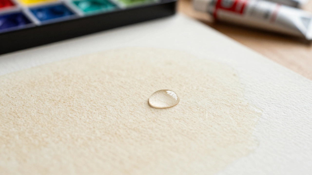
The biggest mistake beginners make is treating paper like canvas. Cold Press Paperwatercolor paper with a textured surface ideal for general painting offers a middle ground between smooth hot press and rough cold press, holding pigment well without resisting flow. You need a weight of at least 300 grams per square meter (gsm). Anything lighter will buckle under multiple washes, forcing you to stretch the sheet or work quickly before the texture distorts.
Cotton content matters more than brand names. Cotton fibers absorb water slowly, giving you more time to manipulate the paint on the surface. Wood pulp papers, often found in student sketchbooks, dry too fast and can lead to hard edges when you intended soft ones. When testing paper, run your hand over the grain. If it feels like sandpaper, it might damage your brush bristles over time.
| Type | Texture | Best For |
|---|---|---|
| Hot Press | Smooth | Detail work, fine line, illustration |
| Cold Press | Tanley Texture | General purpose, landscapes, layers |
| Rough | Heavy Tooth | Textural effects, granulation, expressive washes |
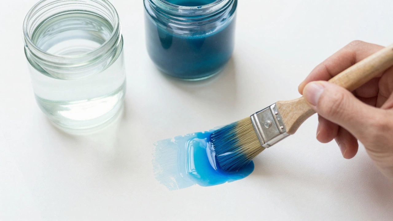
Controlling the Wetness Ratio
Water is both the vehicle and the enemy. The ratio of pigment to water determines whether your wash looks transparent and luminous or opaque and muddy. Wet-on-Wet Techniqueapplying wet paint onto wet paper for soft blends requires the paper to be soaked enough to allow paint to migrate naturally. If the paper is damp but not fully wet, you get “bloom” or “backruns,” those jagged coffee-rain patterns that ruin clean gradients.
To test readiness, tilt the paper slightly. If there is a glossy sheen, it is wet enough. If the water beads up, it is dry. Consistency in your water level across the page prevents unexpected stopping points in your gradient. A large pan of clean water is essential for washing brushes, keeping the mixing bowl distinct from the rinsing bowl ensures you don’t accidentally dilute your mixed color with dirty water.
Managing Color and Light
Transparency is the hallmark of strong watercolor work. Layering colors creates depth that opaque mediums like Gouacheopaque water-based paint with covering power similar to poster paint simply cannot achieve. To keep your colors vibrant, limit the number of pigments used in a single mix. Three colors mixed together tend to dull into gray because most pigments are not perfectly pure. Instead, choose two complementary colors or analogous hues to build value.
Temperature changes define volume. Even within a blue sky, there are warm blues and cool blues. Using a single tube color throughout a landscape flattens the image. Slightly warming the shadows makes them recede less aggressively, while cooling the highlights pulls them forward. Always mix slightly more paint than you think you need; running out mid-wash leaves visible patches of white paper that look like errors.
Planning Composition and Negative Space
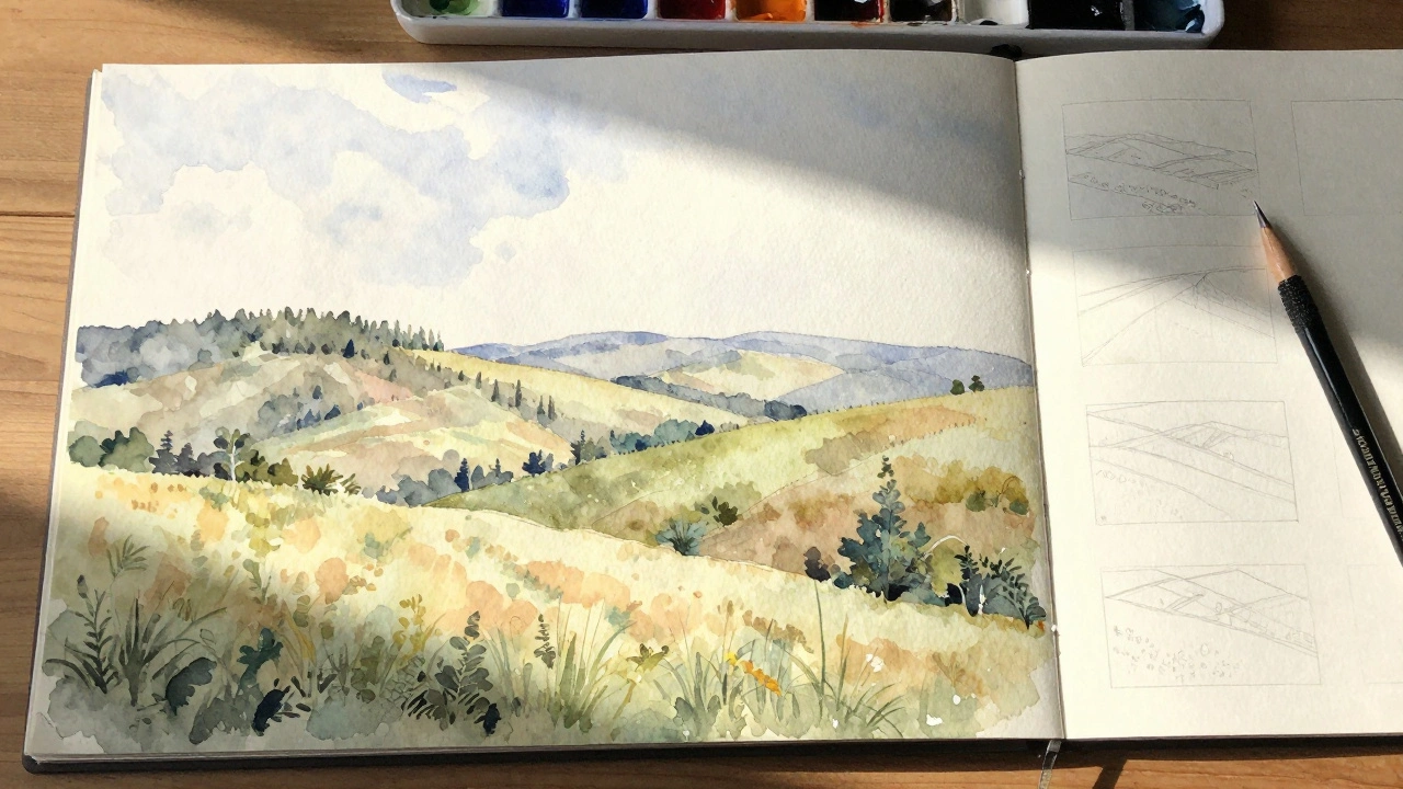
Before applying paint, you must commit to a plan. Unlike oil painting, you cannot easily cover up a mistake with a heavy layer. White paper acts as your highlight source once the paint touches it. Leaving specific areas untouched for highlights is more effective than trying to lift paint later. Sketch lightly in pencil, focusing on shapes rather than details. Identify where the strongest contrast will occur to guide the viewer’s eye immediately.
Thumbnail sketches take five minutes and save hours of ruined paper. Check your values (light vs dark) in black and white first. If the shape doesn’t hold up without color, adding watercolor won’t fix the design. Leading lines and negative space around objects give the subject room to breathe. Without breathing room, the painting feels crowded and chaotic.
Avoiding Common Technical Errors
Muddy colors usually result from dirty brushes or excessive mixing on the paper. Clean your brush thoroughly after every major color switch. Another frequent issue is overworking the paper. Once the paint dries, going back into it often lifts previous layers and turns them brown. Wait for complete dryness between glazes. If you need to lift color, use a stiff brush or a sponge dampened only enough to pull, not soak.
Masking Fluidrubbery substance used to protect white paper from paint application is useful for small, sharp details like windows in a building or highlights on foliage, but it can seep into the tooth of the paper and damage the surface if left too long. Remove it gently with a rubber cement pickup tool while working flat. Overuse of masking fluid can make the painting feel stiff; aim to leave whites empty from the start whenever possible.
Building Muscle Memory Through Practice
Consistency comes from repetition. Set aside time to practice washes specifically. Create a grid of squares, filling each with a different gradient to understand how different paper weights handle moisture. Practice dropping colors while still wet to see how they interact. These drills should be boring because the goal is reliability, not creativity. Once your hands know exactly how the brush behaves on paper, your brain is free to focus on artistic expression.
Keep a journal of the paints you use. Some brands behave differently due to particle size. High-staining pigments behave differently than low-staining ones. Documenting these behaviors helps you predict outcomes in future works. Over time, you stop guessing and start predicting, which is the true sign of mastery in this medium.
What kind of paper do I need for watercolor?
Use 100% cotton cold-press paper with a weight of 300gsm. This provides the right balance of texture and durability for most techniques.
Why does my watercolor look muddy?
Muddy colors often come from mixing too many pigments together or using a dirty brush. Limit mixes to two colors and rinse brushes frequently.
Can I fix mistakes in watercolor?
You can lift some paint while wet using a clean sponge, but it is harder once dry. The best approach is planning and leaving white spaces intentionally.
How do I prevent hard edges?
Hard edges form when paint hits dry paper. Keep the surrounding area wet when blending colors to ensure soft transitions.
What is the difference between artist grade and student grade paint?
Artist grade contains higher pigment concentration and better lightfastness. Student grade often has fillers and may fade faster over time.