Professional Shadow Color Mixer
Select two colors from the palette below to simulate professional shadow mixing. Professionals avoid pure black by mixing complementary colors to create rich, vibrant darks.
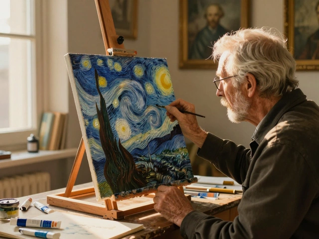
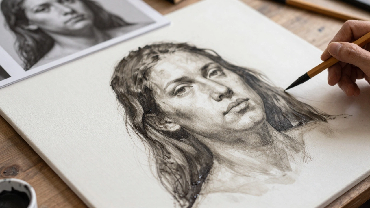
Ever looked at a gallery piece and wondered why that face feels alive while your latest attempt looks like a stiff mask? It’s rarely about having "the gift." Most of the time, it comes down to a few specific technical choices that separate amateur sketches from professional portrait painting is a genre of visual art focused on capturing the likeness, personality, and mood of a subject through painted media. Whether you are using oils, acrylics, or watercolors, the principles remain largely the same. You don’t need to be a master anatomist to get better results today. You just need to stop guessing and start observing.
The gap between a hobbyist project and a pro-level piece usually isn't talent-it's process. Professionals don't just "paint what they see." They construct the image layer by layer, managing value, edge, and color temperature with intention. If you want your work to command attention, you have to treat the canvas like a construction site, not a drawing pad. Let’s break down exactly how to upgrade your technique.
1. Master the Value Structure First
Here is the hard truth: beginners obsess over color; professionals obsess over value. If your values (the lightness or darkness of a color) are wrong, no amount of pretty reds and blues will save the portrait. The human eye reads form through contrast, not hue.
Before you mix a single tube of paint, squint at your reference photo or live model. Squinting flattens the image and removes detail, leaving only the big shapes of light and shadow. You should be able to see three distinct zones: the lights, the mid-tones, and the darks.
- The Lights: These are the areas hitting the source directly. Keep them clean and bright.
- The Mids: This is where most of the local color lives. It’s the transition zone.
- The Darks: These define the structure. Without strong, confident darks, the face looks flat and foggy.
Start your painting with a monochrome underpainting. Use a neutral tone like raw umber or payne’s gray diluted with your medium. Block in these three zones loosely. If the face looks recognizable in grayscale, your color layers will sit on a solid foundation. If it looks muddy or undefined now, adding color later will only make it worse.
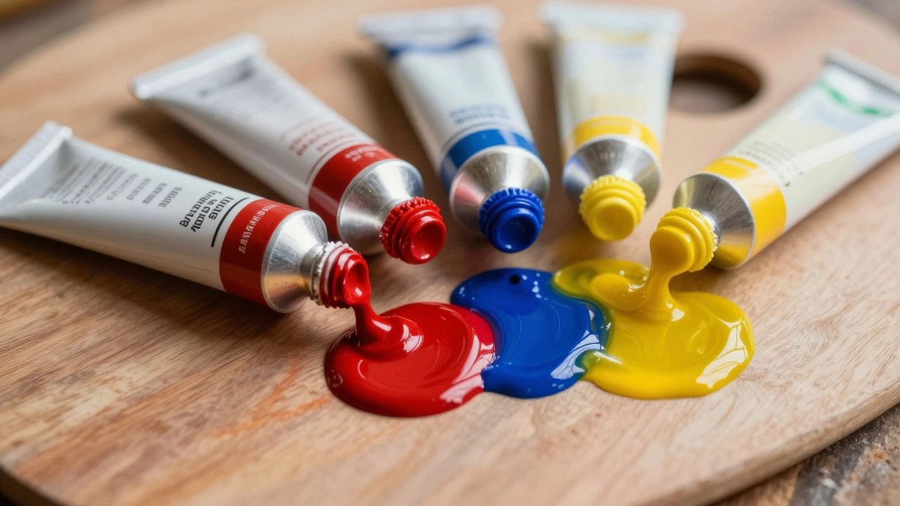
2. Stop Using Pure Black for Shadows
One of the biggest mistakes I see artists make is reaching for black paint when they need a shadow. Pure black is dead. It absorbs all light and makes the skin look plastic or bruised. Real shadows are full of reflected light and color information.
In a typical indoor setting with warm artificial light, the shadows often lean cool-blues and purples. In outdoor sunlight, shadows might pick up the green of grass or the blue of the sky. To create professional-looking depth, mix your darks using complementary colors. For example, mixing alizarin crimson with phthalo blue creates a rich, vibrant dark that feels alive compared to straight lamp black.
| Light Source | Shadow Tendency | Mixing Suggestion |
|---|---|---|
| Warm Indoor Light | Cool (Blue/Purple) | Ultramarine Blue + Alizarin Crimson |
| Natural Sunlight | Varied (Green/Blue) | Phthalo Green + Yellow Ochre (darkened) |
| Overcast Day | Neutral/Cool Gray | Titanium White + Raw Umber + Tiny bit of Blue |
Test your mixes on the palette first. Ask yourself: does this dark feel like it belongs in the environment? If it looks like a hole punched in the paper, you’ve gone too far into neutral gray or black.
3. Paint Skin Tones as Transparent Glazes
Skin is not opaque clay; it is translucent tissue over muscle and bone. When you paint skin with thick, opaque strokes, it looks like a mannequin. To achieve that professional, luminous quality, you need to let light pass through your paint layers.
This is where glazing becomes your best friend. A glaze is a thin layer of transparent pigment mixed with a high ratio of medium (like linseed oil for oils or glazing liquid for acrylics). Apply this over your dry underpainting.
- Establish the base: Start with a warm mid-tone across the entire face.
- Build warmth: Glaze a thin layer of yellow ochre or cadmium yellow light over the cheeks and nose tip. This mimics blood flow near the surface.
- Add coolness: Glaze a very thin wash of blue or purple around the ears, neck, and hairline. These areas are further from the heart and appear cooler.
- Refine highlights: Use an opaque white mixed with a touch of yellow for the brightest spots (bridge of the nose, brow ridge).
By building up transparency, you create depth. The viewer’s eye penetrates the layers, creating the illusion of volume. This technique is standard in classical oil painting but works beautifully with acrylics if you use retarders to keep the paint open longer.
4. Control Your Edges
If every line in your portrait is sharp and defined, the image will look frantic and amateurish. Professional paintings guide the viewer’s eye using edge control. You need a mix of hard, lost, and soft edges.
- Hard Edges: Use these sparingly. Place them where you want the viewer to focus-usually the eyes, the corner of the mouth, or the highlight on the nose. These areas have high contrast and clear boundaries.
- Soft Edges: Use these for transitions between planes, like the curve of the cheekbone or the jawline. Blend these gently so the form rolls smoothly.
- Lost Edges: These are areas where the shadow merges completely with the background or another shadow. For example, the side of the head might disappear into the dark hair. Losing an edge creates unity and prevents the figure from looking cut out.
Think of your brushwork like a camera lens. The focal point is in sharp focus (hard edges), while the foreground and background blur slightly (soft/lost edges). This optical effect adds immediate sophistication to your work.
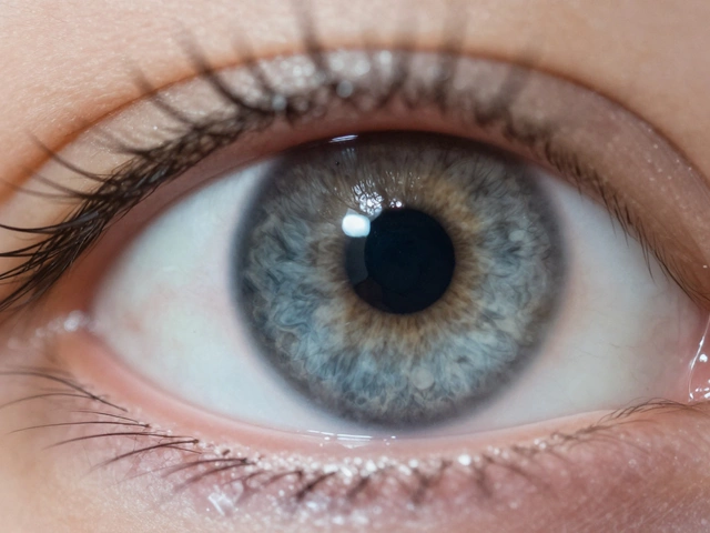
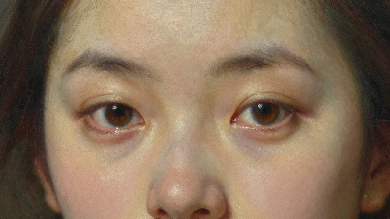
5. Capture the Eyes with Precision
The eyes are the window to the soul, cliché as it sounds. But technically, they are complex spheres, not flat ovals. Beginners often paint the iris as a perfect circle sitting on top of the white of the eye. This kills the dimension.
Treat the eyeball as a ball wrapped in moist tissue. The iris wraps around the curve of the eye. Therefore, the bottom part of the iris is darker than the top because it is turning away from the light. Add a subtle shadow cast by the upper eyelid onto the iris. This small detail anchors the eye in space.
Also, never forget the moisture. A tiny, sharp highlight reflects the light source. But more importantly, add a secondary, softer reflection nearby. This suggests the wet, curved surface of the cornea. Keep the whites of the eyes off-white; they should pick up the ambient color of the room. Pure white eyes look dead.
6. Check Proportions with Geometry
Even the best color and lighting won't save a face that looks distorted. Before you commit to details, map out the proportions. Use simple geometric shapes to block in the structure.
A common rule of thumb is the "five-face" width. The face is roughly five eyes wide. The distance between the eyes is approximately one eye-width. The bottom of the nose aligns with the bottom of the eyebrows. The corners of the mouth align with the center of the pupils. These aren't strict laws-every face is unique-but they are excellent starting points.
Use your brush handle as a measuring tool. Hold it at arm's length, close one eye, and measure the height of the nose against the width of the forehead. Transfer these ratios to your canvas. Constantly step back from your easel to check the overall shape. Working too close traps you in the details and hides proportional errors.
7. Unify the Composition
A professional portrait doesn't exist in a vacuum. The subject must feel connected to their environment. This means the background shouldn't just be an empty void; it should interact with the figure.
Use color echoes to tie the piece together. If there is a warm orange in the subject's shirt, place a subtle hint of that same orange in the background or even in the shadows of the face. This creates a cohesive color harmony. Conversely, ensure there is enough contrast between the subject and the background so the face pops forward. If the background is too busy or similar in value to the skin, the portrait will lose its impact.
Finally, sign your work confidently. A small, legible signature in a corner shows ownership and completion. It’s a small psychological cue that tells the viewer, "This is finished. This is intentional."
What is the best paint medium for beginner portrait painting?
Acrylics are generally recommended for beginners because they dry quickly, allowing you to correct mistakes easily and build layers without waiting days. However, if you prefer blending and working wet-on-wet, oils offer more forgiveness in terms of texture and mixing time. Watercolors are the hardest for realistic portraits due to their unforgiving nature and lack of opacity for corrections.
How do I avoid making my portrait look waxy?
A waxy look usually comes from over-blending or using too much medium. Instead of smudging paint until it disappears, try using distinct brushstrokes that follow the form of the face. Also, ensure you are using enough contrast. Flat, evenly lit faces look like wax dolls. Introduce stronger shadows and sharper highlights to break up the uniformity.
Can I use a photograph as a reference for professional portraits?
Yes, photographs are excellent references, but be aware of lens distortion. Wide-angle lenses can stretch features, especially at the edges of the frame. Crop in on the face to minimize this. Also, photos flatten light. Try to infer the third dimension (depth) rather than just copying the 2D image pixel by pixel.
Why does my skin tone look dirty or muddy?
Muddy colors happen when you mix too many pigments together, especially complements, until they turn gray-brown. Limit your palette for skin tones to three or four key colors (e.g., Titanium White, Yellow Ochre, Cadmium Red, and a touch of Blue for shadows). Mix cleanly on your palette before applying to the canvas.
How long should a professional portrait take to complete?
There is no set time, but a well-structured approach helps. A small study might take 2-4 hours. A large, detailed oil portrait could take weeks due to drying times between glazes. Focus on finishing the value structure and composition first; details can always be added later, but a bad structure cannot be fixed easily.