Art isn't just about pretty pictures-it’s a language built on rules. Whether you’re painting a landscape or designing a logo, these seven principles of art are the grammar of visual communication. Without them, your work might look random or confusing. But when you apply these fundamentals, your art becomes clear, intentional, and powerful. Let’s break down each principle with real examples and practical tips so you can use them in your own projects.
Key Takeaways
- Balance distributes visual weight-symmetrical or asymmetrical.
- Contrast uses differences to create focal points and depth.
- Emphasis directs attention to the most important part of your piece.
- Movement guides the viewer's eye through the composition.
- Pattern repeats elements to create rhythm and structure.
- Rhythm uses repetition to create visual flow, like music.
- Unity ties all elements together for a cohesive whole.
Balance
Balance is the distribution of visual weight in a composition. It can be symmetrical (mirrored) or asymmetrical (uneven but balanced). For example, in Michelangelo's sculpture David, the figure's stance creates a dynamic balance that feels stable yet alive. In your own work, try placing heavier visual elements on one side and counterbalancing them with smaller elements on the other. This creates harmony without being boring.
Many beginners think balance means perfect symmetry, like a mirror image. But asymmetrical balance is just as common in great art. Think of a painting with a large dark object on one side balanced by several smaller light objects on the other. The key is to feel visually stable, not perfectly mirrored. Try this exercise: place three different objects on a table. Move them around until the composition feels balanced. Notice how small changes affect the whole picture.
Contrast
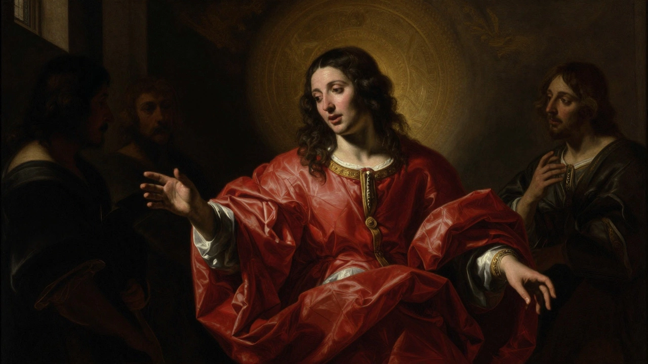
Contrast uses differences to make elements stand out. Think of light versus dark, smooth versus rough textures, or bright colors against muted tones. Caravaggio's paintings, like The Calling of Saint Matthew, use dramatic chiaroscuro-extreme light and shadow-to draw your eye to the main subject. When creating your own art, play with contrast to create focal points and add depth. A common mistake is overusing it, which can make the piece feel chaotic. Keep it intentional.
Contrast isn't just about color. It can be size, shape, texture, or even theme. In abstract art, a small geometric shape against organic forms creates visual tension. In photography, a sharp subject against a blurred background uses focus contrast. The goal is to highlight what matters most. If everything in your work contrasts equally, nothing stands out. So choose one or two elements to contrast sharply and let the rest blend.
Emphasis
Emphasis directs attention to the most important part of your piece. It’s how you tell your audience where to look first. Picasso’s Guernica uses exaggerated scale and stark black-and-white contrast to emphasize the horror of war. To create emphasis, try making one element larger, brighter, or more detailed than others. Or use surrounding elements to frame your focal point.
Many artists accidentally make everything important. But good emphasis means selecting one main idea to highlight. For example, in a portrait, the eyes are often emphasized with brighter lighting or sharper detail. In landscape painting, a single bright tree against a muted background draws the eye. Ask yourself: what’s the story I want to tell? Then make sure that element gets the spotlight.
Movement
Movement guides the viewer's eye through the composition. Van Gogh’s Starry Night uses swirling brushstrokes to create a sense of motion. Lines, shapes, and colors can all lead the eye-like a path through a forest. Use diagonal lines for energy, curved lines for flow, or repeating patterns to create rhythm.
Movement isn’t about physical motion. It’s about how your eye travels across the artwork. A well-designed piece feels alive, not static. In graphic design, arrows or directional text can guide the viewer through a layout. In sculpture, the shape of the form can create implied movement. Try this: draw a simple line that starts at one edge and leads the eye to a focal point. Notice how the direction affects the feeling.
Pattern
Pattern repeats elements to create rhythm and structure. M.C. Escher’s tessellations use intricate repeating shapes to form seamless designs. Patterns can be geometric, organic, or even chaotic. They give your work consistency and predictability-like a visual heartbeat.
Pattern isn’t just for wallpaper. In painting, repeated brushstrokes can create texture. In photography, a row of windows or trees can form a pattern. The key is to use repetition intentionally. Too much pattern can feel boring, but too little can feel scattered. Look for opportunities to repeat shapes, colors, or textures in a way that supports your main idea.
Rhythm
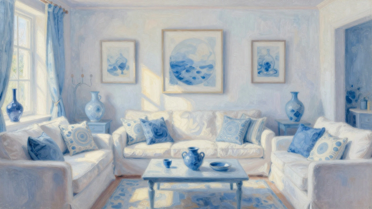
Rhythm uses repetition to create visual flow, like music. Think of a song with a steady beat-it’s predictable but engaging. In art, rhythm comes from repeating elements with variations. A series of waves in a seascape painting, each slightly different, creates a rhythmic flow. Or in a collage, alternating colors and shapes keeps the eye moving.
Rhythm is pattern with variation. It’s not just repeating the same thing over and over. It’s like a jazz improvisation-structured but with subtle changes. In architecture, a row of columns with slight differences in spacing creates rhythm. In a painting, a repeated shape that changes size or color adds life. Try creating a simple rhythm in your next piece: repeat a shape three times, each time altering one element. Notice how it feels different from strict pattern.
Unity
Unity ties all elements together for a cohesive whole. When balance, contrast, and the other principles work in harmony, your artwork feels complete. Think of a well-organized room where everything fits-no single item stands out awkwardly. Unity doesn’t mean everything has to be identical. It means all parts support the central idea.
Many artists struggle with unity because they focus too much on individual elements. But unity is about how everything connects. In a painting, consistent color palette or recurring shapes can create unity. In photography, consistent lighting or style across a series. If your work feels disjointed, ask: what’s the common thread? Add subtle connections to tie it all together.
Principles at a Glance
| Principle | Definition | Real-World Example | How to Apply |
|---|---|---|---|
| Balance | Distribution of visual weight | Michelangelo's David | Place heavier elements opposite lighter ones |
| Contrast | Differences to create focal points | Caravaggio's chiaroscuro | Use light/dark or color differences intentionally |
| Emphasis | Directing attention to key elements | Picasso's Guernica | Make one element larger or brighter than others |
| Movement | Guiding the viewer's eye | Van Gogh's Starry Night | Use lines or shapes to create flow |
| Pattern | Repeating elements for structure | M.C. Escher's tessellations | Repeat shapes or textures consistently |
| Rhythm | Repetition with variation for flow | Seascape with varied waves | Repeat elements with slight changes |
| Unity | Tying elements together for cohesion | Consistent color palette in a series | Use recurring colors or themes |
Are the seven principles of art the same as design principles?
Yes, the seven principles of art are often called design principles. They apply to both traditional art forms and modern design. Whether you're painting, graphic design, or even web design, these principles help create effective visual communication. The terms are used interchangeably in most educational contexts.
Can you use these principles in digital art?
Absolutely. Digital artists use these principles every day. In graphic design software, you apply balance when arranging elements on a page. Contrast helps make text stand out against backgrounds. Movement guides viewers through interactive interfaces. The principles are universal-they work whether you're using a pencil or a tablet.
How do I know if my artwork has good balance?
Hold your artwork at arm's length and squint your eyes. If the composition feels stable without any one side "pulling" too much, it's balanced. You can also flip the image horizontally-symmetrical balance should look the same both ways. For asymmetrical balance, check if the visual weight feels evenly distributed. If one part feels heavier, adjust by adding or removing elements.
What's the difference between pattern and rhythm?
Pattern is consistent repetition-like a wallpaper design where the same shape repeats exactly. Rhythm adds variation to the repetition. Think of a song with a steady beat: the pattern is the beat itself, but the rhythm includes the variations in volume or timing. In art, a pattern might repeat shapes identically, while rhythm uses similar shapes with slight differences to create flow.
Do all artworks need to follow all seven principles?
Not necessarily. Some artists intentionally break rules for effect. A chaotic abstract piece might ignore balance or unity to convey emotion. But even when breaking rules, understanding the principles helps you make intentional choices. The key is knowing why you're deviating-so you're not just being random.
Which principle is most important?
It depends on your goal. For a portrait, emphasis might be key to highlight the subject. For a landscape, movement could guide the viewer through the scene. Unity often ties everything together, but no single principle is universally "most important." Think of them as tools-you choose which ones to use based on what you want to communicate.
Can beginners apply these principles effectively?
Yes! Start simple. Focus on one principle at a time. Practice creating balance in a still life drawing, or use contrast in a black-and-white sketch. Over time, these concepts will become second nature. Many professional artists still refer back to these basics-so they're valuable at every skill level.
