Portrait Impact Simulator
Explore why black and white portraits feel more powerful. Adjust the sliders below to see how stripping away color (chroma) and enhancing tonal contrast (luminance) shifts the viewer's focus from aesthetic details to emotional connection.
Psychological Analysis
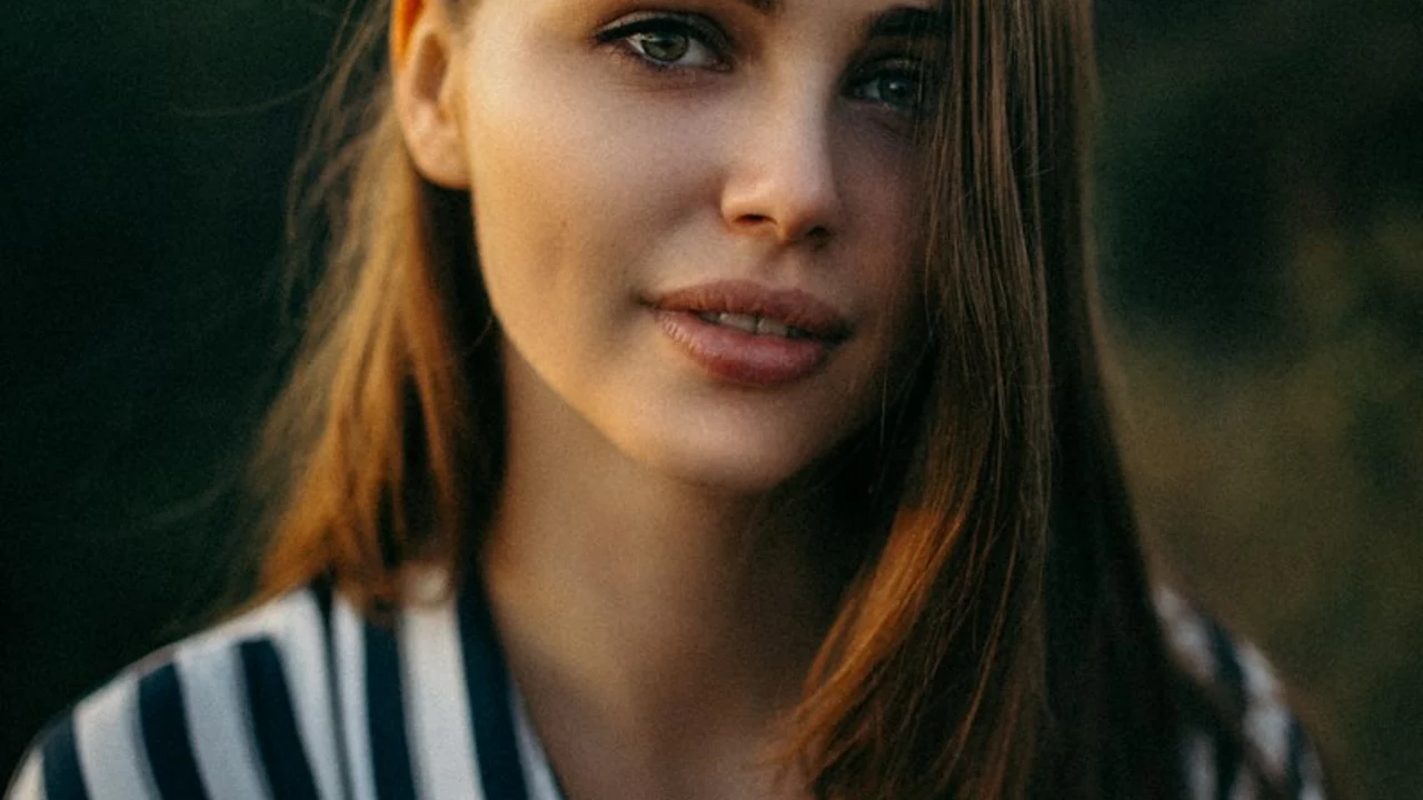
You’ve seen it happen. A vibrant, colorful portrait hangs on the wall, and you glance at it, nod politely, and move on. Then, three steps away, a stark black and white face stops you dead in your tracks. You lean in. You study the eyes. You feel a strange pull, almost like eye contact across a crowded room. Why does stripping away color make us stare harder? It isn’t just nostalgia for old film cameras or a trick of modern Instagram filters. There is real science and centuries of artistic tradition behind why black and white portraits hit different.
Color Distracts, Contrast Connects
Here’s the blunt truth: color is noisy. When you paint or photograph a subject in full color, your brain has to process a lot of data at once. Is that shirt too bright? Does the background clash with their skin tone? Are those shadows realistic? This visual clutter forces your brain into "analysis mode" rather than "connection mode." By removing hue, you remove the noise. You force the viewer to look at what actually matters: form, light, and expression.
Think about how we process faces. We are wired to read micro-expressions-the slight twitch of a mouth, the shadow under an eye, the tension in a jawline. Color can mask these subtle cues. A heavy blush might hide fatigue; a colorful background might compete with the subject’s mood. In a monochrome image, every gradient of gray becomes a direct line to emotion. The darkness of a shadow isn't just "dark blue" or "brown"; it is pure absence of light, which our brains interpret as mystery, depth, or sorrow depending on the context.
The Psychology of Tonal Contrast
It comes down to how our eyes work. We don't see the world in high-definition color all the time. Peripheral vision, motion detection, and shape recognition rely heavily on luminance-how bright or dark something is-rather than chroma (color). When you look at a black and white portrait, you are tapping into the most primal part of human vision. You aren't asking "What color is this?" You are asking "Where is the light coming from?" and "What shape is this face making?"
This reliance on luminance creates a stronger sense of volume. In painting, this is known as chiaroscuro, a technique mastered by masters like Caravaggio and Rembrandt. They didn't use black and white because they lacked pigments; they used limited palettes to sculpt faces out of darkness. When you view a grayscale portrait, your brain fills in the third dimension more aggressively because it has fewer conflicting signals to ignore. The result feels more tangible, more solid, and paradoxically, more real.
| Feature | Color Portrait | Black & White Portrait |
|---|---|---|
| Primary Focus | Aesthetic harmony, clothing, environment | Expression, texture, bone structure |
| Emotional Distance | Distant (observer looks at the scene) | Intimate (observer looks into the person) |
| Time Perception | Anchored to current trends/fashion | Timeless, universal, historical |
| Cognitive Load | High (processing many hues) | Low (processing light values only) |
Texture Tells the Story
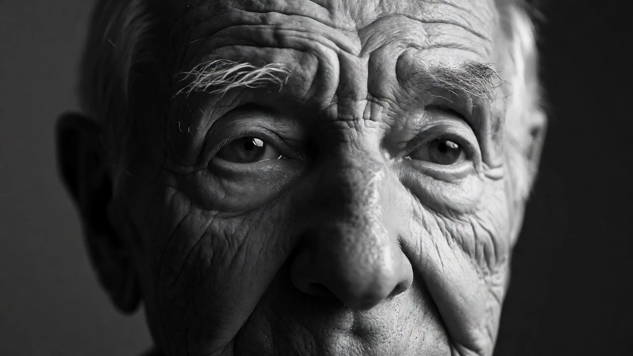
Have you ever noticed how wrinkles, pores, and stubble disappear in soft, colorful lighting but scream for attention in high-contrast monochrome? That’s intentional. Texture is the language of lived experience. Smooth, airbrushed skin often reads as artificial or distant. Rough, detailed skin reads as authentic.
In color photography or painting, skin tones vary wildly based on lighting temperature. A warm tungsten bulb makes everyone look orange; a cloudy day makes them look pale. These shifts can distract from the actual surface details of the skin. Black and white standardizes this. It reveals the topography of the face. A scar becomes a ridge of light. A tear becomes a highlight. The viewer connects with the humanity of the subject because they can literally see the wear and tear of life written on their skin, unmasked by makeup or flattering hues.
Timelessness vs. Trendiness
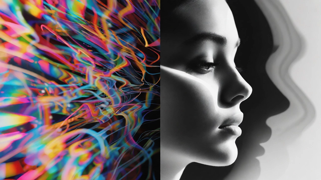
Color dates itself. Think about photos from the 1970s. The avocado greens, harvest golds, and burnt oranges immediately tell you when the picture was taken. Fashion colors change every decade. If you want a portrait to feel eternal, you have to step outside the timeline. Black and white removes the temporal markers. It doesn't matter if the subject is wearing a t-shirt or a tuxedo, or if the photo was taken in 1950 or 2026. The lack of color anchors the image in a "now" that feels permanent.
This is why family heirlooms are almost always black and white. It’s not just because early photography couldn't do color well. It’s because black and white feels serious. It feels important. It strips away the casual vibe of everyday life and elevates the subject to something monumental. When you commission a portrait, whether painted or photographed, you often want to capture the essence of the person, not the outfit they wore that Tuesday afternoon.
Simplifying the Composition
Artists love black and white because it simplifies decision-making. In a color piece, you have to worry about complementary colors, saturation balance, and hue harmony. One wrong red next to one wrong green can ruin the whole vibe. In monochrome, you only have one variable: value. Light or dark? Bright or dim?
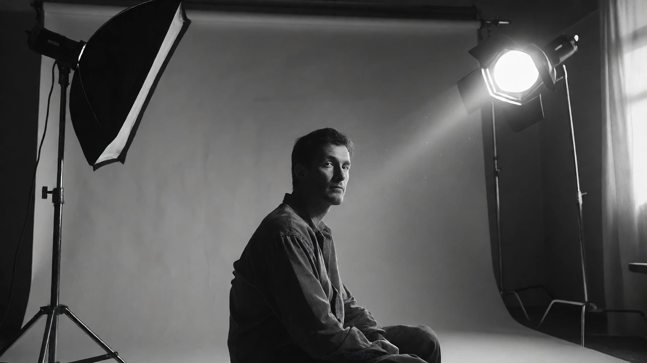
This limitation is liberating. It allows the artist to guide the viewer’s eye with ruthless precision. You can darken the edges of the frame (vignetting) to push focus onto the eyes. You can blow out highlights to create a dreamlike aura. You can crush blacks to add drama. Without color competing for attention, the composition becomes cleaner. The subject stands alone, isolated against a void or a simple gradient, forcing an unmediated connection between the viewer and the viewed.
Common Pitfalls to Avoid
Just because you removed color doesn't mean the portrait is automatically better. Bad black and white portraits fail for specific reasons. Here is what to watch out for:
- Muddy Mid-Tones: If everything is gray, nothing pops. You need deep blacks and bright whites to create range. If the histogram looks like a flat hill, the image will feel dull.
- Loss of Separation: Dark hair on a dark background disappears. In color, hue differences keep them separate. In B&W, you must ensure there is enough luminance difference to distinguish the subject from the backdrop.
- Over-Sharpening: Because B&W emphasizes texture, over-sharpening makes skin look cracked and ugly rather than detailed. Subtlety wins here.
- Ignoring Skin Flaws: While B&W reveals truth, it also reveals blemishes harshly. Artists often need to gently retouch or paint over distracting spots that aren't part of the character's story.
How to Create Your Own
If you are a painter or photographer looking to try this style, start small. Don't jump straight into a complex group shot. Pick one subject with strong facial features-someone with distinct cheekbones or expressive eyes works best. Use a single light source. Hard light creates dramatic shadows; soft light creates gentle gradients. Decide on your mood before you pick up the brush or click the shutter. Do you want mystery? Go for low-key lighting with lots of shadow. Do you want joy? Go for high-key lighting with bright whites and minimal shadows.
Remember, the goal isn't just to remove color. It's to amplify presence. When you strip away the distraction of hue, you leave only the soul of the subject. And that, ultimately, is why we stop and stare.
Do black and white portraits really look more professional?
Generally, yes. Black and white removes distractions related to fashion, background colors, and lighting temperature errors. This simplicity is often associated with classic portraiture and fine art, leading viewers to perceive the image as more serious and professionally executed compared to casual color snapshots.
Why do some people dislike black and white portraits?
Some viewers find black and white portraits cold or clinical. Without color, the image can lose warmth and vitality, which are key components of human attraction. Additionally, if the contrast is poorly managed, the portrait can look muddy or overly harsh, emphasizing flaws rather than character.
Is black and white better for older subjects?
Often, yes. Aging brings changes in skin pigmentation, such as sunspots or uneven tone, which can be distracting in color. Black and white neutralizes these color inconsistencies while highlighting the textures and lines that tell the story of a long life, turning potential 'flaws' into dignified character traits.
Can I convert a color portrait to black and white later?
Yes, but it requires careful editing. Simply desaturating a color image often results in flat, gray images. You need to adjust individual color channels (e.g., darkening blues to make skies darker, or lightening yellows to smooth skin) to recreate the dynamic range intended in a native black and white shoot or painting.
Does black and white hide bad lighting?
No, it exposes it. Good lighting is crucial in black and white because the entire image relies on luminance. Poor lighting leads to flat, featureless faces. However, black and white can help unify inconsistent color temperatures (like mixing indoor yellow light with outdoor blue light), making the overall image feel more cohesive even if the light sources were mismatched.