Abstract Painting Playground
Experiment with the principles from the article. Try using large gestures, limiting your palette, or focusing on balance. Remember: there are no mistakes here!
Tools & Palette
Try This Exercise:
The Monochrome Challenge: Select only Black and White above. Create a painting using only value contrasts to learn form without hue distraction.
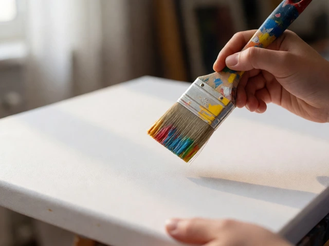
You stare at the canvas. It’s white, intimidating, and completely empty. You’ve seen those swirling colors on gallery walls or Instagram feeds, thinking, "I could do that." But when you pick up a brush, your hand freezes. What does it even mean? Do you need a plan? A subject? The truth is, abstract painting is less about drawing what you see and more about expressing what you feel-or just playing with paint until something clicks. If you’re wondering where to start, you’re in good company. Most successful abstract artists started exactly where you are now: confused but curious.
Key Takeaways
- Forget Representation: You don’t need to paint a recognizable object. Focus on color, shape, and texture instead.
- Start Small & Cheap: Use cheap canvases or paper and basic acrylics to remove the fear of ruining expensive materials.
- Embrace Mistakes: In abstract art, there are no errors-only happy accidents and new layers to cover them.
- Study the Masters: Look at Kandinsky, Pollock, or Rothko to understand how they used composition without realism.
- Process Over Product: Enjoy the act of painting. The final result matters less than the experience of creating.
The Mental Block: Why We Freeze
Most beginners struggle because they try to apply realistic rules to an unrealistic medium. We’re taught from childhood that a tree must be green and a sky blue. When you break those rules, anxiety kicks in. Abstract Art is defined as art that does not attempt to represent an accurate depiction of a visual reality but instead uses shapes, colours, forms, and gestural marks to achieve its effect. That definition is your permission slip. You aren’t failing to draw a horse; you’re succeeding at exploring emotion through pigment.
Think of it like music. Instrumental jazz doesn’t need lyrics to make sense. It relies on rhythm, harmony, and improvisation. Your painting works the same way. Does this red blob clash with that blue streak? Or does it create tension? That’s the conversation you’re having with the canvas. Stop asking "What is this?" and start asking "How does this feel?"
Choosing Your Tools Without Breaking the Bank
You don’t need professional-grade oils or imported brushes to start. In fact, starting with high-end materials can paralyze you because you’ll be too afraid to ruin them. Go to your local art store or check online retailers for student-grade supplies. Here’s a simple starter kit that works wonders:
| Item | Recommendation | Why? |
|---|---|---|
| Paint Medium | Acrylics (Student Grade) | Fast-drying, water-soluble, and forgiving. Easy to layer over mistakes. |
| Surface | Canvas Panels or Heavy Paper | Cheap enough to waste. No stretching required. Great for practicing composition. |
| Brushes | One large flat, one round, one fan | Versatility without clutter. Large brushes force bold strokes. |
| Palette | Disposable plates or wax paper | No cleanup hassle. Keeps you focused on painting, not washing dishes. |
Acrylics are the best friend of the beginner. They dry fast, meaning you can build layers quickly. If you hate what you painted ten minutes ago, wait fifteen, grab a brush, and paint right over it. This immediacy keeps the momentum going. Oil paints, while beautiful, require days or weeks to dry, which can kill the experimental vibe if you’re impatient.
Step One: Let Go of Control
The biggest hurdle isn’t technical skill; it’s control. Beginners often try to micromanage every stroke. Try this exercise: close your eyes. Dip a large brush into a mix of two contrasting colors. Open your eyes and make one long, sweeping motion across the canvas. Don’t look at the brush. Just move your arm. Did it land where you planned? Probably not. Does it matter? Not really.
This technique, often called Gestural Painting, connects your body to the artwork. It bypasses the critical brain and lets instinct take over. If the first stroke feels wrong, add another. Maybe the second stroke balances the chaos. This iterative process is the heart of abstraction. You aren’t building a picture; you’re negotiating with chance.
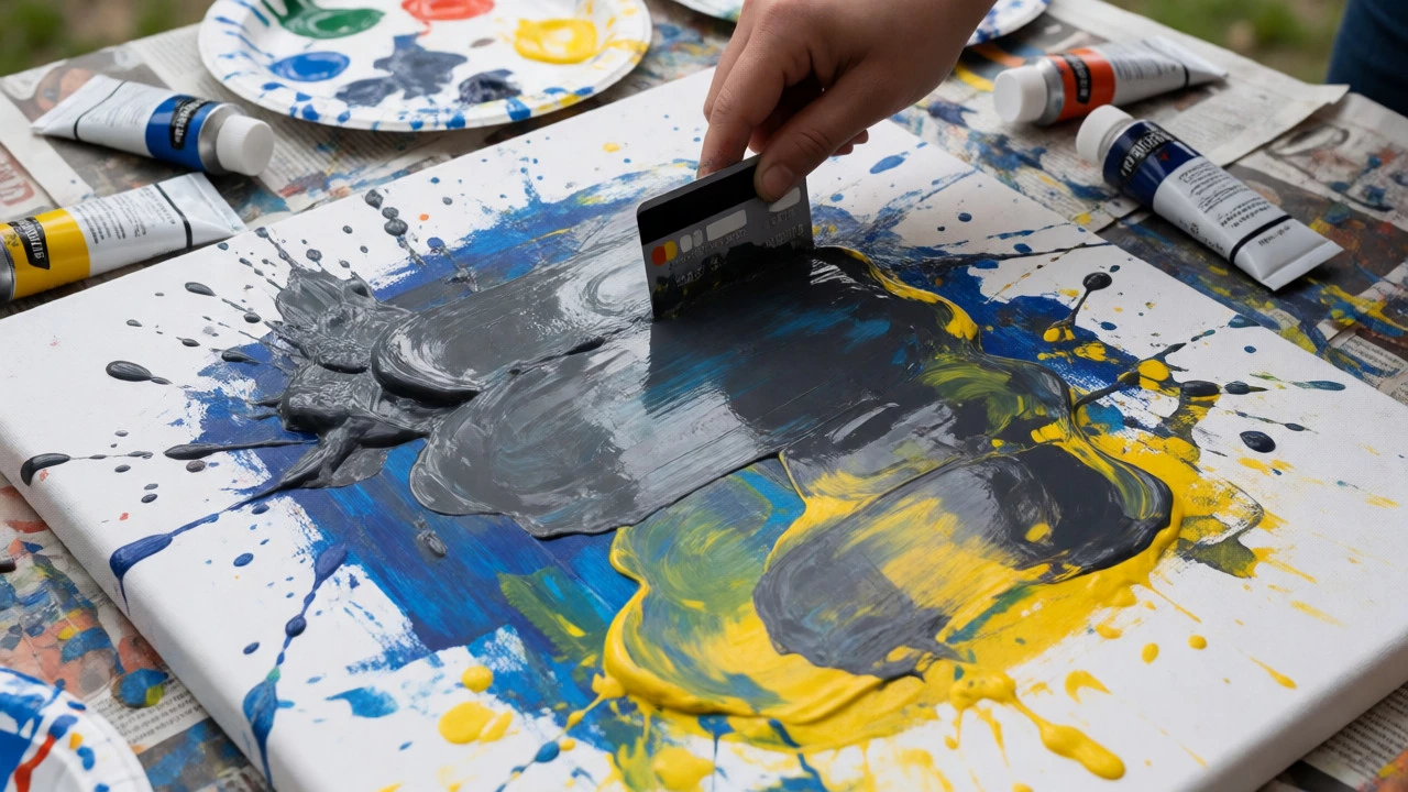
Consider using unconventional tools. Throw away the brushes for a moment. Use old credit cards to scrape paint. Pour diluted ink directly onto the surface. Crumple newspaper and stamp it down. These methods create textures you can’t replicate with a fine tip. Embrace the mess. Some of the most iconic works by Jackson Pollock were created by dripping and pouring paint, not careful brushing.
Understanding Composition Without Objects
Okay, so you have splashes of color everywhere. Now what? How do you know when it’s finished? This is where composition comes in. Even without trees or faces, your painting needs balance. Think of your canvas as a scale. If you have a heavy, dark mass in the bottom left corner, the top right might feel empty and light. You need to counterbalance it.
Use these three principles to guide your eye:
- Focal Point: Every painting needs a place where the viewer looks first. This could be a bright splash of yellow or a dense cluster of black lines. Make sure it’s not dead center unless you want symmetry.
- Balance: Distribute visual weight evenly. If one side is busy, keep the other side calm. Asymmetrical balance is usually more interesting than perfect symmetry.
- Movement: Lead the viewer’s eye around the canvas. Curves pull the eye gently; sharp angles stop it abruptly. Use lines and shapes to create a path.
A great trick is to squint at your work. When you blur your vision, details disappear, and you only see values (light vs. dark) and big shapes. If the composition looks confusing when squinting, it’s probably confusing when open-eyed too. Adjust the contrast or rearrange elements until the big shapes feel stable.
Color Theory for Non-Realists
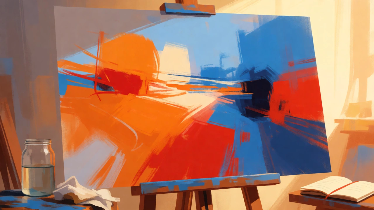
You don’t need to memorize the color wheel, but you should understand temperature. Warm colors (reds, oranges, yellows) tend to advance toward the viewer. Cool colors (blues, greens, purples) recede into the background. Use this to create depth. Paint a warm orange circle on top of a cool blue field, and it will pop out. Swap them, and it sinks back.
Limit your palette. Beginners often buy every tube of paint available, leading to muddy mixes. Pick three primary colors plus white and black. Mix everything from those five tubes. This constraint forces creativity and ensures harmony. If you use random colors, the painting can look chaotic rather than dynamic. Harmony doesn’t mean boring; it means intentional.
Try mixing complementary colors (opposites on the wheel) to create grays and neutrals. Red + Green makes a muddy brown-gray. Blue + Orange makes a slate gray. These muted tones can calm down a loud painting. Add a tiny bit of white to lighten them, or black to deepen them. Understanding how colors interact is your secret weapon.
Overcoming the "It Looks Like a Child Did It" Fear
This is the most common critique beginners hear, and it’s also the most discouraging. But here’s the thing: children’s art is unselfconscious. Adults trying to be abstract often fail because they are self-conscious. They want their scribbles to look "profound."
To avoid looking amateurish, focus on intentionality. Why did you put that line there? Was it to lead the eye? To break up a large space? To add energy? You don’t need to explain it to anyone else, but you need to know why you made that choice. If you can articulate the reason, it becomes design, not just doodling.
Look at the work of Wassily Kandinsky. He believed colors had spiritual vibrations. His paintings look playful, but they are carefully composed musical scores for the eyes. Study his work. Notice how he repeats shapes and rhythms. Then try to mimic that structure with your own messy marks. Stealing structure is a great way to learn.
Practical Exercises to Get Started Today
If you’re still stuck, try these specific prompts. Set a timer for 15 minutes each. Speed prevents overthinking.
- The Monochrome Challenge: Use only black and white. Create a painting using only value contrasts. Focus on light and shadow shapes. This teaches you form without the distraction of hue.
- Music Mapping: Put on a song with strong beats. Paint along with the rhythm. Fast drums equal short, choppy strokes. Long violin notes equal smooth, sweeping lines. Let the audio dictate the visual output.
- The Three-Shape Rule: Limit yourself to only three distinct shapes on the entire canvas. Fill the rest with color fields. This forces you to think about negative space and placement.
- Destructive Layering: Paint a colorful underlayer. Let it dry. Then paint a thick, opaque layer on top. While it’s wet, scrape away parts of the top layer with a credit card to reveal the colors beneath. This creates instant depth and history.
Remember, the goal isn’t to sell a masterpiece tomorrow. The goal is to get comfortable with the uncertainty. Abstract painting is a practice, not a destination. Keep your supplies handy. Paint small. Paint often. And when you step back and look at your latest piece, ask yourself: "Does this make me feel anything?" If yes, you’re doing it right.
Do I need to know how to draw realistically before starting abstract art?
No, you do not. While understanding anatomy and perspective helps, abstract art relies more on composition, color theory, and emotional expression than realistic rendering. Many famous abstract artists had strong foundational skills, but many others developed their style independently. Your lack of realistic drawing skills won't hold you back; in fact, it might free you from the pressure to 'get it right' visually.
What type of paint is best for beginners?
Acrylic paint is widely considered the best medium for beginners. It dries quickly, allowing you to correct mistakes and build layers within minutes. It is also water-soluble, making cleanup easy. Unlike oil paints, which require solvents and long drying times, acrylics let you experiment freely without waiting days between sessions.
How do I know when my abstract painting is finished?
This is subjective, but a good rule of thumb is to stop when adding more elements detracts from the composition rather than enhancing it. Squint at your work; if the overall balance feels stable and your eye moves naturally across the canvas, it might be done. Another sign is fatigue-if you find yourself tweaking minor details endlessly, it may be time to step away and return later with fresh eyes.
Can I use household items instead of art brushes?
Absolutely. Using sponges, rags, credit cards, combs, or even fingers can create unique textures and effects that traditional brushes cannot. This approach encourages experimentation and reduces the pressure to master brushwork immediately. Many contemporary abstract artists prefer mixed media and unconventional tools to achieve specific aesthetic goals.
Is there a wrong way to paint abstractly?
Technically, no. However, compositions that lack balance, focal points, or intentional movement can feel unresolved or chaotic in a negative way. The 'wrong' way is usually just a lack of intentionality. If you make a mark randomly, it’s okay. If you keep making random marks without considering how they relate to each other, the painting may feel disjointed. Learning basic design principles helps elevate random marks into cohesive art.