When you look at a great landscape painting, it doesn’t just show you a place-it makes you feel like you’re standing there. The wind on your skin, the quiet hum of distant trees, the way light spills across a valley at golden hour. But what turns a simple scene into something unforgettable? It’s not just about having a good camera or being in the right spot. It’s about four core essentials that every strong landscape painting, whether digital or traditional, relies on.
Composition: The Silent Storyteller
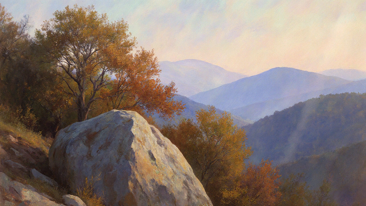
Composition is the invisible hand that guides your eye. It’s not about following rules like the rule of thirds like a checklist. It’s about arranging elements so your viewer doesn’t just see the landscape-they explore it.
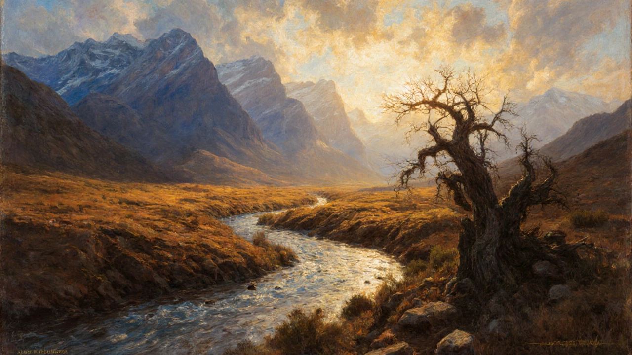
Look at the work of artists like Albert Bierstadt or contemporary painters like John Singer Sargent. Their landscapes don’t dump everything in the center. They lead you in. A winding river, a diagonal ridge, a cluster of trees leaning toward the light-all act as visual pathways. These paths keep your eyes moving, not stuck on one spot.
A common mistake? Filling the frame with too much. A sky that takes up 80% of the canvas with no clouds? A flat field stretching to the horizon with no variation? That’s visual noise. Great composition leaves breathing room. It uses negative space to make the important parts stand out. A single tree against a vast sky isn’t empty-it’s powerful.
Lighting: The Soul of the Scene
Light doesn’t just illuminate a landscape-it defines its mood. The difference between a dull gray morning and a fiery sunset isn’t just brightness. It’s contrast, warmth, and shadow.
Think about how the low angle of the sun in early morning or late afternoon casts long shadows. Those shadows create texture. They turn a flat hillside into ridges and valleys you can almost feel. That’s why most serious landscape painters avoid midday light. The sun is too high. Everything flattens out. No drama. No depth.
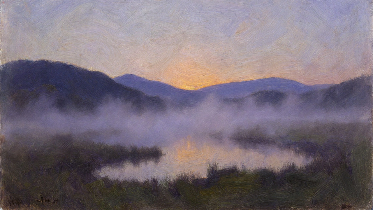
Golden hour isn’t just a buzzword. It’s when the light is soft, warm, and directional. It paints rocks in amber, turns grass into gold, and makes clouds glow from within. Twilight offers something else: cool blues and muted tones that feel quiet, almost sacred. The best landscape paintings don’t just capture light-they capture its emotional weight.
Depth: Making the Flat Feel Real
A landscape is three-dimensional, but a canvas is flat. How do you trick the eye into seeing distance? You use depth cues.
One simple trick: atmospheric perspective. Distant mountains don’t look the same as the ones up close. They’re lighter, bluer, less detailed. That’s because particles in the air scatter light. Painters have used this for centuries. Turner mastered it. So do modern digital artists.
Another cue? Size. A tree in the foreground should be bigger than the same tree in the background. Overlapping helps too. A rock in front of a bush, a branch in front of a mountain-these layers build space. Even brushstroke technique can imply depth. Thick paint for close objects, thin washes for far ones.
Without depth, a landscape looks like a wallpaper. With it, you feel like you could walk into it. That’s the magic.
Color Harmony: Emotion in Pigment
Color isn’t just about what’s there-it’s about how it makes you feel. A painting full of clashing reds and greens can feel chaotic. One with quiet blues and muted greens feels calm. That’s color harmony.
Most successful landscape paintings use a limited palette. Not because the artist is limited, but because they’re intentional. Think of a scene with warm earth tones-ochres, siennas, burnt umber-paired with cool shadows in ultramarine or cobalt. The contrast creates balance.
Color temperature matters too. Warm colors (reds, oranges, yellows) come forward. Cool colors (blues, greens, purples) recede. Smart artists use this to push and pull space. A warm foreground with a cool background? That’s depth. A cool sky with a warm ground? That’s contrast. Too many bright colors? It becomes noisy. Too many neutrals? It feels lifeless.
The best landscapes don’t copy nature exactly. They refine it. They simplify. They amplify the emotional truth of a place.
Putting It All Together
These four essentials-composition, lighting, depth, and color harmony-aren’t separate. They work together. A strong composition uses lighting to highlight key areas. Lighting creates the shadows that give depth. Depth is enhanced by color temperature. Color harmony ties the whole thing into a single feeling.
Look at any painting that stays with you. Chances are, it nails all four. You don’t need to be a master to start using them. Just ask yourself before you paint: Where is my eye meant to go? What’s the mood of the light? How do I show distance? What colors make this feel real?
It’s not about perfection. It’s about intention.
Do I need expensive gear to create great landscape paintings?
No. Great landscape paintings have been made with cheap brushes, basic paints, and even pencils. What matters is how you see the scene, not the tools you use. Many famous artists worked with limited materials. Focus on understanding composition, light, and color before upgrading your supplies.
Can I apply these essentials to digital landscape art?
Absolutely. Digital tools offer more flexibility, but the fundamentals don’t change. Whether you’re using Photoshop, Procreate, or oil on canvas, the way light falls, how depth is suggested, and how color affects mood are the same. Digital artists often use layers to build depth and adjust lighting non-destructively-but the principles are unchanged.
How do I find good landscape subjects to paint?
Start where you are. A backyard, a nearby park, even a view from your window. Look for interesting shapes, contrast between light and shadow, and layers of distance. Don’t wait for dramatic mountains. Sometimes the quietest scenes-the mist over a pond, a row of trees against a cloudy sky-are the most powerful. Carry a sketchbook and make quick studies. Over time, you’ll start seeing compositions everywhere.
Should I paint from photos or real life?
Both have value. Painting from life teaches you to observe light and atmosphere in real time. But photos are useful for reference, especially for complex scenes or when weather changes fast. The key is to not copy the photo exactly. Use it as a starting point. Adjust the lighting, simplify the composition, and add your own emotional interpretation. A photo can’t capture the feeling of wind or the smell of rain-that’s your job as the artist.
What’s the biggest mistake beginners make in landscape painting?
Trying to paint everything. Beginners often feel like they need to include every tree, rock, and blade of grass. That leads to clutter. Great landscapes are about selection. What’s the one thing you want the viewer to feel? Focus on that. Cut the rest. Less is more. A single well-placed tree with strong lighting can say more than a whole forest painted poorly.