Complementary Color Shadow Mixer
Select a base color to see shadow application tips
Your Complementary Color
Not selected
Use this color in shadows to create depth
Important Note
Never mix complementary colors directly on your palette—this creates muddy brown. Instead, layer them thin and adjacent for maximum contrast.
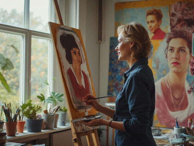
When you mix red and green paint on your palette and get a muddy brown, you’re not doing anything wrong-you’re just not yet using complementary colors the right way. In oil painting, complementary colors aren’t just a rule from art class. They’re the secret to making your paintings pop, feel alive, and hold the viewer’s eye without shouting.
What Are Complementary Colors?
Complementary colors are pairs that sit directly opposite each other on the color wheel a circular arrangement of colors showing relationships between hues, based on the RYB model (red, yellow, blue) used in traditional painting. In oil painting, we use the classic RYB (Red-Yellow-Blue) model, not the RGB or CMYK systems used in digital design. This means the true complementary pairs are:
- Red and Green
- Yellow and Purple
- Blue and Orange
These pairs don’t just look nice together-they create maximum contrast. That contrast is what makes colors feel more intense when placed side by side. A red rose against a green leaf doesn’t just look like a flower-it looks like it’s glowing.
Why Do Complementary Colors Work So Well in Oil Painting?
It’s not magic. It’s physics and perception. When two complementary colors are placed next to each other, your eyes process them simultaneously. The visual system tries to balance them out, which makes each one appear more saturated. This is called simultaneous contrast a visual phenomenon where adjacent colors influence each other’s perceived hue, brightness, and saturation.
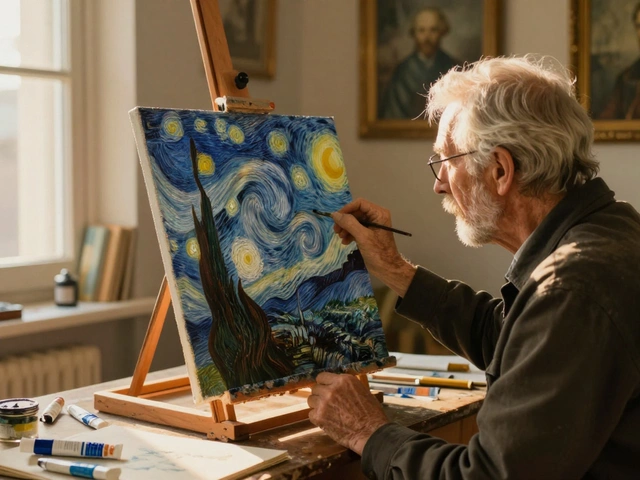
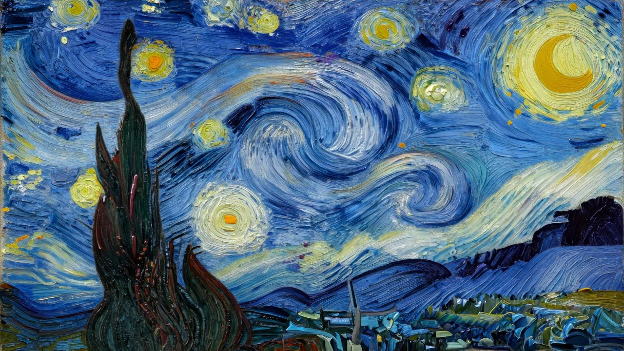
Think about how Vincent van Gogh used this. In Starry Night, he didn’t just paint the sky blue and the stars yellow. He layered thin glazes of cobalt blue next to cadmium yellow, letting the contrast vibrate. The result? A sky that feels like it’s humming.
Even when you’re not using pure complements, their presence-even in small amounts-can lift the whole painting. A touch of burnt sienna (a warm orange-brown) in the shadow of a blue jacket? That’s not a mistake. It’s a subtle way of introducing its complement to deepen the color.
How to Use Complementary Colors in Practice
Here’s how real oil painters use this without overdoing it:
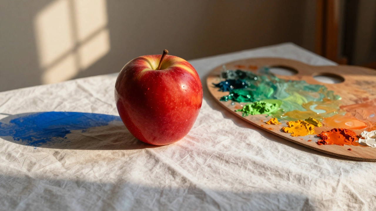
- Use complements to create depth-paint shadows with a hint of the subject’s complement. A red apple’s shadow? Add a touch of green. A blue vase? Mix a little orange into the shadow. It creates a natural, believable darkness without turning to gray.
- Break up flat areas-if you’ve got a large area of yellow, like a field, don’t just fill it with one tone. Add tiny dabs of purple in the distance or under trees. It tricks the eye into seeing more texture and light variation.
- Control harmony with small doses-you don’t need huge patches of complementary colors. A splash of orange in a blue sea, a streak of red in a green forest-these accents create rhythm and movement.
- Neutralize overly bright colors-if your red is too loud, mix in a little green. Not enough to turn it brown, just enough to mute it. This is how old masters like Rembrandt achieved rich, deep tones without using black.
Common Mistakes and How to Avoid Them
Many beginners think complementary colors mean you should slap red next to green and call it done. That rarely works. Here’s what goes wrong-and how to fix it:
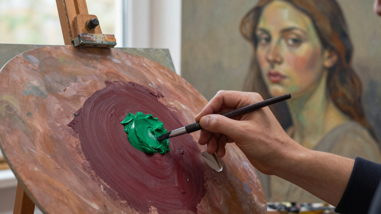
- Muddy mixtures-mixing complements directly on the palette turns them into gray or brown. That’s fine if you want neutral tones, but if you want color, keep them separate. Layer them thinly instead.
- Overuse-if every shadow has its complement, your painting feels chaotic. Use complements like seasoning, not the whole meal.
- Ignoring value-a bright red next to a bright green can be overwhelming. Make sure one has a darker value. A deep maroon next to a muted olive green reads far more naturally than neon red and lime green.
Try this test: paint a simple still life with a red apple on a white cloth. Paint the shadow under the apple with pure black. Now paint another version with a mix of ultramarine blue and burnt sienna (a dark orange-brown). The second one will look more three-dimensional, more real. That’s the power of complement in action.
Modern Oil Painters Who Mastered This
Look at J.M.W. Turner a 19th-century British painter known for his luminous landscapes and innovative use of color and light-he used complementary contrasts to create atmospheric glow. His sunsets weren’t just orange; they were orange against deep violet-blue skies.
Contemporary painter Richard Schmid a modern realist oil painter who teaches precise color mixing and observational painting techniques teaches his students to always ask: “What’s the complement of this color in the shadow?” He’ll mix a touch of green into a blue shadow on a red brick wall-and the wall suddenly feels solid, lit by real sunlight.
Even Pierre-Auguste Renoir a French Impressionist painter who used broken color and complementary contrasts to capture light and movement didn’t paint shadows as gray. He used purples, blues, and greens to deepen flesh tones, making skin look warm and alive under natural light.
Color Wheel Reference for Oil Painters
| Primary Color | Complementary Color | Typical Pigments Used |
|---|---|---|
| Red | Green | Alizarin Crimson + Viridian, Cadmium Red + Sap Green |
| Yellow | Purple | Cadmium Yellow + Dioxazine Purple, Yellow Ochre + Ultramarine Blue |
| Blue | Orange | Ultramarine Blue + Cadmium Orange, Cerulean Blue + Burnt Sienna |
Notice how the pigments listed aren’t pure. That’s intentional. Real painters rarely use straight-from-the-tube complements. They mix their own versions to control intensity and temperature.
How to Test This Yourself
Grab a small canvas. Paint a single object-a cup, a fruit, a flower-with one dominant color. Then, paint its shadow using its complement. Don’t blend them. Just place the complement next to it. Step back. Now paint a second version where the shadow is gray. Compare. The difference isn’t subtle. The one with the complement looks like it’s lit from within.
Do this three times with different subjects. You’ll start seeing complements everywhere-in the way light hits a red brick wall, in the blue of a shadow under a yellow hat. It’s not theory anymore. It’s observation.
Final Thought: It’s Not About Rules, It’s About Awareness
Complementary colors aren’t a magic formula. They’re a lens. Once you start looking for them, you’ll notice how nature uses them constantly. The red of a cardinal against snow. The orange of autumn leaves against a blue sky. The green of a forest floor under a golden sun.
Oil painting doesn’t need you to copy nature. It needs you to see it. And once you see how complements work, your colors will stop looking painted. They’ll start looking real.
Are complementary colors the same in digital art as in oil painting?
No. Digital art uses the RGB (Red-Green-Blue) or CMYK (Cyan-Magenta-Yellow-Black) color models, which have different complements. In RGB, the complement of red is cyan, not green. Oil painters stick to the RYB model because it matches how pigments physically mix. Using digital complements in oil paint will lead to muddy results.
Can I use complementary colors in monochrome paintings?
Yes-even in a limited palette. If you’re working with just blue and white, you can still imply its complement (orange) by using warmer grays or ochre tones in highlights. The eye fills in the contrast. Many old masters painted entire portraits using only earth tones, but still created depth by varying the temperature of their shadows.
Why do my complementary colors look muddy when I mix them?
Because they neutralize each other. Mixing red and green creates a brownish-gray, which is useful for shadows, but not for vibrant color. The trick is to place them side by side, not mix them. Use glazing or thin layers to let the colors interact optically instead of physically.
Do I need to use all three complementary pairs in one painting?
Not at all. Most successful paintings use one or two pairs. Too many can feel chaotic. Choose the pair that supports your subject. A landscape with a sunset? Use blue and orange. A portrait with warm skin? Use green in the shadows under red tones. Less is more.
What if I don’t have the exact complementary pigment?
You don’t need the exact match. If you’re using cadmium red, you don’t need viridian green. A mix of ultramarine blue and yellow ochre can create a good enough green to complement it. The goal isn’t perfection-it’s contrast. Test combinations on scrap canvas. You’ll find what works for your palette.