Landscape Composition Planner
Composition Controls
Ever looked at a landscape drawing and felt like you could step right into it? That sense of depth isn't magic. It’s the result of specific visual tricks that artists have used for centuries. While creativity is personal, the mechanics of making a flat piece of paper look like a vast, three-dimensional world rely on a set of reliable principles. If your drawings feel flat or cluttered, you’re likely missing one of these core rules.
Understanding these fundamentals doesn’t mean following a rigid script. Think of them as the grammar of visual language. Once you know the rules, you can break them with purpose rather than by accident. Let’s look at what actually makes a landscape drawing work.
The Rule of Thirds: Placing Your Horizon
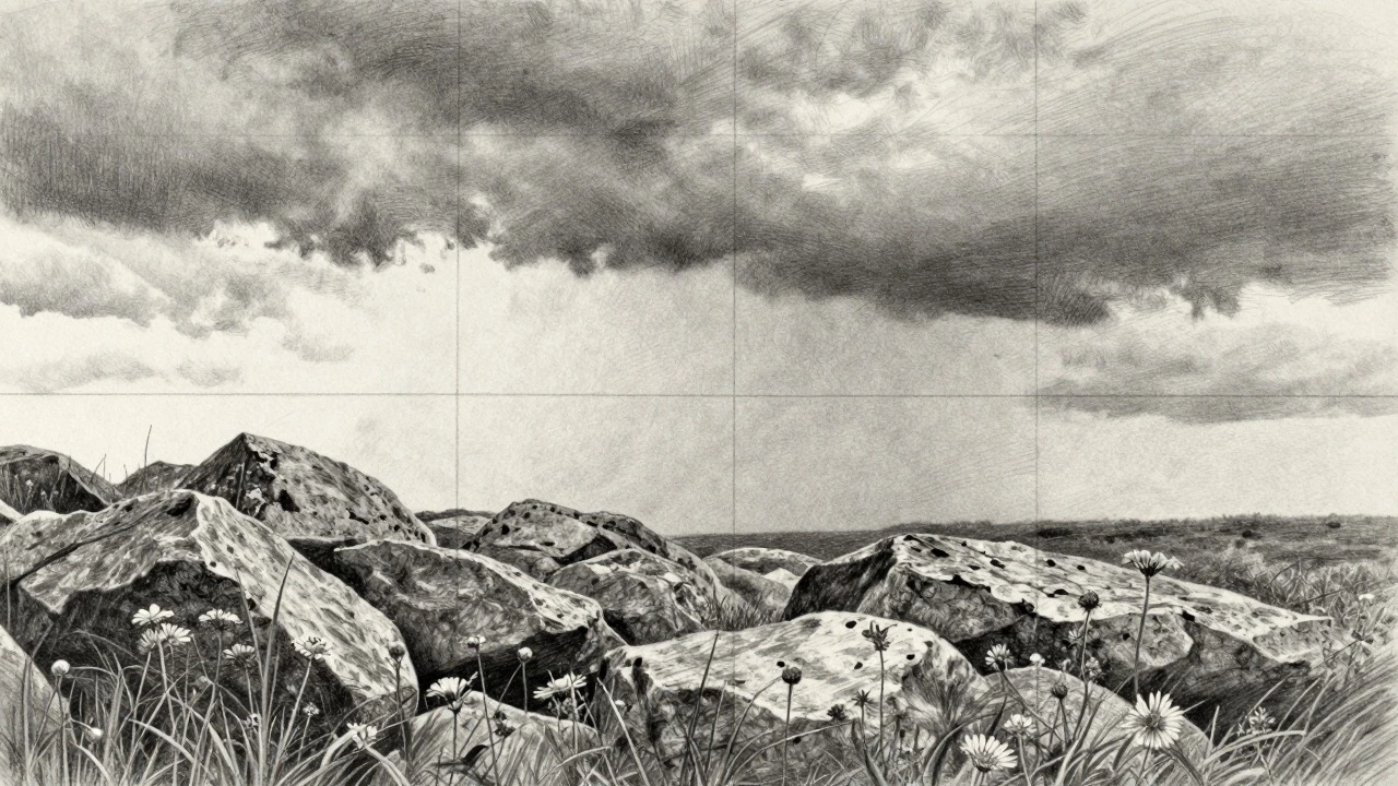
The most common mistake beginners make is placing the horizon line dead center. This splits the image in half, giving equal weight to the sky and the land, which often results in a boring, static composition. The Rule of Thirds is a compositional guideline that divides an image into nine equal parts using two horizontal and two vertical lines. The idea is to place key elements along these lines or at their intersections.
In landscape drawing, this usually means deciding what your subject is. Is it the dramatic storm clouds above? Then place the horizon line on the bottom third line, giving the sky two-thirds of the space. Is it a detailed foreground with flowers and rocks? Place the horizon on the top third line. This imbalance creates tension and interest. It forces the viewer’s eye to move through the larger area, discovering details, rather than resting immediately on a split screen.
- Sky-focused: Horizon on the lower third line.
- Land-focused: Horizon on the upper third line.
- Balance: Avoid the exact center unless symmetry is the specific point (like a reflection).
Atmospheric Perspective: Creating Depth
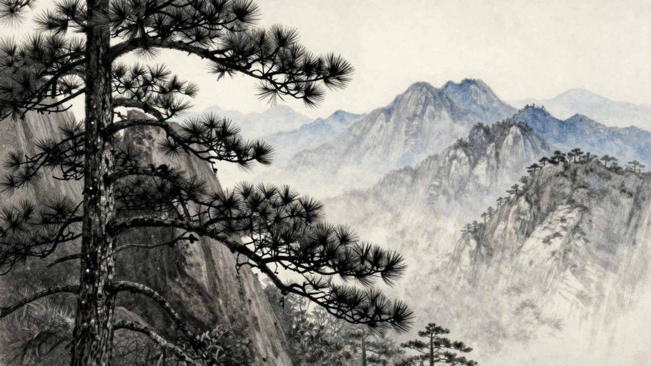
If the Rule of Thirds handles placement, Atmospheric Perspective is the technique of simulating the effect of the atmosphere on objects as they recede into the distance. Also known as aerial perspective, this rule explains why distant mountains look blue and faint while nearby trees are dark and sharp.
The air between you and the subject contains particles like dust and moisture. These particles scatter light, reducing contrast and shifting colors toward the background hue (usually blue or gray) over long distances. In a black-and-white drawing, this translates to value and edge quality.
To apply this, you need to adjust three things as objects move from foreground to background:
- Value: Foreground elements should be the darkest darks and lightest lights. Background elements should be mid-tones. The contrast decreases with distance.
- Detail: You can see individual leaves and bark textures up close. In the distance, trees become silhouettes or soft shapes. Remove fine lines in the background.
- Edges: Foreground edges are hard and crisp. Background edges are soft and blurred. Use a blending stump or smudge tool to soften distant forms.
Without this progression, your landscape will look like a collage of separate pieces pasted together, rather than a cohesive space.
Linear Perspective: Guiding the Eye
While atmospheric perspective deals with color and tone, Linear Perspective is a mathematical system for creating the illusion of depth and distance on a flat surface. It relies on the principle that parallel lines appear to converge as they recede into the distance.
In natural landscapes, strict linear perspective (like city streets) is less obvious but still present. Roads, rivers, fences, and rows of trees all follow perspective rules. A river narrowing as it goes back isn’t just getting smaller; its banks are converging toward a vanishing point on the horizon.
You don’t always need to draw grid lines, but understanding the concept helps. If you draw a path leading into the woods, make sure the sides of the path get closer together as they go back. If you draw a fence, the posts should get shorter and closer together visually. Ignoring this makes objects look tilted or floating.
| Technique | Primary Effect | Key Attribute |
|---|---|---|
| Atmospheric | Softens detail and contrast | Value shift and edge softness |
| Linear | Converges parallel lines | Vanishing points and scale reduction |
| Overlapping | Establishes spatial order | One object blocks another |
Scale and Overlapping: Establishing Size
How do we know a tree is huge and a person is small? We use relative size. In drawing, Relative Scale is the comparison of the size of objects within a scene to establish their distance and true dimensions. A simple way to anchor scale is to include a familiar object. A lone tree might look abstract, but a tree next to a house instantly communicates its height.
Combine this with overlapping. When one object partially covers another, the brain automatically understands that the covering object is closer. This is the most basic cue for depth. Layer your drawing: foreground elements overlap middle-ground elements, which overlap background elements. Without clear overlapping, elements can appear to float in isolation.
Value Structure: The Power of Contrast
Many artists spend hours sketching outlines but skip the Value Scale, which is the range of lightness and darkness in a drawing, independent of color. Value is more important than line. You can recognize a landscape in silhouette because of its values, not its contours.
A strong landscape needs a full range of values. Check your drawing: do you have pure white (or very light), deep black (or very dark), and everything in between? If your entire drawing sits in the middle grays, it will look muddy and weak.
Plan your values before you start shading. Decide where the light source is. Everything facing the light gets lighter values; everything turning away gets darker. Cast shadows are crucial here. They anchor objects to the ground. A tree without a shadow looks like it’s hovering. The shadow also tells the viewer the direction of the light, unifying the scene.
Leading Lines: Directing Attention
Once you have depth and structure, you need to control where the viewer looks first. This is done through Leading Lines, which are visual elements that guide the viewer's eye through the composition toward a focal point.
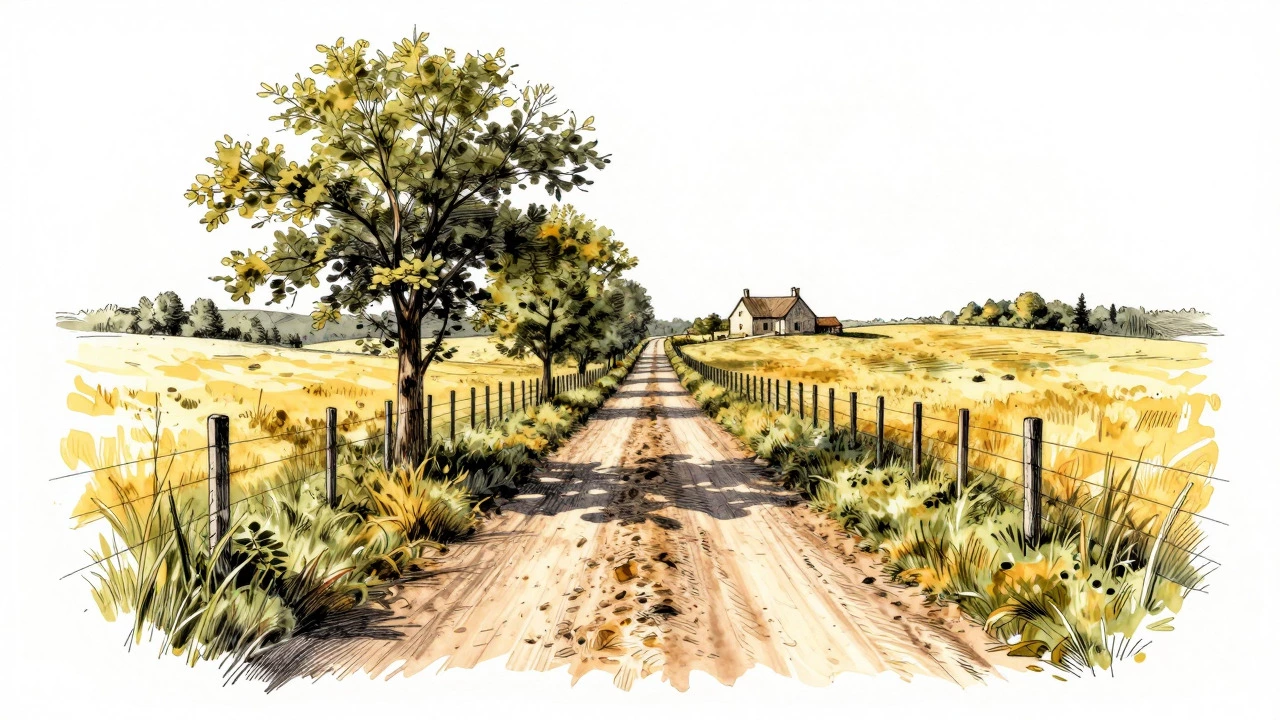
Nature provides plenty of leading lines: winding roads, flowing rivers, rows of crops, or even the alignment of clouds. Use these to point toward your main subject. If your focal point is a cabin in the woods, ensure the path leads directly to it. If the lines lead out of the page, the viewer’s eye will leave the drawing, and the composition feels unfinished.
Keep the lines subtle. They don’t have to be literal lines. A change in texture or a shift in value can act as a line. The goal is a smooth visual journey, not a forced arrow.
Focal Point: The Anchor of Interest
A landscape shouldn’t be equally interesting everywhere. That causes visual fatigue. You need a Focal Point, which is the primary area of interest in a composition that draws the viewer's attention first. This is where you put the highest contrast, the most detail, and often the brightest light.
Common focal points include a solitary tree, a building, a figure, or a bright patch of sunlight. Surround this point with simpler areas. If everything is detailed, nothing stands out. Simplify the background and secondary elements to make the focal point pop. This hierarchy keeps the viewer engaged and gives the drawing a clear message.
Edge Control: Hard vs. Soft
Finally, manage your edges. Not every line should be sharp. Edge Quality refers to the transition between light and dark areas, ranging from hard (crisp) to lost (invisible).
Use hard edges for the focal point and foreground objects. Use soft edges for middle ground and background. Use "lost" edges where an object blends into the background, such as a dark cloud against a dark sky. Varying edge quality adds realism and prevents the drawing from looking stiff or cartoonish. It mimics how our eyes focus sharply on one thing while blurring the rest.
What is the most important rule in landscape drawing?
While all rules matter, atmospheric perspective is often the most critical for creating believable depth. Without shifting values and softening edges in the distance, a landscape will look flat regardless of other techniques.
Should I always use the Rule of Thirds?
It is a helpful starting point, but not a strict law. Once you understand why off-center compositions work better, you can experiment with central symmetry or other layouts if they serve your artistic intent.
How do I decide where to place my horizon line?
Decide what is the main subject of your drawing. If the sky is dramatic, place the horizon low. If the foreground details are important, place the horizon high. Avoid the center unless you want a balanced, calm mood.
Why does my landscape look flat?
Flatness usually comes from a lack of value contrast or ignoring atmospheric perspective. Ensure your background is lighter and softer than your foreground, and that you have distinct darks and lights throughout the piece.
Do I need to know linear perspective for natural scenes?
Yes, but loosely. Natural elements like rivers, paths, and tree lines still follow convergence rules. Understanding this helps you draw them correctly so they don't look distorted or disconnected from the ground plane.