Art Print Resolution & Camera Requirements Calculator
| Camera Type | Megapixels | Status |
|---|
You’ve finished a piece you’re proud of. Maybe it’s an oil painting, a watercolor sketch, or a mixed-media collage. Now you want to turn it into a print for your website, a gallery show, or just to share with friends. But when you snap a quick photo with your phone, the colors look dull, the texture is lost, and the edges are wavy. It doesn’t look like the real thing.
Getting a professional-grade image of your artwork isn’t about buying a $5,000 camera. It’s about controlling light, angle, and file size. If you get these three things right, even a mid-range DSLR or mirrorless camera can produce images sharp enough for large-format printing. Here is how to stop guessing and start capturing your work accurately.
Quick Summary / Key Takeaways
- Lighting is everything: Use two identical light sources at 45-degree angles to eliminate shadows and glare.
- Shoot in RAW: This format preserves more detail and allows for better color correction than JPEG.
- Keep it flat: The camera sensor must be perfectly parallel to the artwork to avoid perspective distortion.
- Resolution matters: Aim for at least 300 DPI (dots per inch) at your final print size.
- Calibrate your monitor: Your screen’s colors might lie to you; use a hardware calibrator for accurate proofing.
Setting Up the Stage: Lighting and Background
Before you touch your camera, set up your shooting environment. The biggest enemy of art photography is uneven lighting. If one side of your canvas is brighter than the other, your print will have dark corners that no amount of editing can fully fix without degrading quality.
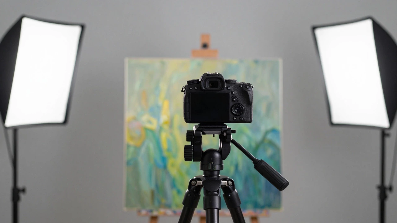
The gold standard for this is the 45-Degree Rule. Place two identical light sources on stands, angled at 45 degrees to the surface of the art. They should be opposite each other. This creates soft, even illumination across the entire piece. If you don’t have studio strobes, two LED panels with diffusers work well. Avoid natural window light if possible, because clouds move and the sun changes intensity throughout the day, making consistency impossible.
Next, consider the background. You don’t need a fancy backdrop. A plain white sheet or a neutral gray wall is perfect. The goal is to isolate the artwork so the viewer’s eye goes straight to the piece. If you are photographing textured works like impasto oils, be careful not to cast harsh shadows from the lights themselves. If you see small dark spots moving around as you adjust the lights, they are likely reflections of the bulbs or your own shadow. Move the lights further back or use larger diffusers to soften them.
Camera Settings for Maximum Detail
Now that the light is set, let’s talk about the camera. Whether you use a dedicated camera or a high-end smartphone, the principles remain the same. You want maximum sharpness and minimum noise.
- Format: Switch to RAW mode. RAW files capture all the data from the sensor. They are larger files, but they give you flexibility to adjust exposure and white balance later without losing quality. JPEGs compress data, which can create artifacts in smooth gradients, like skies in a landscape painting.
- Aperture: Set your aperture between f/8 and f/11. This range provides the best overall sharpness for most lenses. Wide open apertures (like f/1.8) only focus on a thin slice of the image, which is bad for flat surfaces. Very narrow apertures (like f/22) can cause diffraction, blurring the fine details.
- ISO: Keep your ISO as low as possible, usually 100 or 200. Since you are using artificial light, you have plenty of time to expose the shot. Low ISO means less digital noise, resulting in cleaner blacks and smoother colors.
- Shutter Speed: Use a tripod. With a stable base, you can use a slower shutter speed (like 1/60th or 1/30th of a second) to ensure the exposure is correct without raising the ISO. If you don’t have a tripod, keep the shutter speed above 1/125th to avoid blur from hand shake.
Focusing is critical. Use manual focus rather than auto-focus. Auto-focus systems often struggle with flat, repetitive patterns found in art. Zoom in on your viewfinder or live view, pick a detailed area in the center of the artwork, and focus manually until it looks razor-sharp. Remember, if the center is sharp, the whole image will be sharp if your camera is parallel to the art.
Composition and Angle: Avoiding Distortion
This is where many artists make mistakes. They hold the camera slightly tilted, thinking it’s close enough. In reality, even a 5-degree tilt creates trapezoidal distortion. Your square painting becomes a rectangle, and your circles become ovals. For prints, this is unacceptable.
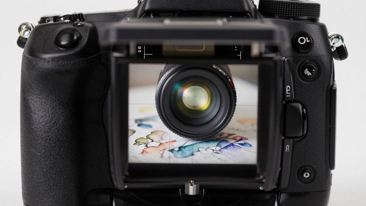
Your camera sensor must be perfectly parallel to the plane of the artwork. If you are using a DSLR or mirrorless camera, use the electronic level feature if available. If not, use a bubble level app on your phone attached to the top of your camera. Align the grid lines in your viewfinder with the edges of the canvas. Fill the frame completely with the artwork, leaving no margin. Cropping later reduces your resolution, so it’s better to fill the frame now.
If you are photographing a very large piece, you may need to step back. Ensure the lens is centered directly in front of the middle of the art. If you shoot from the left side, the right side of the image will appear slightly smaller due to perspective. Stepping back and zooming in with a longer focal length (around 50mm to 85mm on a full-frame camera) helps minimize this effect. Avoid wide-angle lenses (under 35mm) as they exaggerate edge distortion.
Post-Processing: Getting the Colors Right
You have your RAW file. Now you need to edit it. Do not rely on the automatic adjustments in basic photo apps. Open the file in professional software like Adobe Lightroom or Capture One.
First, check your histogram. It should span from left to right without clipping at either end. If the whites are clipped, you’ve lost highlight detail. If the blacks are crushed, you’ve lost shadow detail. Adjust the exposure and contrast gently.
Next, correct the white balance. If you used daylight-balanced LEDs, your white balance should be close to 5500K. If you used tungsten bulbs, it might be closer to 3200K. Use a gray card if you took one alongside the art; it ensures neutral grays stay neutral. Without a reference, trust your eyes but compare against the physical piece. Does the red look too orange? Is the blue too purple? Make subtle adjustments to the hue sliders.
Finally, sharpen for print. Screen viewing requires less sharpening than print. Apply moderate unsharp masking or high-pass filter sharpening. Be careful not to overdo it, or you’ll see halos around the brushstrokes. Export the final image as a TIFF or high-quality JPEG with sRGB color profile for web use, or Adobe RGB if you are working with a professional printer who supports wide gamut colors.
Common Mistakes to Avoid
Even with good gear, simple errors can ruin a print job. Here are the pitfalls I see most often:
- Glare: Glossy varnishes reflect light. If you see bright spots on the canvas, change the angle of your lights or use polarizing filters on both the lights and the lens to cut the reflection.
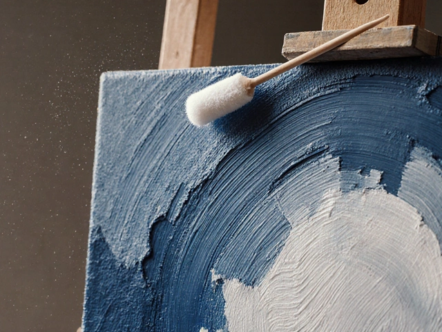
- Dust and Fingerprint: Clean your lens before every session. A single speck of dust on the lens appears as a blurry dot in the center of your print. Wipe the artwork gently with a microfiber cloth if it’s safe to do so.
- Inconsistent Batching: If you are photographing multiple pieces, do not change your lighting or camera settings between shots. Shoot all your art in one session under the same conditions to ensure color consistency across your portfolio.
- Ignoring File Size: Check your megapixels. If you plan to print a 24x36 inch poster, you need at least 7200x10800 pixels (at 300 DPI). A 12-megapixel camera gives you roughly 4000x3000 pixels, which is only suitable for smaller prints. If your camera is lower resolution, consider hiring a professional photographer with a medium format camera.
Equipment Comparison: What You Actually Need
You don’t need the most expensive gear, but you do need the right tools. Here is a breakdown of what serves different budgets and needs.
| Item | Budget Option | Professional Option | Why It Matters |
|---|---|---|---|
| Camera | Recent Smartphone (12MP+) | Full-Frame Mirrorless (24MP+) | Sensor size affects noise and dynamic range. Larger sensors handle low light better. |
| Lens | Standard Kit Lens | Prime 50mm or 85mm | Primes are sharper and have less distortion than zooms at equivalent focal lengths. |
| Support | Sturdy Tripod | Tripod + Ball Head | A ball head makes aligning the camera parallel to the art much easier. |
| Lighting | Two LED Panels + Diffusers | Studio Strobes + Softboxes | Strobes offer consistent power and faster flash durations, freezing any potential movement. |
| Editing Software | Free (Darktable/GIMP) | Adobe Lightroom/Photoshop | Paid software offers superior color management profiles and non-destructive editing. |
If you are just starting out, a recent smartphone and a cheap tripod are sufficient for small prints up to 8x10 inches. However, if you are selling prints online or submitting to galleries, investing in a dedicated camera and proper lighting pays off quickly in terms of perceived value and customer satisfaction.
FAQ
Can I take pictures of my art with just a phone?
Yes, for small prints (up to 8x10 inches), a modern smartphone is capable enough. Just ensure you use a tripod, shoot in the highest resolution mode available, and control your lighting carefully. For larger prints, a dedicated camera with a larger sensor is recommended to reduce noise and increase detail.
What is the best aperture for photographing paintings?
The sweet spot is usually between f/8 and f/11. At these settings, the entire surface of the painting remains in sharp focus without suffering from diffraction, which can soften details at very narrow apertures like f/16 or f/22.
How do I remove glare from glossy art?
Use cross-polarization. Attach a circular polarizer filter to your camera lens and place linear polarizers over your light sources. Rotate the lens filter until the glare disappears. Alternatively, adjust the angle of your lights so they are not reflecting directly into the camera lens.
Do I need to edit the photo before sending it to a printer?
Yes. Always perform basic corrections for white balance, exposure, and cropping. Convert the file to the color space requested by your printer (usually sRGB for web proofs and CMYK or Adobe RGB for large format printing). Never send a raw file unless specifically instructed by the lab.
What resolution do I need for a large format print?
For large format prints viewed from a distance, 150 to 200 DPI is often acceptable. However, for close-up viewing or standard giclée prints, aim for 300 DPI. Calculate your required pixel dimensions by multiplying the print size in inches by the desired DPI. For example, a 24-inch wide print at 300 DPI requires 7200 pixels of width.