Landscape Composition Simulator
Practice placing your horizon and focal point using the Rule of Thirds. Click on the canvas to place a focal point, then use the slider to adjust the horizon.
Walk into any gallery or scroll through an online art forum, and you’ll spot the difference between a snapshot in paint and a compelling landscape painting. The former records what was there; the latter tells you how it felt to be there. But here’s the trap many beginners fall into: they think landscape painting is about copying trees and hills exactly as they appear. It’s not. It’s about translation.
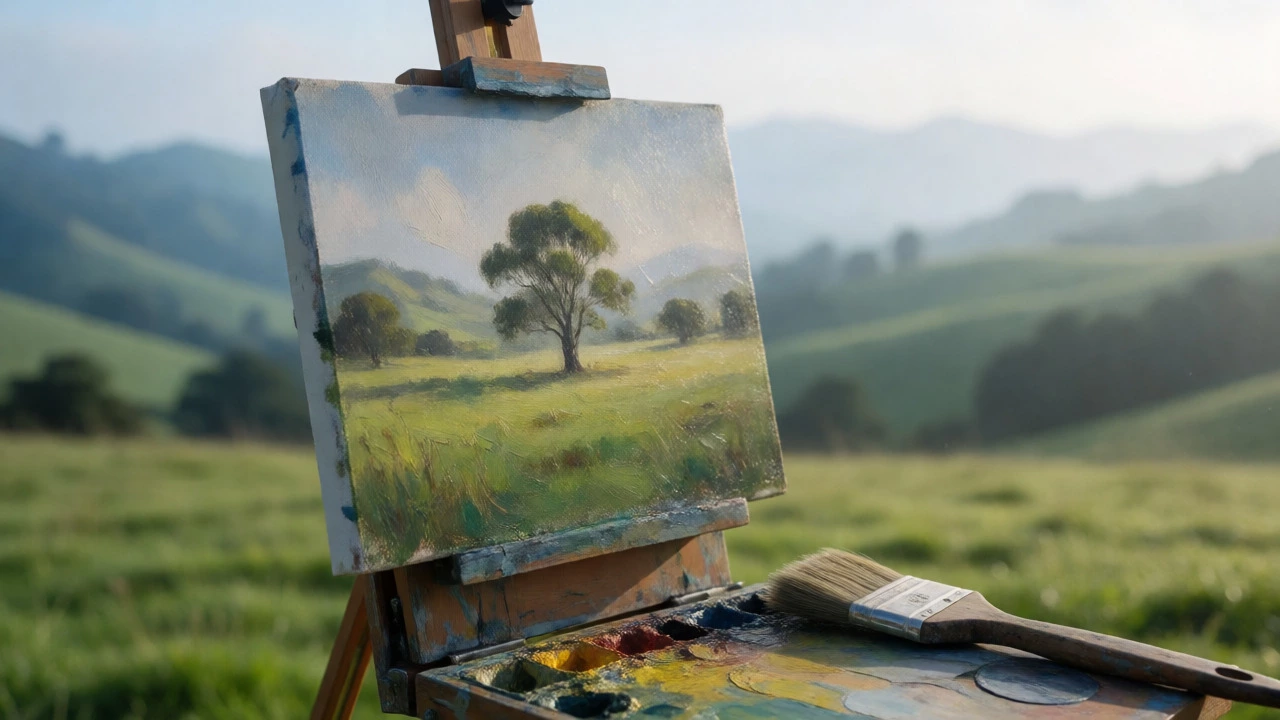
You’re translating a three-dimensional world onto a two-dimensional surface, using only pigment and brushwork. To do that effectively, you need a framework. These aren’t rigid laws like gravity-they’re tools for organizing chaos. Whether you’re painting plein air in Wellington’s changing weather or working from photos in your studio, mastering these principles will stop your paintings from looking flat, muddy, or boring.
Composition Is Your Blueprint
If you get the composition wrong, no amount of pretty colors will save the painting. Composition is how you arrange elements on the canvas to guide the viewer’s eye. Think of it as directing traffic. You don’t want the viewer’s eye wandering off the edge of the canvas immediately. You want them to enter, explore, and linger.
The most common mistake? Placing the horizon line dead center. This splits the painting in half and creates visual tension without purpose. Instead, try the Rule of Thirds. Imagine dividing your canvas into nine equal parts with two horizontal and two vertical lines. Place your main focal point-maybe a lone tree, a barn, or a distant peak-at one of the intersections. If the sky is dramatic, give it two-thirds of the space. If the land has interesting texture, give it two-thirds. Never split it 50/50 unless you have a very specific reason.
Another powerful tool is the S-curve. A winding river, a curving road, or even a row of fence posts can lead the eye from the foreground deep into the background. This creates depth and movement. Without a path for the eye to follow, your painting feels static. Ask yourself: Where does the viewer look first? Where do they go next? If you can’t answer that, your composition needs work.
Mastering Value Structure
Color gets all the glory, but value (the lightness or darkness of a tone) does the heavy lifting. Many struggling painters focus so hard on getting the “right green” for the grass that they ignore whether that green is too light or too dark relative to the shadow under the tree. If your values are wrong, your form collapses.
A simple test: Squint at your subject. When you squint, details blur, and you see only shapes of light and dark. Do this while painting. If your painting looks like a gray blob when squinted at, you have a problem. You need clear separation between your darkest darks and your lightest lights. Most landscapes have a limited range of values. Don’t be afraid to exaggerate contrast. If the sky is bright white, make the foreground shadows darker than they actually are. This pushes the foreground forward and makes the light feel intense.
| Element | Typical Value Range | Common Mistake |
|---|---|---|
| Sky | Light to Mid-Tone | Making it darker than the ground behind it |
| Distant Hills | Mid-Tone to Light | Using high contrast in the distance |
| Foreground Shadows | Dark to Very Dark | Keeping them too light due to fear of black |
| Focal Point | Highest Contrast | Blending it into surrounding mid-tones |
Atmospheric Perspective Creates Depth
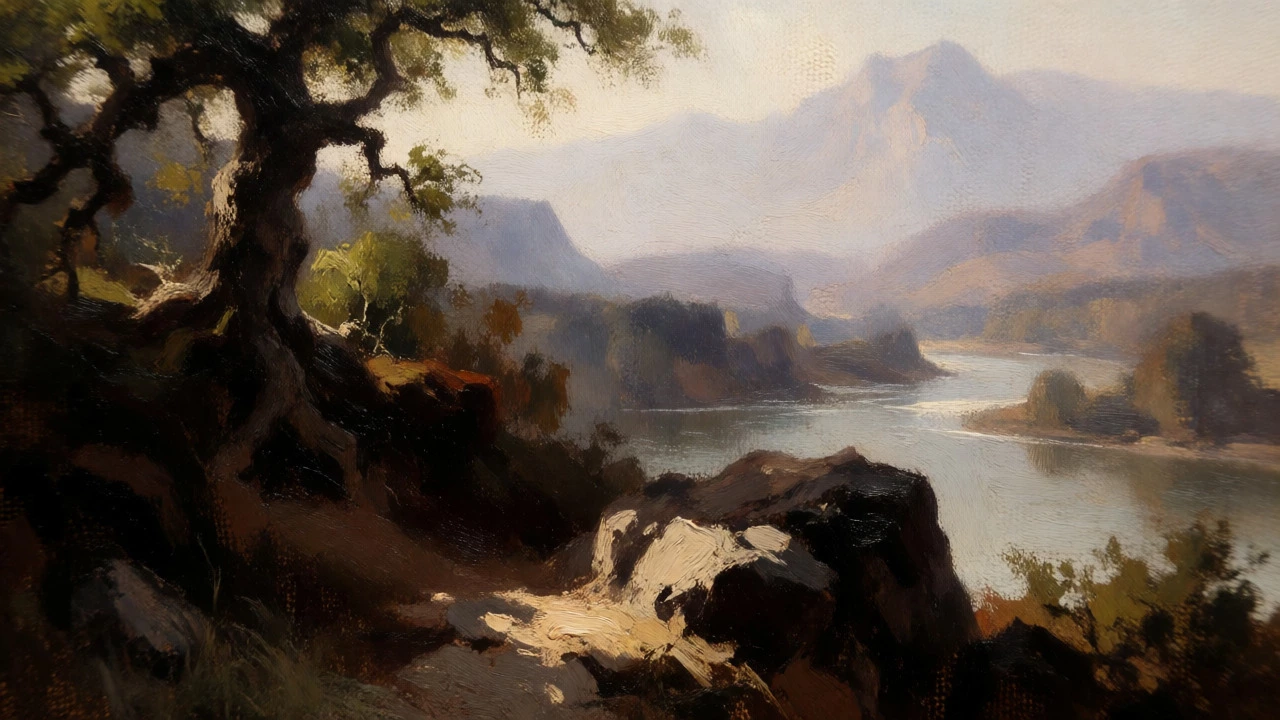
How do you make a flat canvas look miles deep? You use atmospheric perspective. In real life, the atmosphere scatters light, which affects how we see distant objects. As things get further away, three things happen:
- Contrast decreases: Distant mountains don’t have sharp, black shadows. They look soft and hazy.
- Detail disappears: You can’t see individual leaves on a far-off forest. You see masses of color.
- Color shifts: Cool colors (blues, violets) advance visually, while warm colors (reds, oranges) recede? No, wait-it’s the opposite in terms of atmospheric scattering. Distant objects take on the color of the atmosphere, usually blue or gray. Foreground objects retain their local, warmer colors.
To apply this, mix more blue or white into your distant colors. Use softer edges. Save your sharpest edges and highest chroma (color intensity) for the foreground. If your background is as sharp and colorful as your foreground, the painting will look like a collage, not a scene.
Color Harmony and Temperature
Picking random pretty colors doesn’t make a harmonious painting. You need a unified color scheme. One way to achieve this is by choosing a dominant temperature. Is your scene dominated by cool blues and greens (a misty morning)? Or warm yellows and oranges (a sunset)? Stick to that temperature for the majority of the painting. Use the opposite temperature sparingly for accents.
For example, if you’re painting a winter scene in cool blues, add a tiny touch of orange in a cabin window. That small warm accent will pop because of the contrast. If everything is warm, nothing pops. If everything is cool, it might feel monotonous. Balance is key.
Also, avoid using pure tube colors straight from the palette. Mix your own greens. Real foliage isn’t just “green.” It’s olive, chartreuse, teal, brown-green, and yellow-green. Mixing your own colors ensures they relate to each other. If you use pre-mixed Sap Green for every tree, your forest will look artificial.
Brushwork Tells the Story
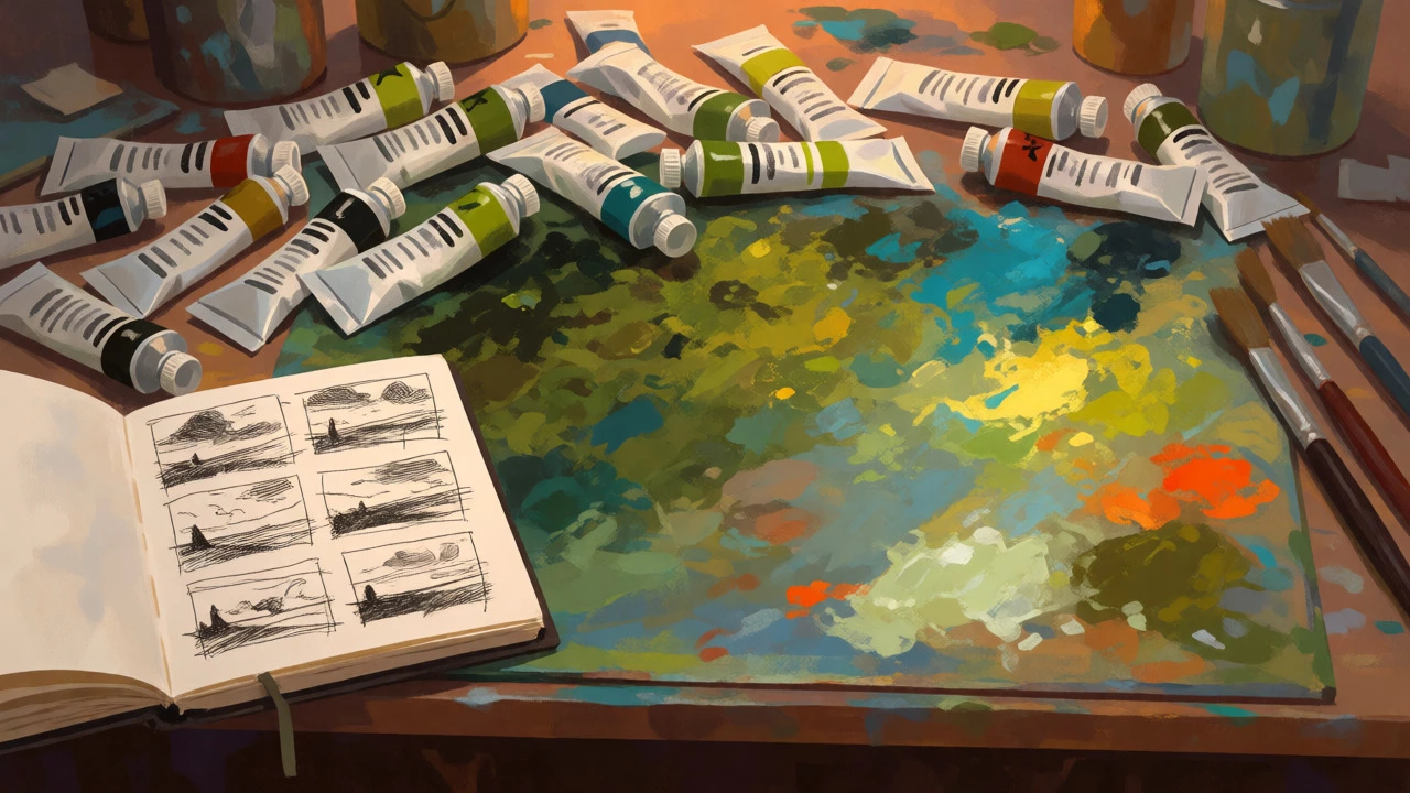
Your brushstrokes are part of the language of the painting. They convey texture and energy. A smooth, blended sky suggests calm. Broken, choppy strokes suggest wind or rough water. Don’t over-blend. Let the viewer see the hand of the artist. It adds authenticity.
Vary your stroke direction to describe form. Horizontal strokes for calm water. Vertical strokes for tall grass or trees. Curved strokes for rolling hills. This subtle cue helps the brain interpret the shape of the object without needing excessive detail. Remember, less is often more. You don’t need to paint every leaf. Paint the impression of a leafy mass.
Breaking the Rules
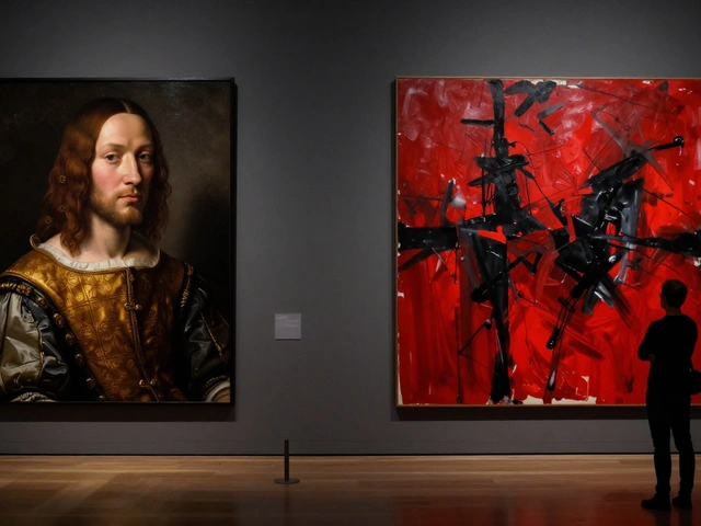
Once you understand these principles, you can break them intentionally. Impressionists broke the rule of realistic color. Expressionists distorted form for emotional impact. But they broke the rules because they knew them first.
Start by following the guidelines strictly. Check your values. Check your composition. Check your perspective. Once your paintings consistently look convincing, start experimenting. Maybe you want a flat, decorative style. Maybe you want to use unnatural colors. That’s fine. Just know why you’re doing it. Rules are guardrails, not cages. They keep you from falling off the cliff until you learn to fly.
Do I need to paint outdoors to learn landscape rules?
No, but it helps significantly. Painting en plein air forces you to observe light changes rapidly, teaching you to simplify quickly. Studio painting allows for slower refinement, but risks becoming overly detailed. A mix of both is ideal.
Why does my landscape look flat?
Flatness usually comes from poor value structure or lack of atmospheric perspective. Check if your foreground is darker and sharper than your background. Ensure there is a clear range from light to dark. If everything is mid-tone, the painting lacks depth.
What is the best horizon line placement?
Avoid the exact center. Place the horizon either in the upper third (to emphasize land) or the lower third (to emphasize sky). This creates dynamic tension and guides the viewer’s eye more effectively than a centered horizon.
How do I choose colors for a landscape?
Limit your palette. Choose a dominant temperature (warm or cool) and stick to it. Mix your own greens and browns rather than using tube colors directly. This ensures color harmony and prevents the painting from looking garish or disjointed.
Is drawing necessary before painting a landscape?
Not strictly, but thumbnail sketches are highly recommended. Spend 10 minutes making small, quick compositions in pencil or charcoal. This helps you solve design problems before committing to paint. It saves hours of frustration later.